|
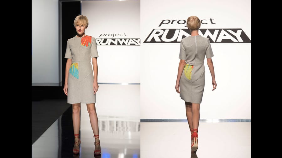
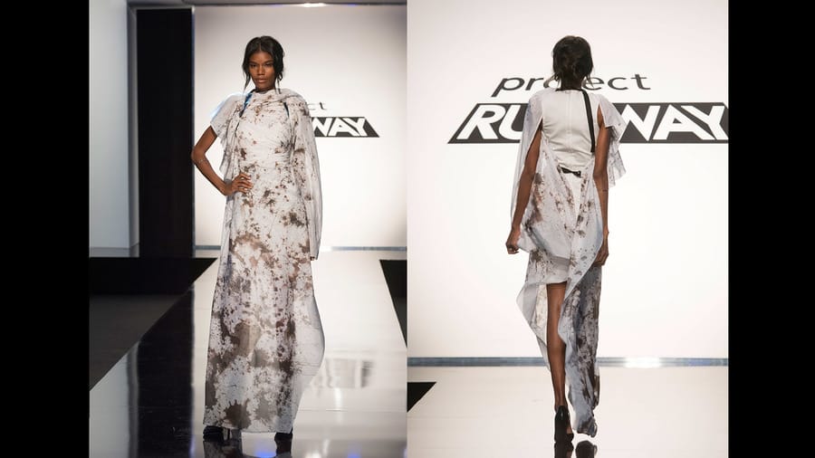
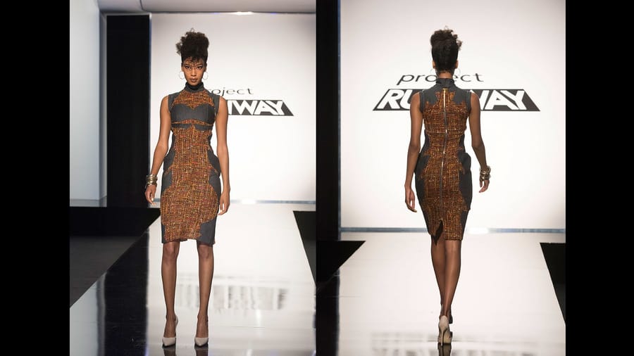
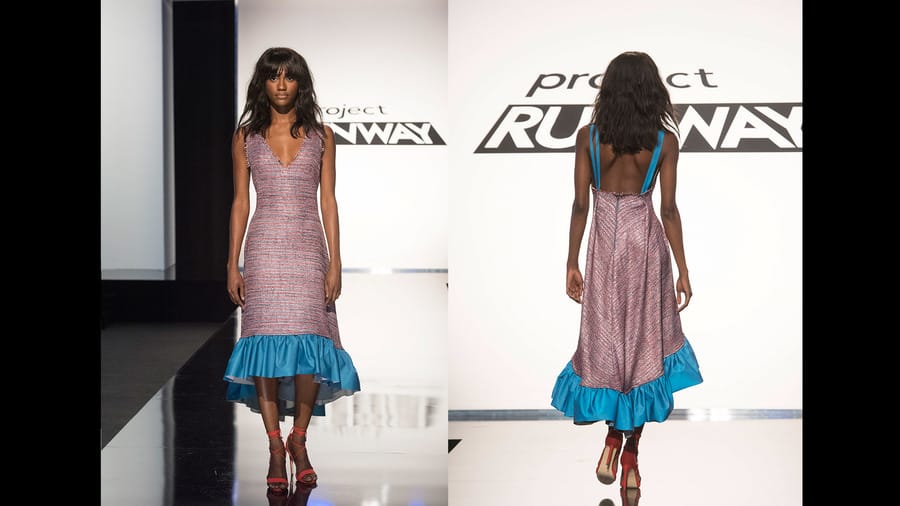
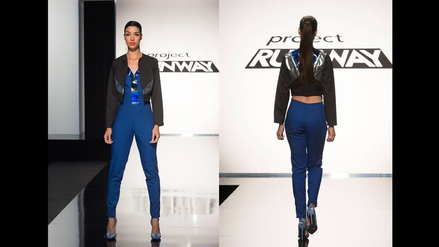
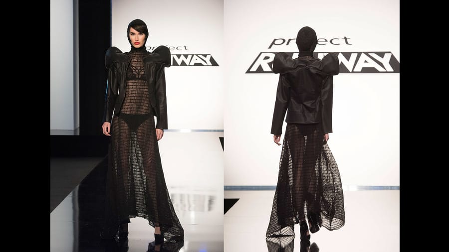
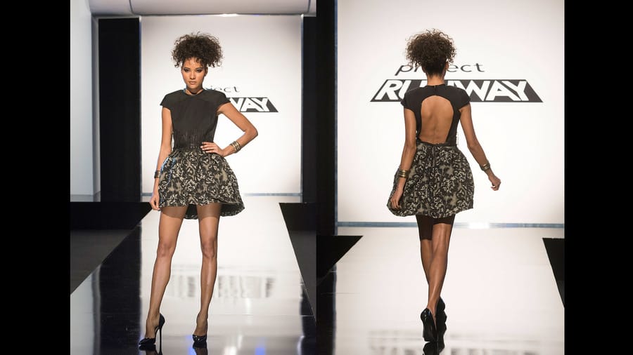
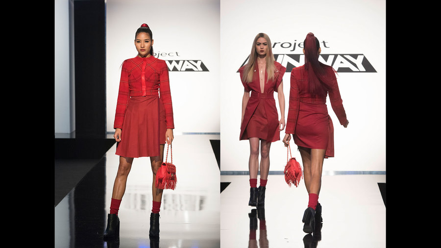
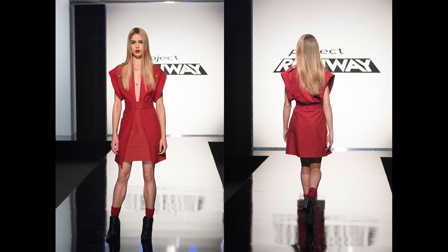
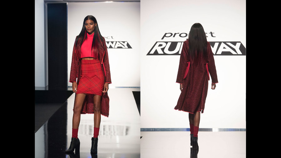
THE CHALLENGE: Be inspired by the aerial view of New York City to create an editorial look for a powerful woman. The winning look will be featured in Marie Claire magazine. My Top 3: 1. Cornelius Ortiz This is 100% the best thing Cornelius has ever made, and it 100% fit the bill for the challenge. He was inspired by shapes he saw from the aerial view of New York to create the style lines, and this is definitely a powerful look for a powerful woman. I love that this dress is completely ageless, and I think it would be great for an editorial in Marie Claire. I want it and my mom wants it, which is hard to achieve, and his execution and styling was spot on. 2. Rik Villa This look wasn't perfect, and I agree with the judges that it would have been nicer had the draped fabric continued on the back, but Rik deserves mad props for creating such a beautiful textile, and I could definitely see this photographing beautifully in a Marie Claire spread. 3. Mah-Jing Wong Like Rik's look, this wasn't perfect by any means. The patterning of the boobs was placed too high, and some of the tweed stretched in weird places. That said, this is probably the most creative dress Mah-Jing has made, the fabrication was interesting, and I appreciate his aesthetic take on what a "powerful woman" should look like. Honorable Mention: Erin Robertson This is not my favorite look of Erin's, but it is SIGNIFICANTLY better than the looks she's made the past few weeks. The color story was bright and fun, and the "business-on-top, party-on-bottom" design was creative and chic. It looks like Erin is making a comeback!! My Bottom 3: 1. Nathalia JMag There really isn't anything positive to say about this look. Nathalia decided that a "powerful woman" needed to be a futeristic superhero, and the result looked like cheap, poorly made student work. After her inexcusable proportions last week and her poor showing this week, I think it was definitely justified for the judges to send her home. 2. Dexter Simmons There are so many things wrong with this look. To start, his jacket was an exact re-creation of his jacket from week 7 that the judges all hated. Second, he spend all his time on the jacket and his dress ended up simply being a single drape of fabric with arm holes. To top it all off, the only interesting design feature was the model's lingerie, which Dexter didn't even make - the model brought it herself. In a design competition, you can't put all your eggs in one jacket (yeah? see what I did there?) and expect it to go well for you. 3. Laurence Basse I was really shocked that the judges didn't rake Laurence over hot coals for this. Sure, she did some nice leatherwork in the waistband, but a touch of good leatherwork just isn't enough at this point in the competition. The back of this dress is a design feature she's done before, and the bottom is just way too short. As a whole it looks like a really cheap homecoming dress, and Laurence can do so much better. So in the end, Nathalia went home. AND DEXTER WENT HOME, TOO. YUSSSSSSS. This was the most deserved double elimination ever, and I couldn't have been more thrilled to see Sassy Pants Diva Dexter go home. AND, I couldn't be more happy about Cornelius winning the challenge, which as you know, is never, EVER something I thought I would say. This was a much needed redemption after Tim used his Tim Gunn save. All photos from www.mylifetime.com
0 Comments
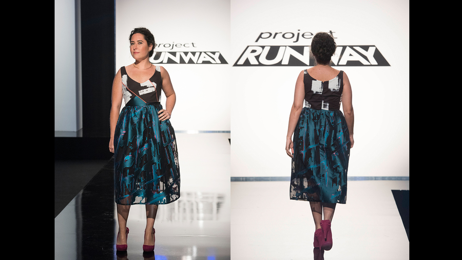
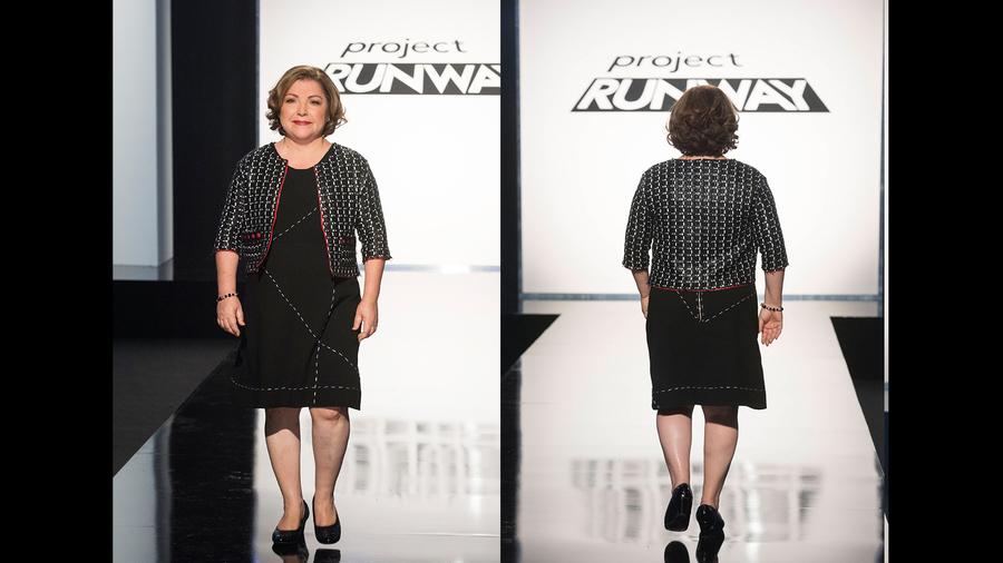
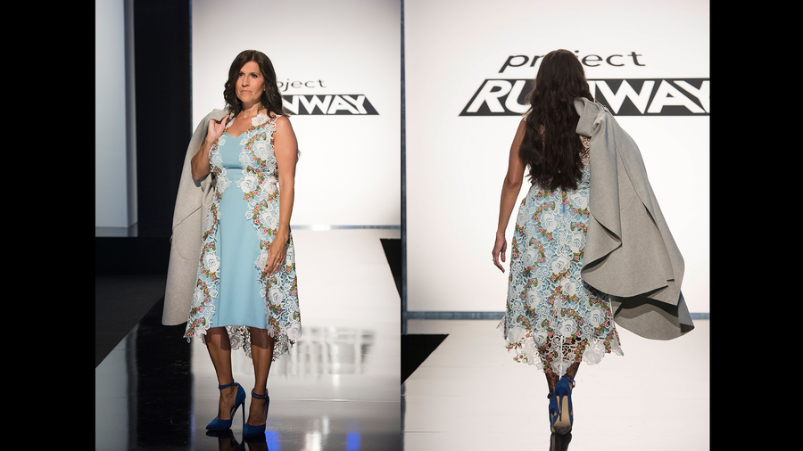
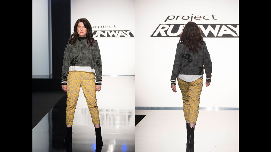
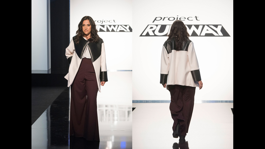
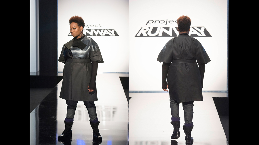
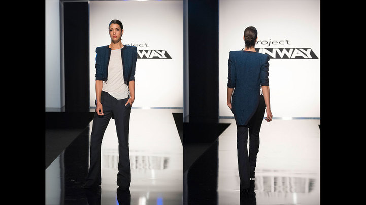
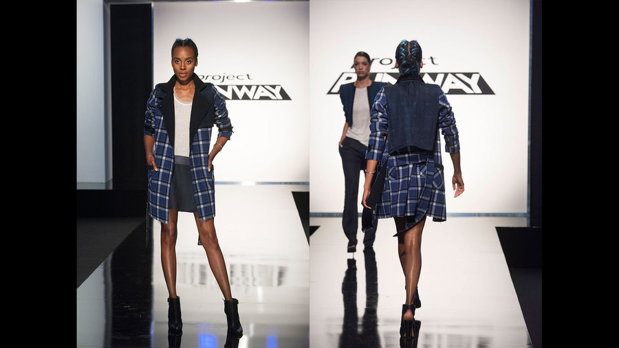
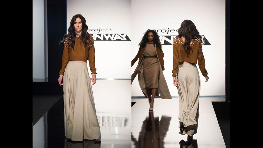
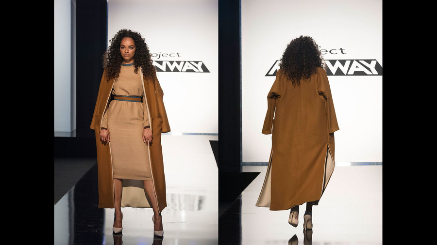
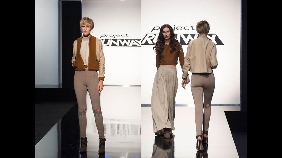
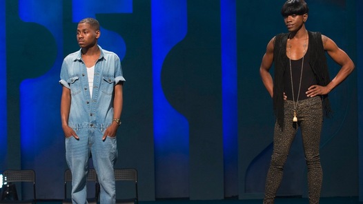
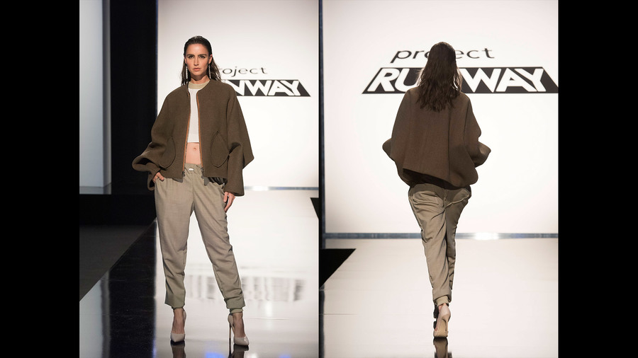
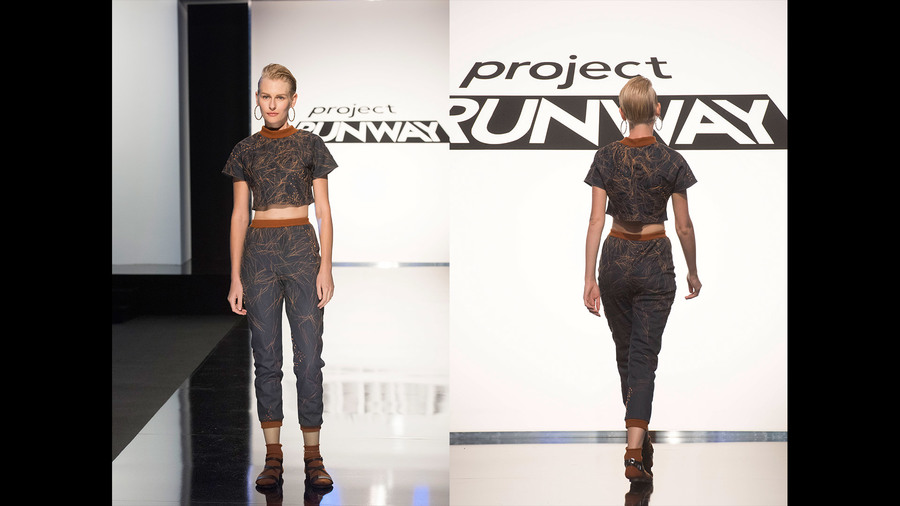
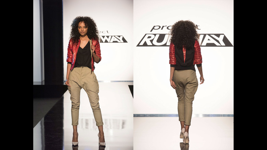
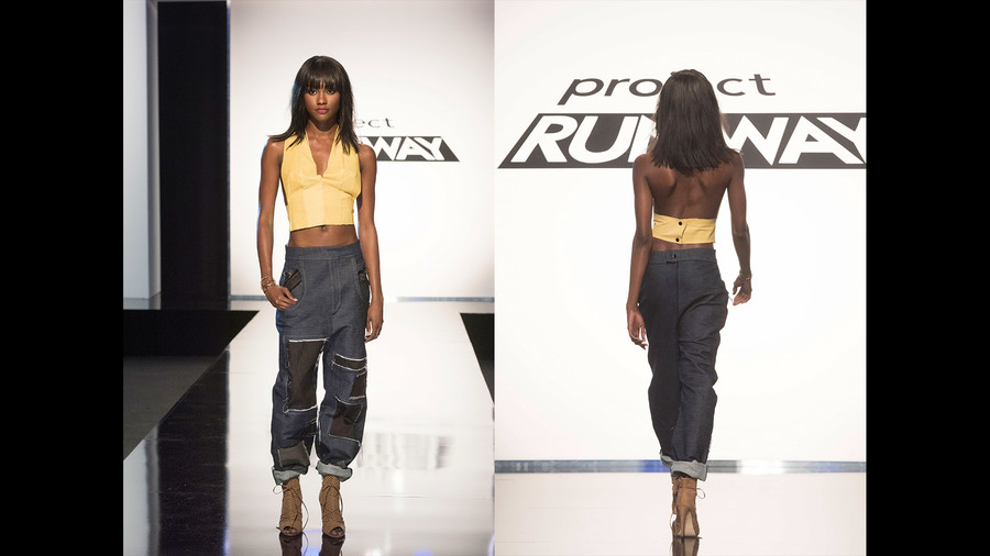
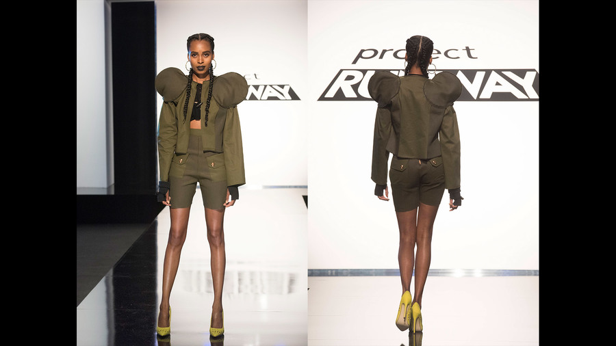
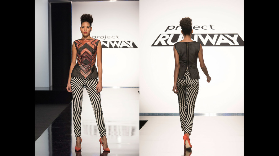
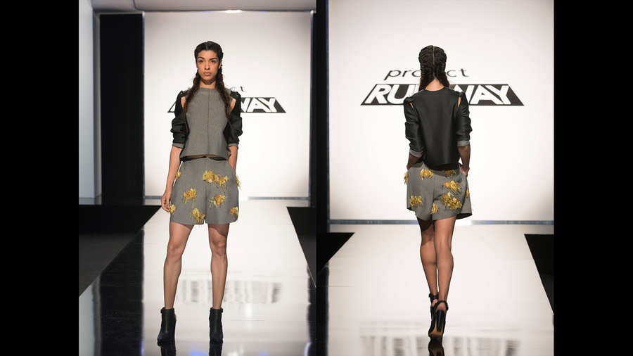
THE CHALLENGE: Create a look for a friend/family member who is creating a "new start" for themselves. The designer and the client will receive $25,000 EACH to help them achieve their goals and dreams. My Top 3: 1. Roberi Parra Roberi’s friend was an aspiring graphic designer who wanted a dress to wear at art showings and industry events, and I couldn't think of a dress that's any more perfect for an artist. It’s graphic and modern but also sweet, which is hard to achieve and it was executed brilliantly. I want this dress. I want this dress. I want this dress. 2. Rik Villa While Roberi's look was my personal favorite, I completely support the judges' choice of Rik as the winner. His mom is returning to school to earn a promotion in management, and this look fits the bill perfectly. It's well proportioned, flattering, professional, and sweet. I love that he incorporated a bit of his heritage with the white stitching, and the fact that Rik is using his prize money from the win to pay back his mom for loaning him money for school and his studio space is totally heart warming. 3. Erin Robertson Erin was in the bottom for this look, and I agree with the judges on the fact that it was a winter coat with a spring dress, however, as someone from the mid-west who frequently has to wear winter coats on Easter, there's a sense of practicality to that situation that works for me. The construction of the dress could have been improved, but we would sell this style at Anthropologie in a second, and it's still a very special piece. My Bottom 3: 1. Jenni Riccetti Jenni definitely deserved to go home. She purchased maroon fabric that would have made her pants look more sophisticated, but even that wouldn't have saved her look overall. It simply wasn't appropriate for a preschool director in any capacity, and she missed the mark of the challenge. 2. Nathalia JMag Nathalia's look was well intentioned, and the idea of a coat for travel was a good idea for her "client," but the proportions swallowed her and the whole thing was poorly made. If she doesn't turn it around next week, she's going home for sure. 3. Mah-Jing Wong The judges put this look in the top, and I can't fault Mah-Jing for creating a look that embodied exactly what his mom wanted. She's starting a record label and wanted a powerful look that made her feel like a warrior. That's definitely what Mah-Jing created, but I just can't get behind it as a look. Her legs looked like toothpicks coming out from the coat and it looked like a costume to me. All photos from www.mylifetime.com We all know how the last team challenge went, and given how poorly most of the designers have been doing lately, I was ready for this team challenge to be another disaster. Much to my surprise and delight, this episode ended up being one of my favorites! The Challenge: In 3 teams of 3, create a 3-piece collection inspired by one of Sally Beauty's new fall color concepts: New Neutrals, Tones of Blue, or Red Violet. As an added twist to this challenge, the collections were shown to the public, and the winner of the public vote earned a 20% boost to their final judges' scores. Team Tones of Blue This team won the judges final vote, and I can completely understand why. Thier fabric choice and cohesive aesthetic earned the top spot, and it was well deserved! Laurence's look was a little funky in the proportions, but it won me over with a cool, relaxed vibe that couldn't be overlooked. The "Chanel-in-Front, Tuxedo-in-Back" jacket was so unusual and yet completely wearable, and any girl could leave the house in this look feeling confident. This look is one of the best things Rik has made on the show so far. I thought his dress was a little too basic, and Tim Gunn expressed the same concern, but in the end, with the coat and with proper styling, it became easy and effortless. I’m not a plaid girl in the least, but the style lines of this coat make it very desireable. ROBERI’S LOOK WAS MY ABOSULTE FAVORITE. It might be one of my favorite Project Runway looks ever, and I want every piece in my closet right now. It had a little touch of punk, but in a subtle, classic way that could allow for many women of any age to appreciate each piece. He TOTALLY deserved the challenge win! Team New Neutrals This team earned the public vote, which surprised me because the public perception of browns and neutrals isn't usually very positive, but their chic sportswear styling ended up being their saving grace! I appreciated that the team mixed and matched their pieces to create an aesthetic that merged their styles. Jenni's popcorn sweater with Nathalia's pants were a great combination. The wide-leg pants give the vibe of a work look, but the sweater allows it to be a little more casual to take it out of the office as well. The "popcorn" detail on the sweater shoulders were genius, and added great textural details. Nathalia's coat paired with Mah-Jing's dress was brilliant. What other wise could have read as a boring, potato-sack dress was transformed into a luxurious, expensive looking outfit. The touch of denim at the waist and neckline was a great way to break up the neutral tones. While I personally would never wear Jenni's leggings because my booty would make a cry for help (and honestly, they aren't that flattering on the model either,) I appreciate the cut out knees and the seam lines to add some interest, and adding the bomber jacket gave the look a cool, "after school" feeling. Team Red Violet This team had all the advantages in the world, and they didn't use any of them. "Red Violet" meant they could have incorporated pinks and purples, and their collection could have been a glorious jewel-toned moment. In addition, red is an action color, which makes the public far more likely to vote for them. Instead, Dexter decided their collection needed to be "punk," and their battle was fought and lost at Mood with their fabric choice. I've been no fan of Cornelius, but I really felt sorry for him. He had to help finish Dexter and Erin's looks, and as a result, his own work suffered. His jacket isn't bad, but the closure in the front looks like a strip of duct tape from afar, and his pleated skirt (which I don't entirely blame him for, since Erin designed it,) was poorly made due to his time constraints. Overall, it's just too red-on-red-on-red to be successful. Dexter's look wasn't the worst, but no woman would ever wear it due to the bra issue in the front, and for a design competition it really wasn't that difficult to make. If this was all he was going to contribute, he should have been more of a help to his team, and the fact that his design aesthetic was responsible for the other looks makes it even less excusable. Erin’s coat saved this collection, and Cornelius was on track with breaking up his suit and putting his skirt with Erin’s look. I was a little pissed that the coat was basically all Erin made, but it was the most successful look overall. Team Red Violet’s critique was a train wreck, but an expected train wreck. Dexter made a trillion excuses as to why they had a disadvantage, Dexter and Erin blamed Cornelius for everything, and Cornelius took the heat for not standing up to his team members. Even though Dexter was responsible for the collection aesthetic and Erin made a lot of the design decisions, Cornelius was sent home. BUT WAIT. Tim used his Tim Gunn save. ON CORNELIUS. I have given Cornelius a lot of crap this season, and that crap has been well deserved in my opinion, but I agree with Tim. In this case, on this week, he did not deserve to go home. Tim stood up to the judges and told them Dexter and Erin were the "mean girls" on the team and tried to explain that Cornelius didn't have a lot to do with the end results, but they didn't listen to him. In the end, Tim uses his save when he completely disagrees with the judges' vote, and I agree that the judges sent the wrong person home. HOWEVER. Cornelius is going to have a lot to prove. Honestly, I haven't loved a single thing he's made this entire season, and I worry that another (more talented) designer might not get the opportunity they deserve because Tim wasted his save. Only time will tell. All I know is that looking at these sassy pants, nothing good is going to come from next week. All photos from www.mylifetime.com THE CHALLENGE: Use the jungle roller coaster experience as inspiration to create street wear for the "urban jungle." My Top 3: 1. Nathalia JMag My only criticism of this is that I wished Nathalia had made a top with a little pop of color. Design wise and construction wise, I have no complaints. I would wear that jacket, I would wear those pants. She played with volume in just the right way, and she designed according to the challenge perfectly! 2. Jenni Riccetti Jenni's pieces were definitely more basic, but she chose a great print and her styling, while not my personal taste, is on trend and would sell well. She definitely understood the challenge, and I think she deserved to be in the top instead of just safe. 3. Laurence Basse Laurence won this challenge because she made an amazing jacket and her styling was great, and I’m happy to give her props for that, but I took issue with some things, too. Her pants definitely made her model look like she had a hefty package – NOT okay under any circumstances, and she acknowledged that she messed them up, but they were really awful. I appreciated that she made a jacket style that was different than her standard shoulder detail, but it was a little too reminiscent of Michael Jackson’s “thriller” look for my taste. ...the fact that each of my top looks still had problems with them should give you a hint that the rest of the designers were a hot mess. My Bottom 4: (That's right, 4. Hot. Mess.) 1. Cornelius Ortiz I’ve taken issue with Cornelius’ attitude and taste level before, but this pushed me over the edge. The pants were constructed well, but the fact that Nina Garcia considered them to be “current” was insane to me; they remind me of everything NSYNC wore in 2001. And if the dated pants weren’t enough, he gave us a poorly made, poorly designed top to go with it. That. Top. Is. Awful. Send. Him. Home. 2. Dexter Simmons This was another scenario where Nina Garcia was completely off base – she applauded Dexter for being innovative and trying something new, but new for the sake of new doesn’t make it acceptable. The jacket shoulders are absurd. The high waisted + Bermuda length shorts are hideous (and he didn’t even finish the hem. Ugh.) The only thing I like about this look is the top underneath the jacket (which you can’t see) and the finger-less gloves (which I can buy at Target.) And if we’re being really honest with ourselves, this isn’t street wear. What woman would ever wear this in her everyday life?! 3. Brik Allen I don’t know if I agree that Brik should have gone home for this because his construction was better than quite a few of the other designers, but as far as taste-level was concerned, it wasn’t too great. I wished he had patterned the pant print so it was symmetrical along the center seam, and I wish he had used his top print as-is instead of deconstructing it into a top that didn’t go with the pants at all. I think Brik struggles with designing well under pressure, and if he had more time to look at his design he would be able to see that his look wasn’t successful. 4. Erin Robertson It would appear that Erin is losing her way, and she CAN’T because I’ve already pinned her as the season winner and if she screws that up I’ll be mad. But I can’t deny that this look is pretty crappy. The top isn’t the worst, but the embroidery details on the shorts were unsuccessful and the fit of her shorts were off, too. If she had used the embroidered sections as sleeve details on a jacket, that might have worked, but on shorts they just look silly. I think the theme park aspect of the challenge confused a lot of the designers and they simply got lost. If it had just been a matter of creating street wear, they probably would have done better. Maybe. At this point, I have no idea what some of the designers are capable of, so we'll see where we go from here. All photos from www.mylifetime.com |
categories
All
archives
May 2019
|
 RSS Feed
