|
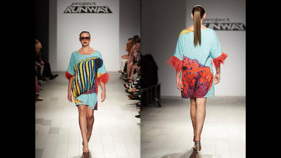
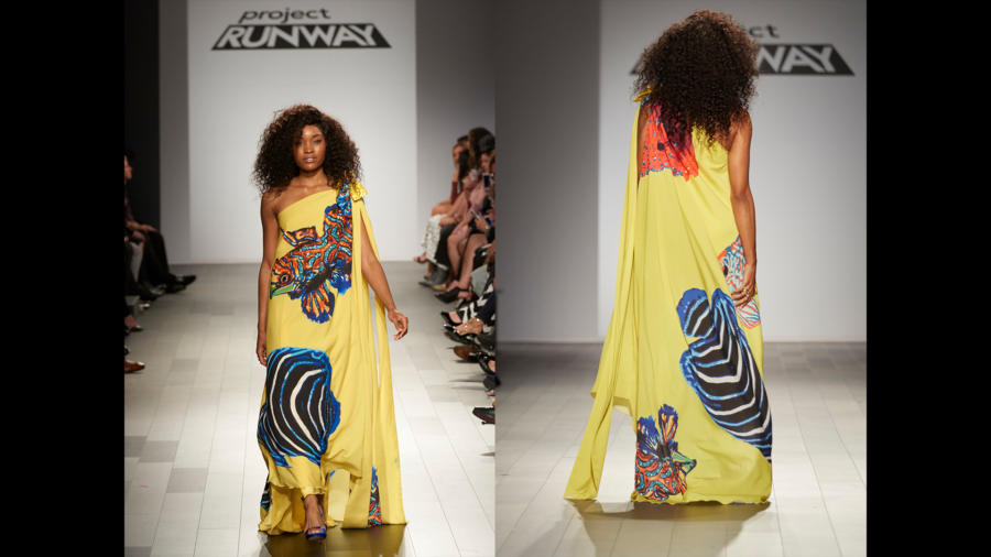
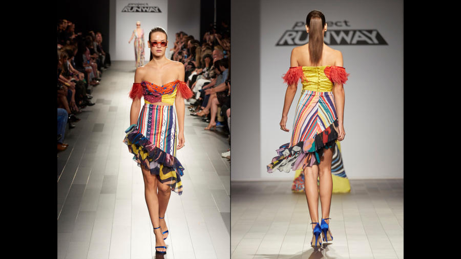
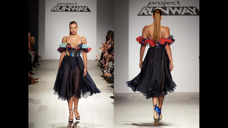
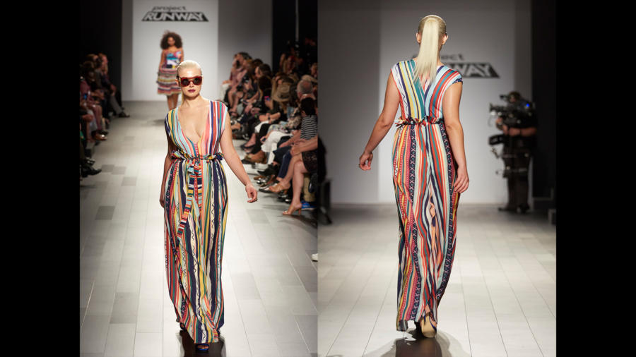
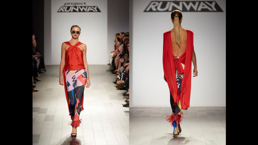
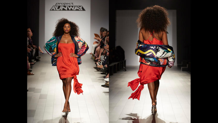
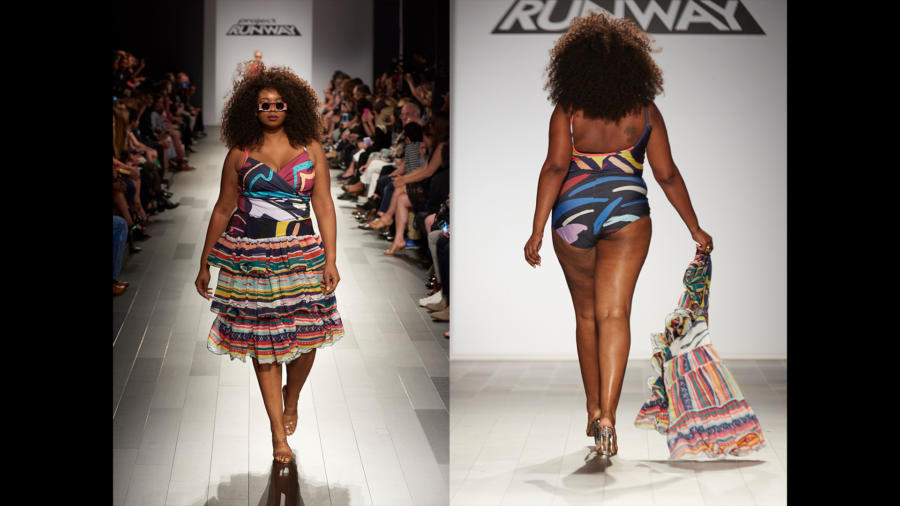
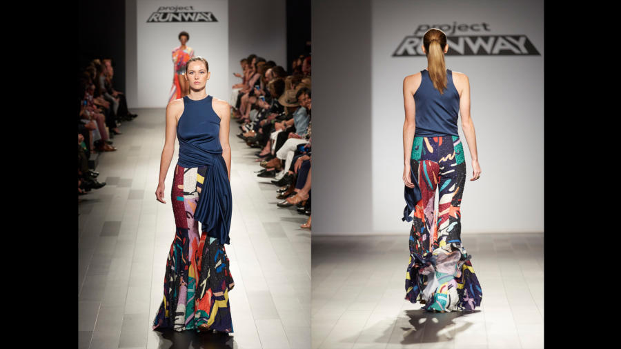
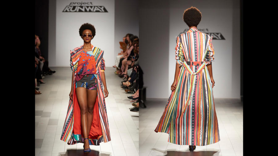
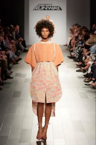
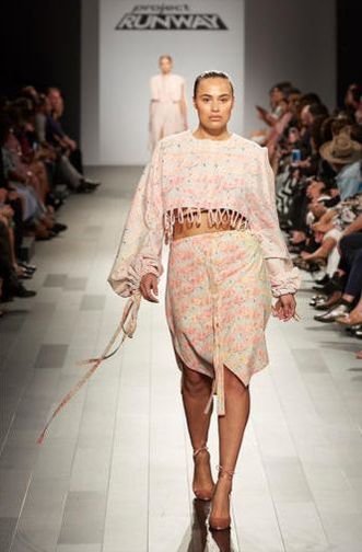
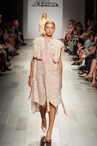
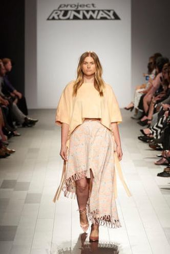
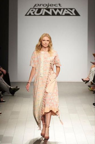
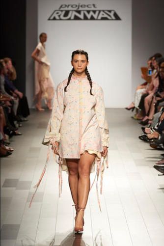
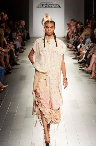
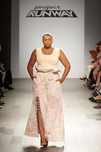
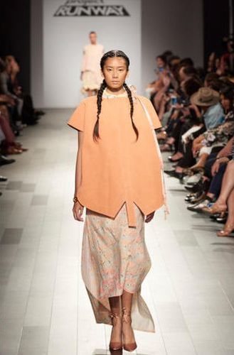
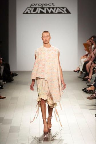
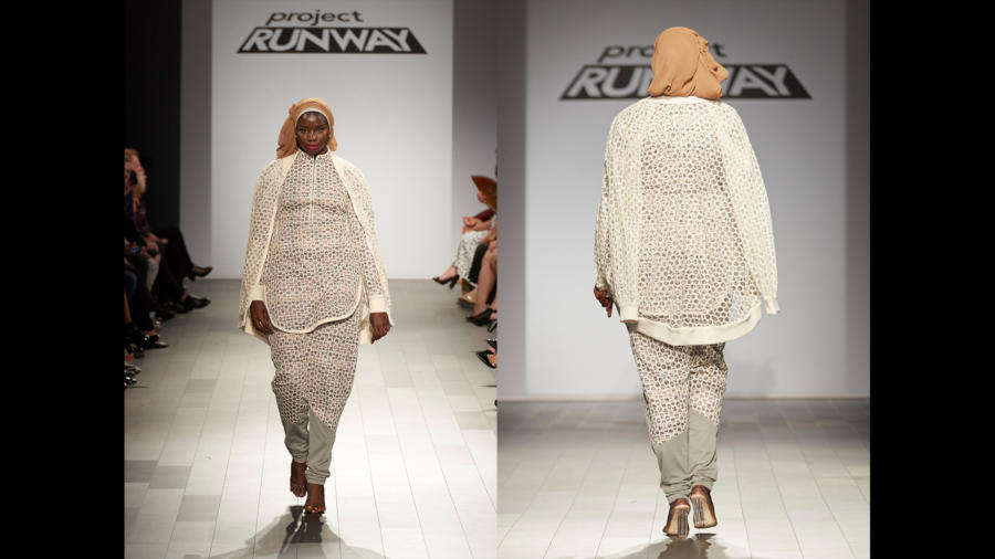
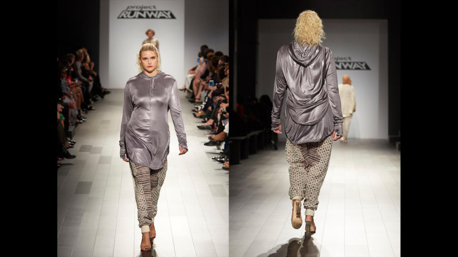
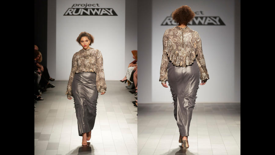
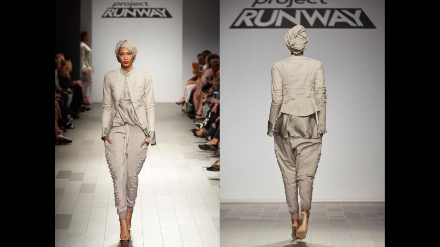
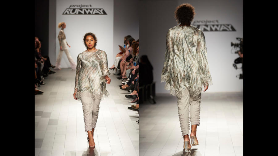
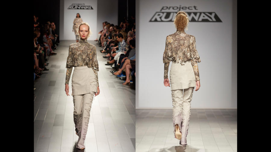
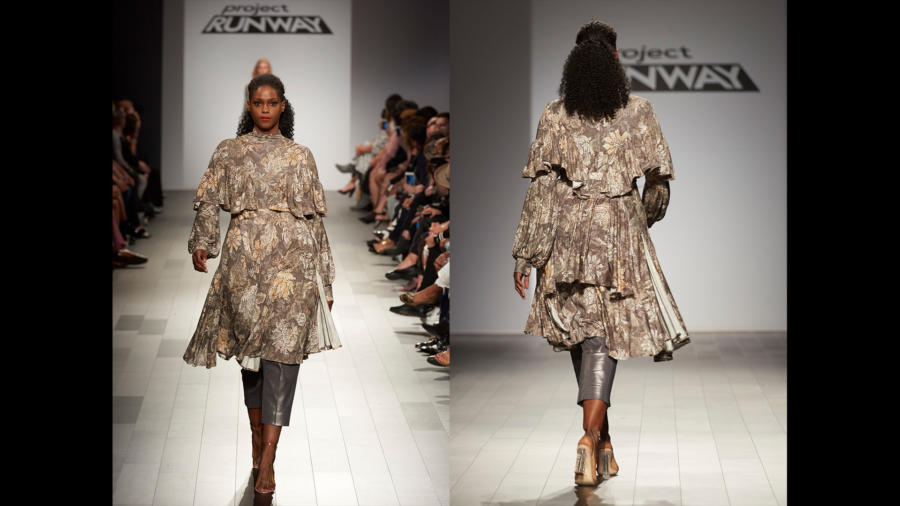
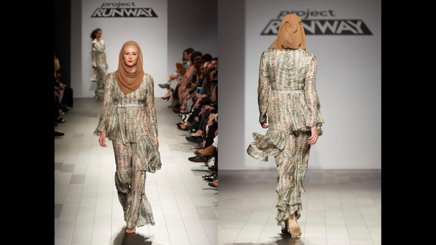
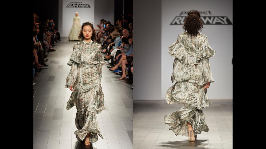
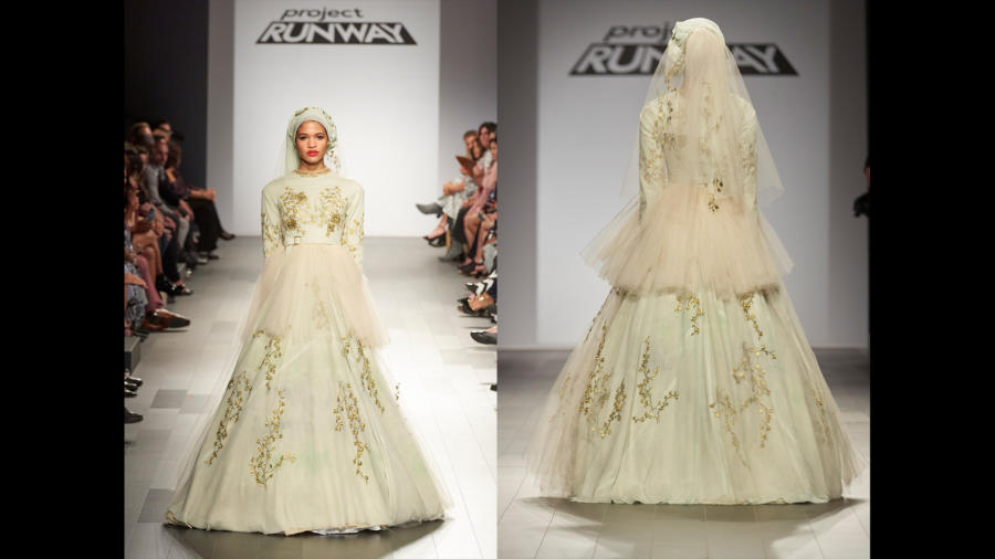
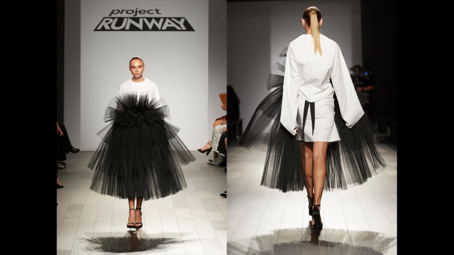
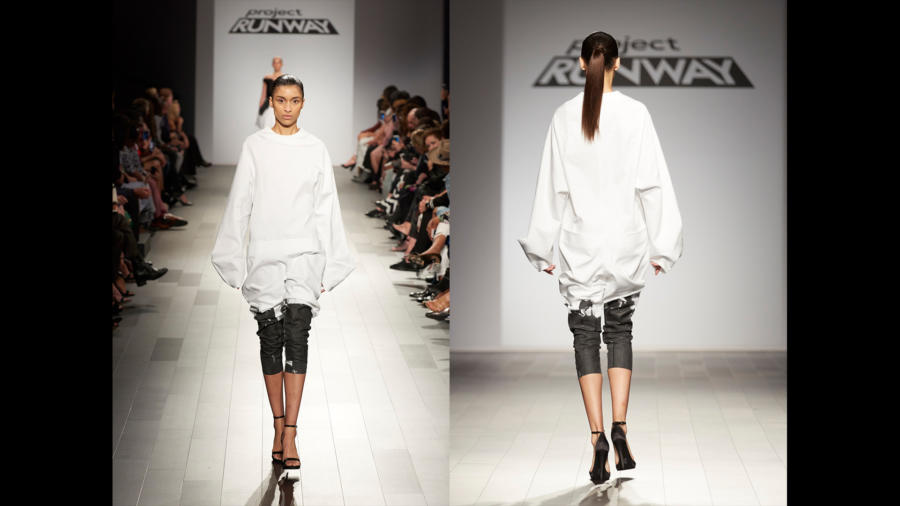
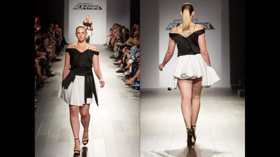
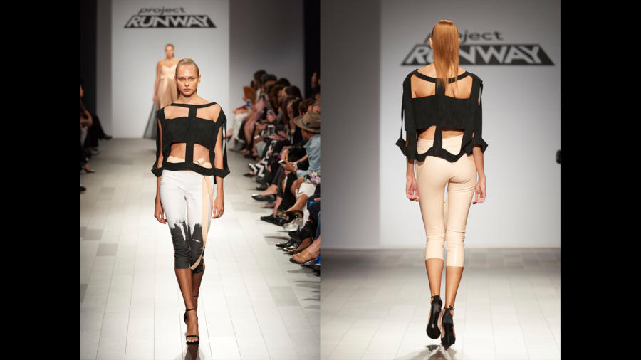
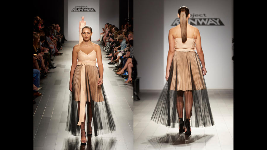
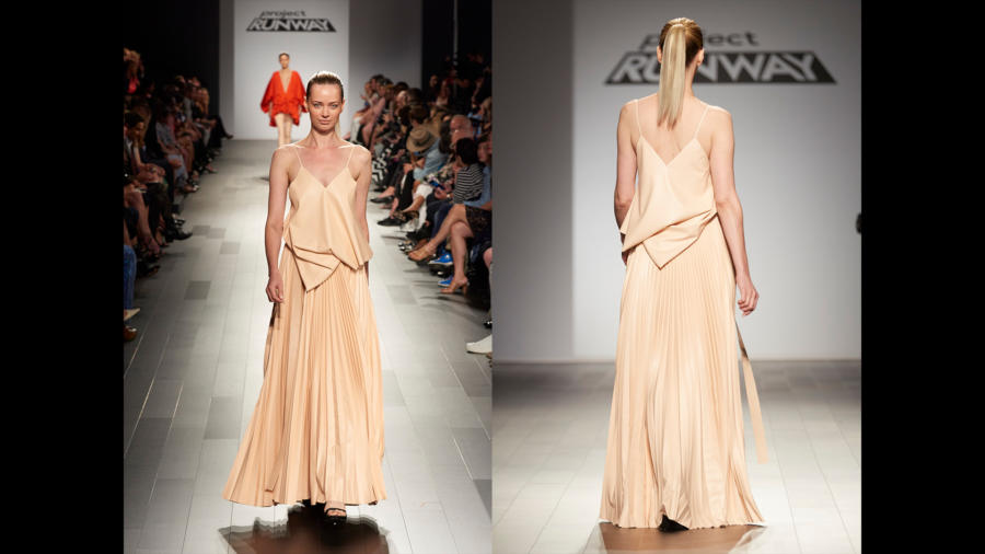
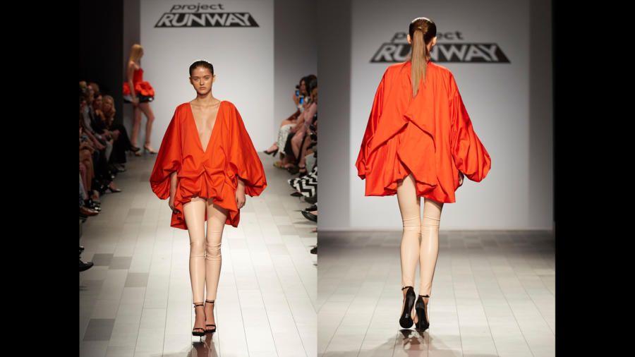
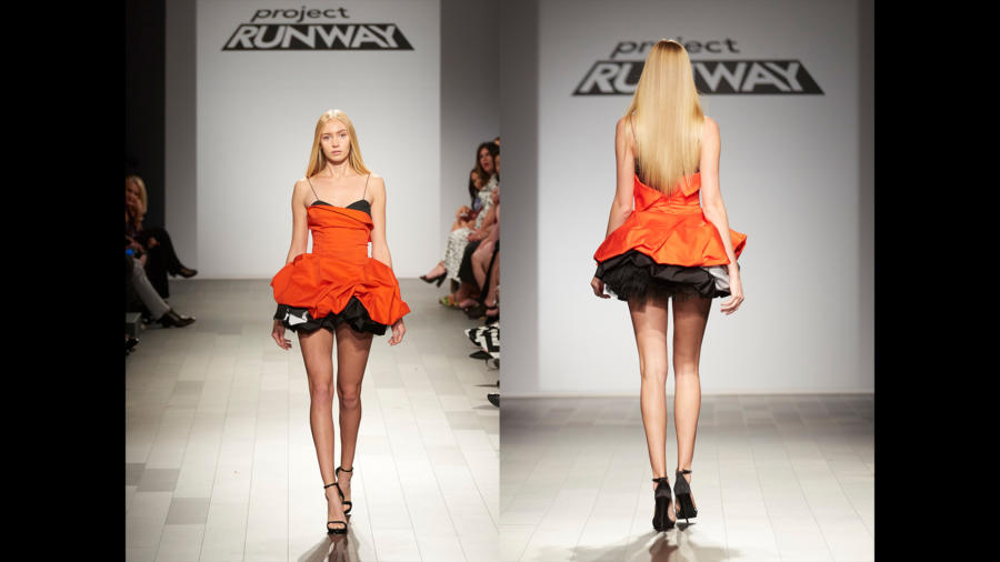
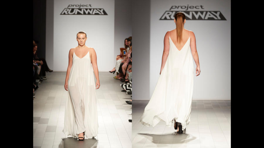
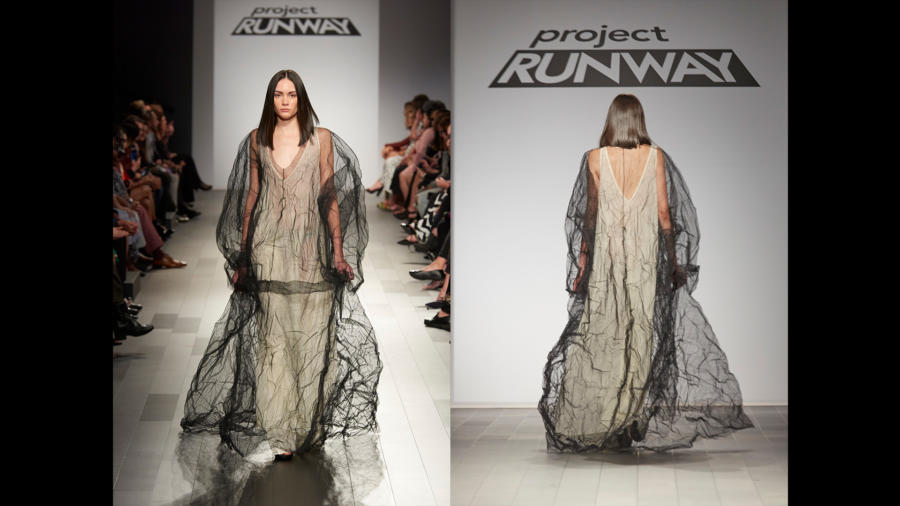
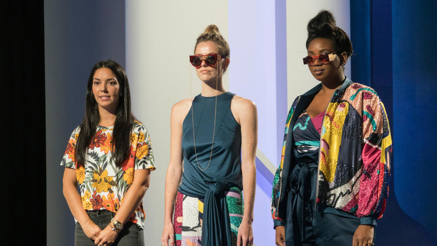
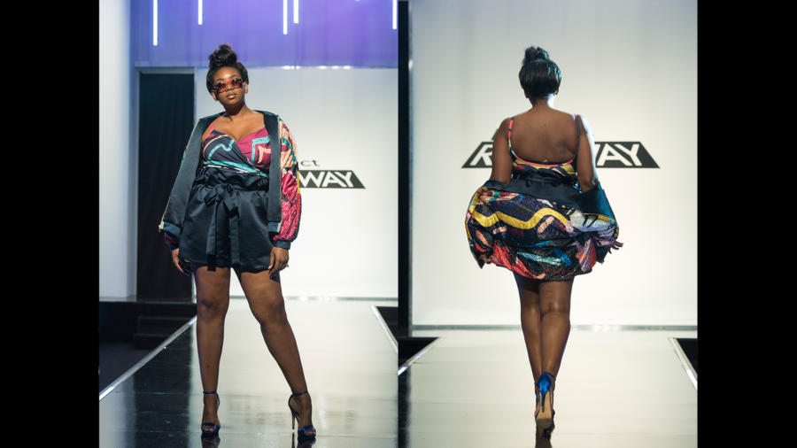
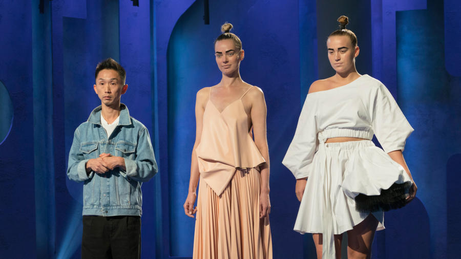
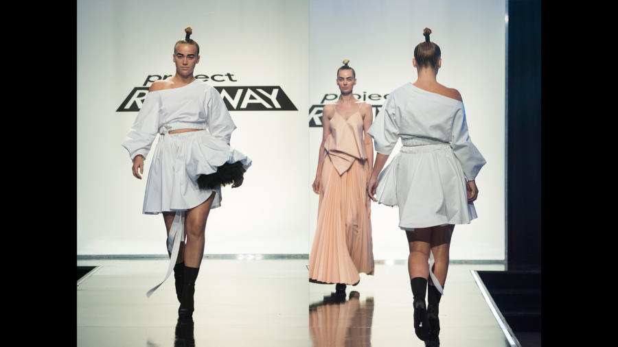
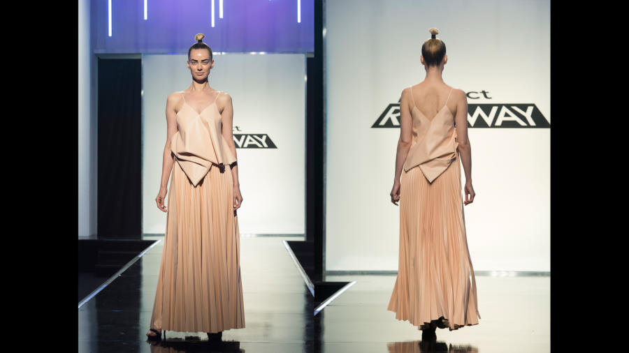
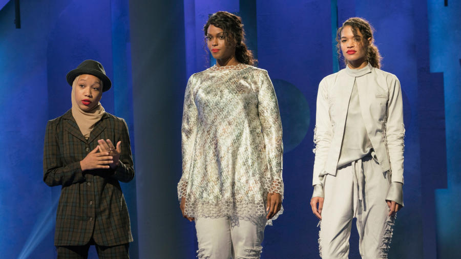
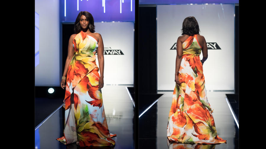
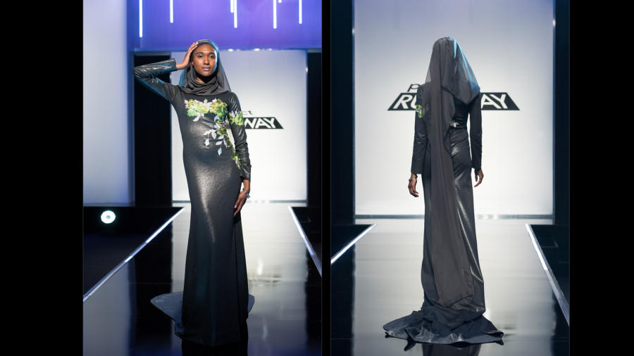
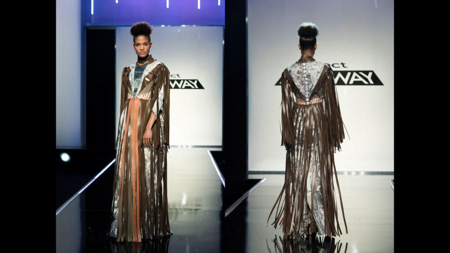
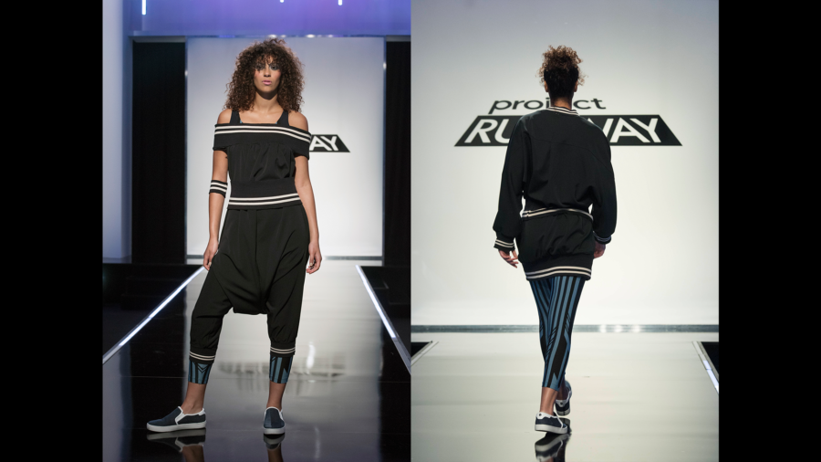
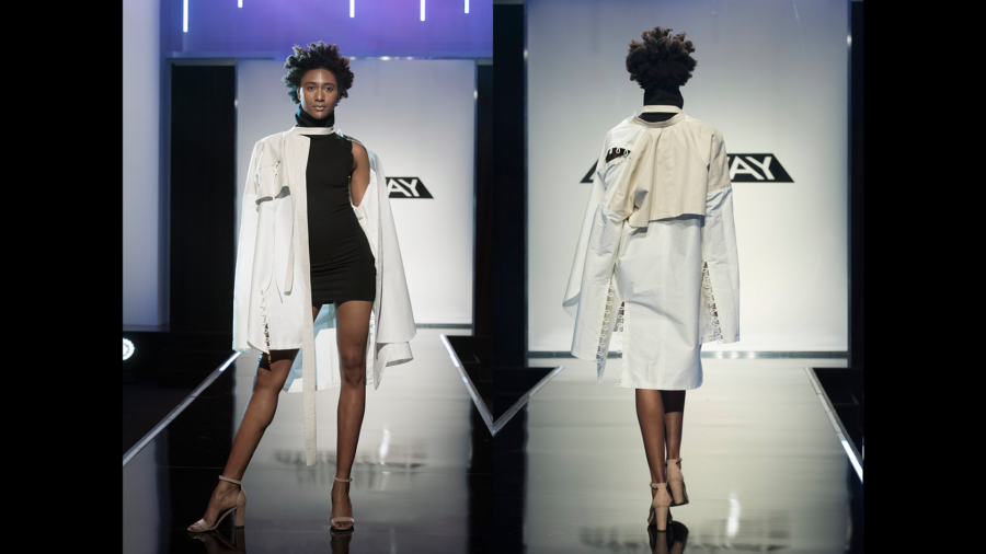
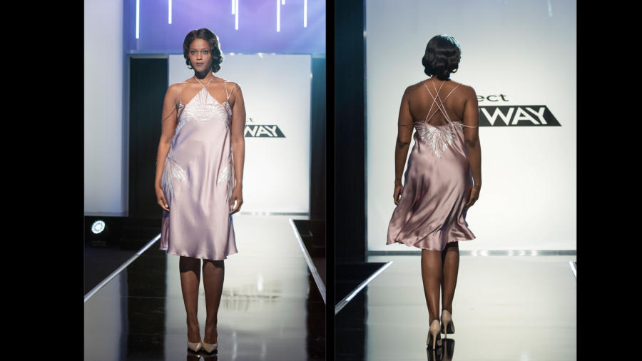
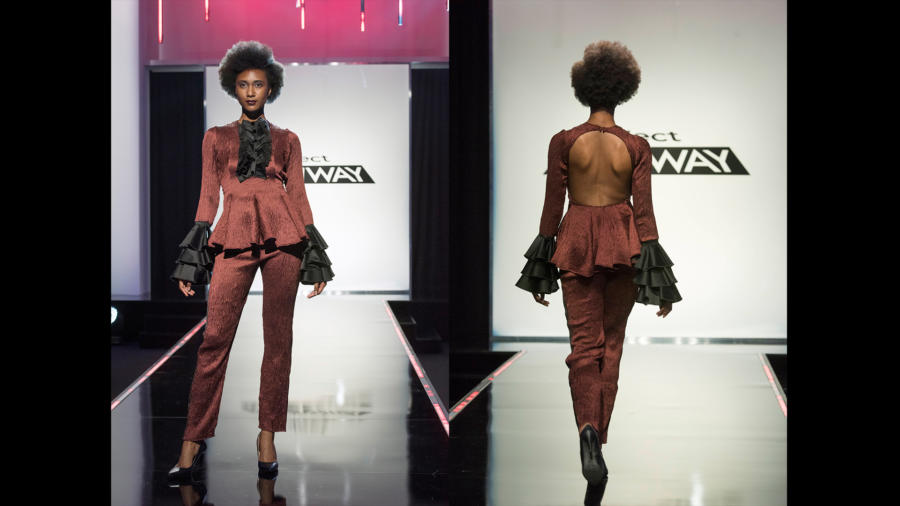
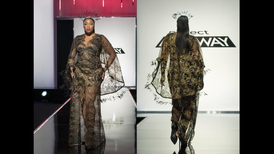
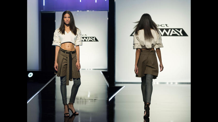
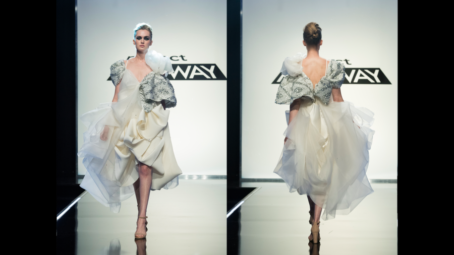
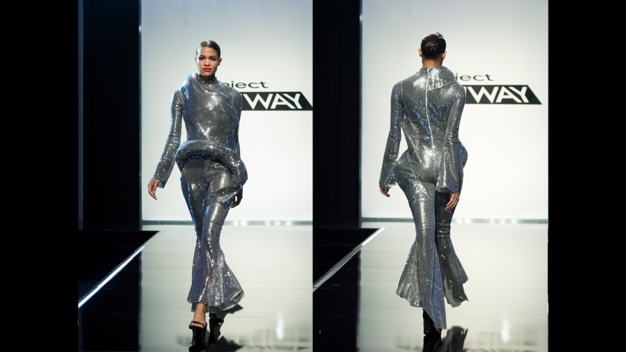
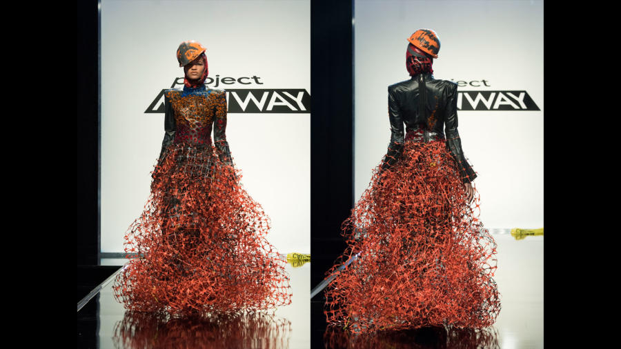
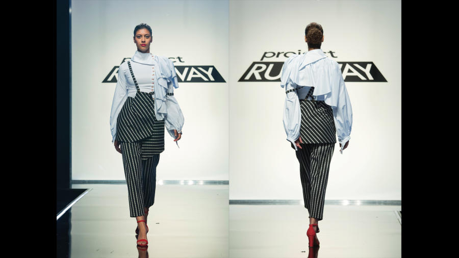
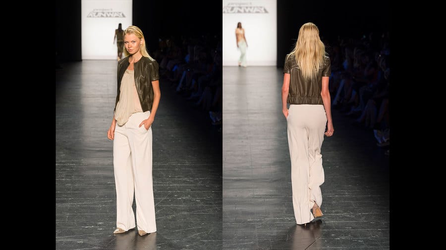
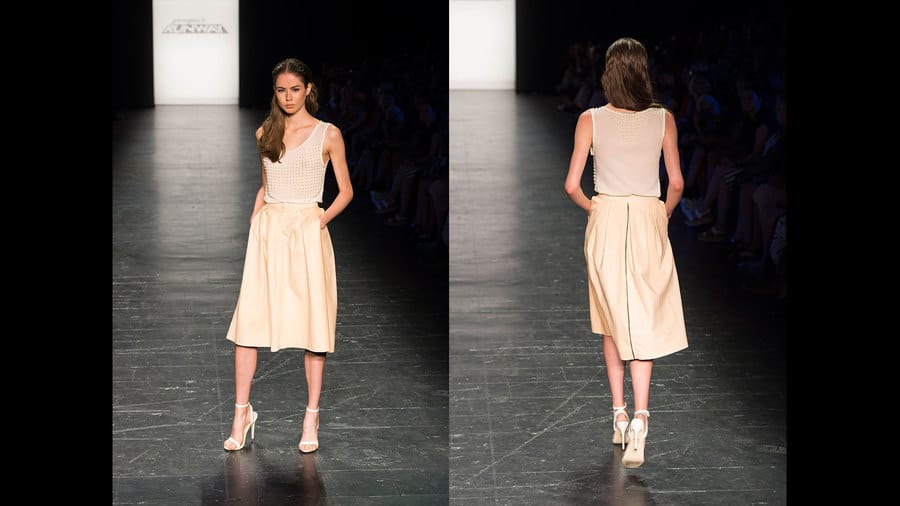
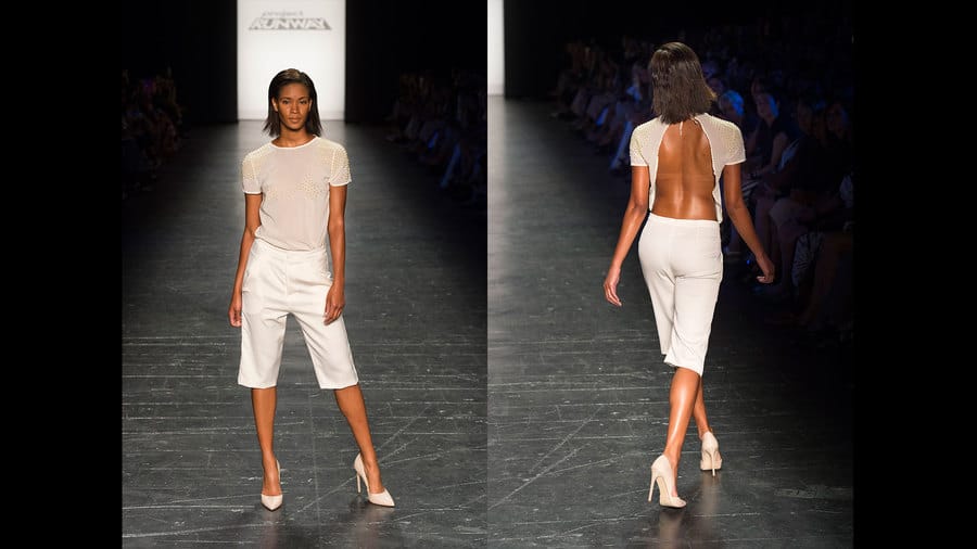
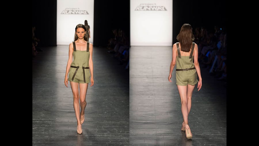
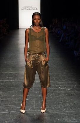
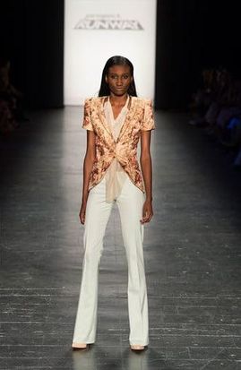
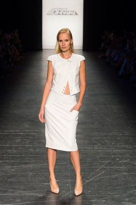
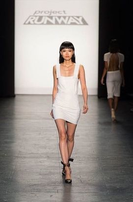
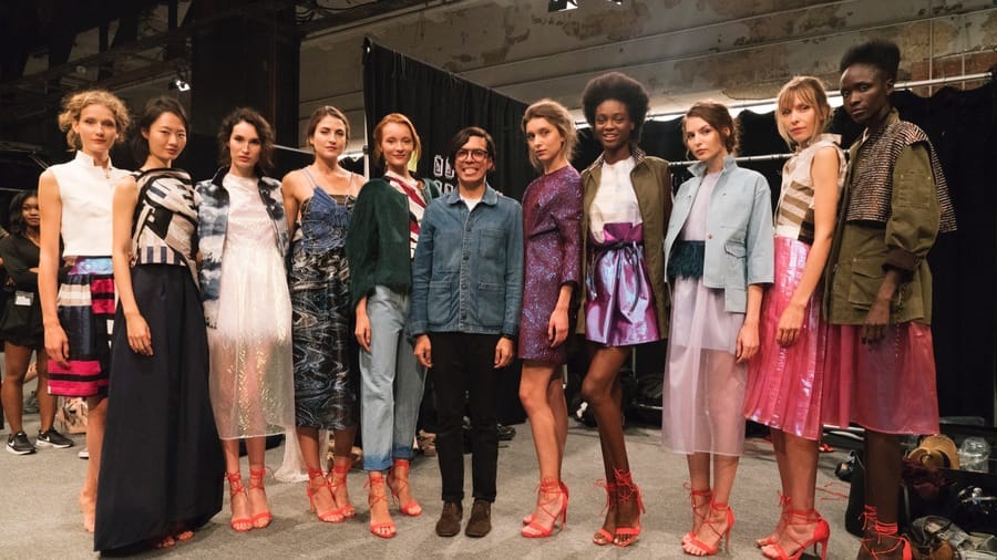
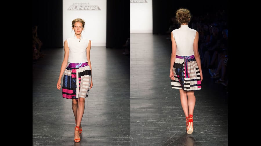
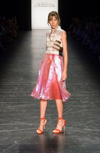
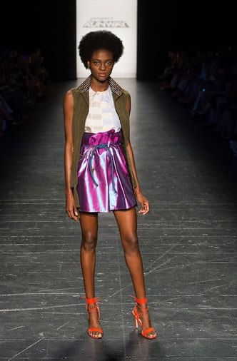
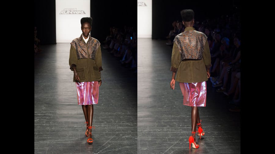
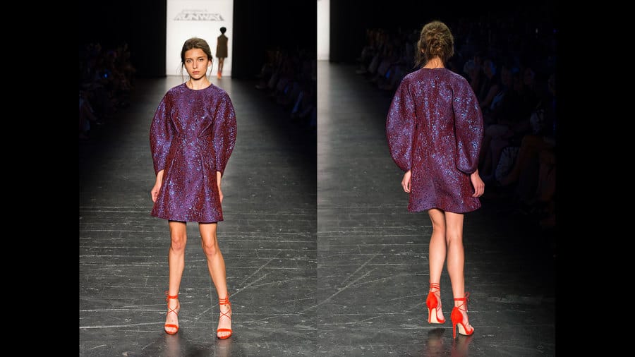
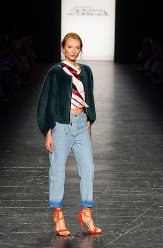
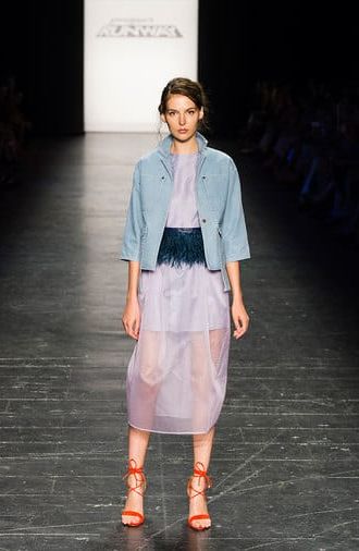
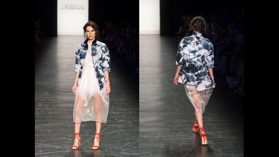
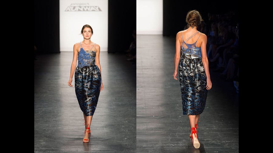
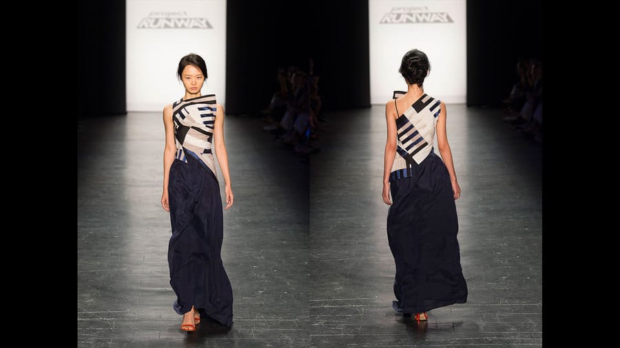
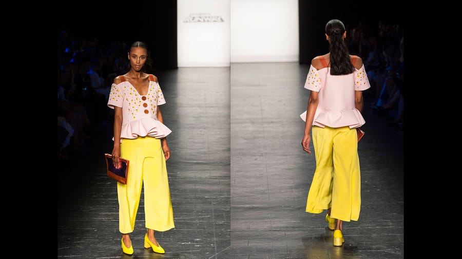
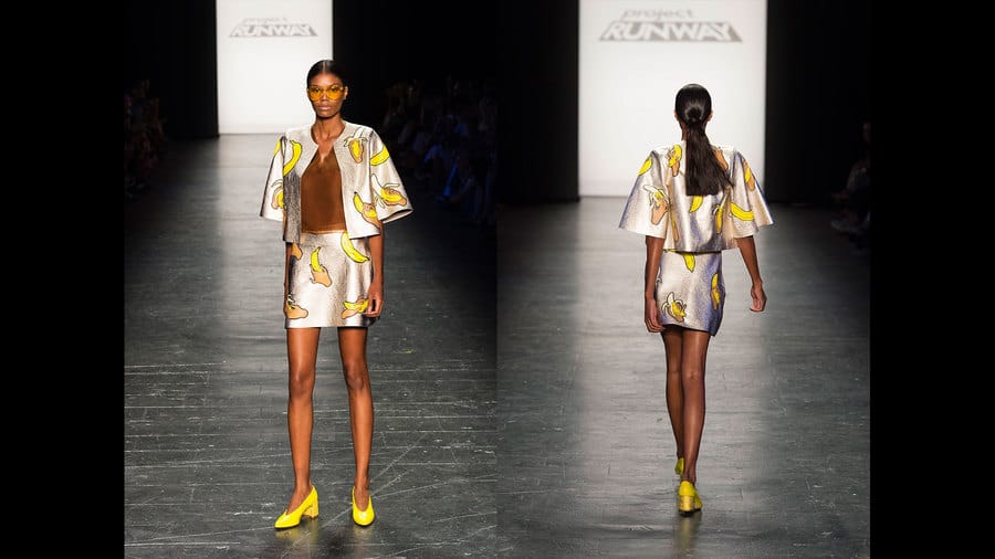
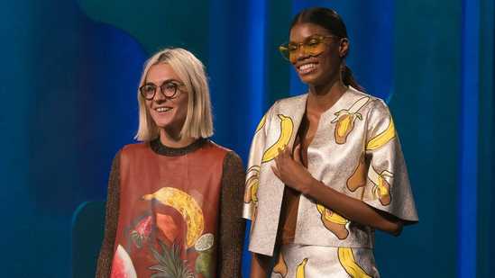
This was definitely a Runway to remember and not remotely what anyone expected. Twitter was going insane during the show, and I'm not sure anyone could agree on who they liked best or who they thought should win, but everyone definitely had an opinion and if will definitely be a season to remember. I was sorry that Margarita was eliminated first because I really loved her collection. The judges were skeptical about her resort-wear aesthetic and just didn't love it in the end, but I firmly believe she has a clientele that and she has the talent to thrive. Her first few looks featured an abstract tropical fish print, which could have gone crazy really quickly, but the ease of her shapes toned the looks down just enough to still be wearable, and the beadwork is phenomenal. The looks that I think ended up being Margarita's downfall were the overtly Puerto Rican designs. They looked a little too "West Side Story" salsa dance-ey, and while there is definitely a market for them they didn't exactly fit the vibe of the rest of the collection. Margarita's striped jumpsuit hit all the right notes for me. The stripe print made the model look like a tall glass of water, and the waist detailing was intricate and flattering. Anthropologie could sell a hundred of these tomorrow. The red satin pieces were some of my favorites in Margarita's collection. The draping and fabrication was so rich and luxurious, and she kept them within her island aesthetic by pairing them with her wacky print. I'm thrilled that she paired her beaded bomber jacket with a more simply-shaped dress to give it a stand-out moment. Margarita's model Jasmine owned the entire season with her BOOM BOOM POW skirt reveal. The entire fashion industry has not seen a plus model strut her stuff in a swimsuit with this level of energy, and I lost my mind watching it. It was a fashion moment we'll never forget. The last two looks were the epitome of how to end a fashion show. Give them color, give them pattern, and give them drama. Regardless of being eliminated, Margarita can be very proud of what she showed. She made her mark and I think we'll hear a lot more from her. As I suspected after his preview, Brandon's collection was a whole lot of the same. I feel bad because he was so devastated to be sent home, but in comparison to the other designers he just didn't make par. They are all very Brandon, all very cool, and there is definitely a market for his clothes, but in the context of a fashion show, they fell flat coming out one right after the other. I don't even have commentary on his outfits because none of them stand out for me...so...here they are? I'm sure Brandon has a great future in fashion ahead of him. After all, he's only 23, and because he made such a mark throughout the season he should have no trouble finding success. Ayana had the most potential to win going into the finale process, but I was definitely nervous for her after her preview. In the end, I think she pulled off some fantastic work, but she was stuck with several mini-collections that didn't vibe well together for my personal taste. She started off with several sportswear looks. The white textured fabric was cool, but the silver metallic was clingy in all the wrong places for her models, and they just didn't fit with the luxury details of the rest of her collection. The next few pieces, which Ayana previewed for the judges, were definitely the most successful. The frayed material and tone-on-tone fabrics were textured, layered, and interesting. Once this muddy floral became a key player in the collection, I started to get mixed feelings. I liked it in combination with the light textured skirt-over-pants, but then she brought back the shiny silver and it just didn't make sense to me. The ruffles were a little too 70's inspired for my taste and they didn't seem to make sense with the rest of the collection. Then Ayana came out with these silky, layered looks that reminded me of 1920's Hollywood leisure looks. Don't get me wrong, they were beautiful, and the layers flowed and flipped down the runway like nothing I've ever seen, but they gave me the impression that Ayana didn't really know what girl she was trying to sell to or what story she was trying to tell. But alas, all was forgiven with this finale look. I mean...holy crap. This is one of the most stunning gowns I've ever seen, not just on Runway, but in my life. The way Ayana manipulated the veil is incredible, and this look will go down in Project Runway history. In the end, Ayana just wanted to show too much and her collection was unfocused. That said, her talent is unmistakable, and her portrayal of a modest aesthetic in a cool, contemporary way has put her on the map. After the judges' preview, Kentaro was so sure he was going to lose that he felt free to do whatever he wanted. This definitely worked to his advantage, and it's clear that when he loosens up and steps outside his box, magic happens. The first few black-and-white looks were intricate and detailed from every angle. I didn't think it was possible to make a white, stiff cotton workable, but somehow the shapes just make sense. The painted details and juxtaposition in fabric lengths were so unique. The transition in the color story was very well done. The cut-out top was fantastic on its own, but to tease with another black-and-white look from the front while turning it into a blush look from the back was brilliant. Kentaro got a lot of flak throughout the season for not creating very flattering looks for curvier models, and I admit that this was not my favorite in his collection. I appreciated that it was a more wearable, ballet-inspired piece, but the fit issues in the bodice were definitely noticeable and it wasn't very successful. I'm willing to forgive the last misstep due to the exquisite beauty in his next lineup of pieces. The blush look he showed in his preview was made even better with some post-preview tailoring and styling edits. The red pieces (and yes, they are red - the photos make them look orange) showcased Kentaro's draping skills and were feminine but daring looks. They were a perfect balance of simplicity and drama. His last two pieces were not quite as interesting - I would have preferred the white slip dress to have been placed earlier in the collection, and the finale piece would have packed more punch with a red-fabric underlay instead of the white. That said, they definitely felt like they were part of the collection and had a soft, delicate flow down the runway. Kentaro was a controversial choice for the win. A lot of people felt that Brandon was robbed given his work throughout the season, and many others thought that Ayana's modest aesthetic deserved to be showcased. Personally, I think Margarita made more leaps and bounds throughout the season and she had the most dramatic collection of the bunch. Each of the designers had completely different aesthetics, so it was really a toss-up as to who the judges would be drawn to. All in all, I can't be mad that Kentaro won. He has a delightful personality, and due to his age it would be more difficult for him to break into the industry without Project Runway's help. I'm proud of how he made it through the ups and downs of the season and stayed true to his vision to the end. Photo credits to www.mylifetime.com
0 Comments
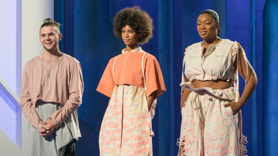
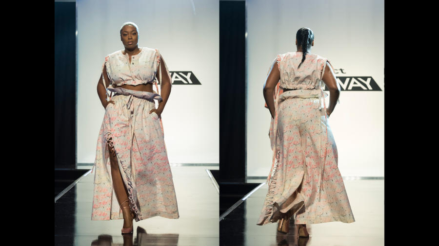
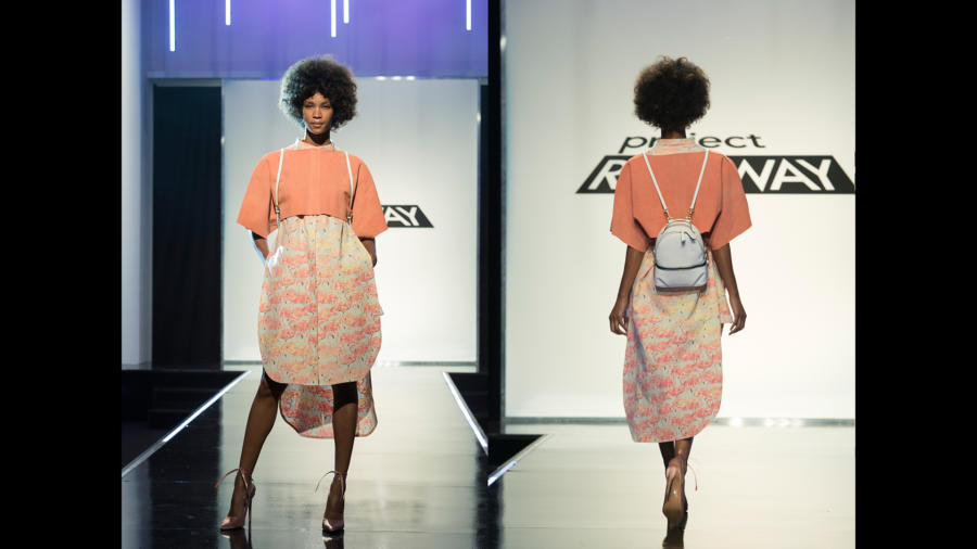
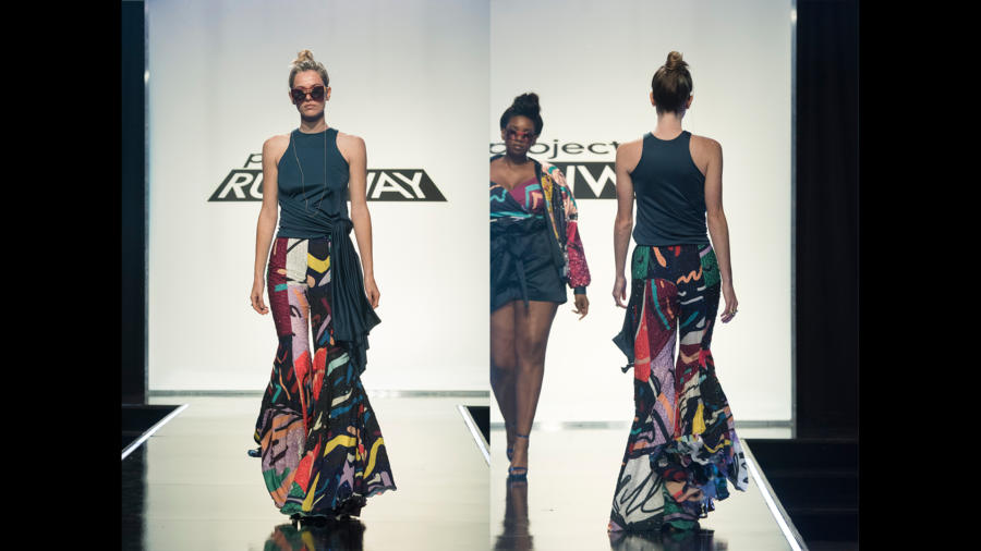
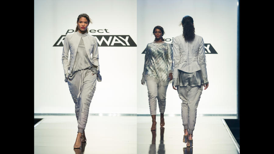
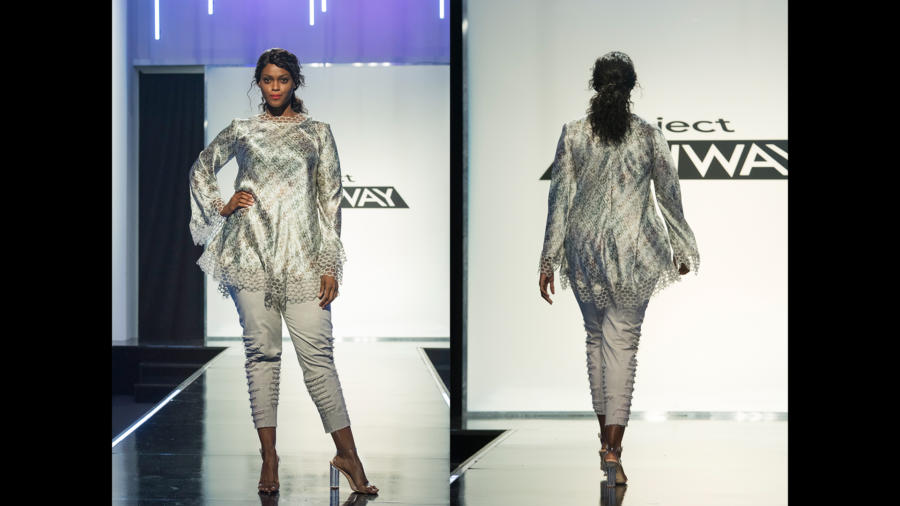
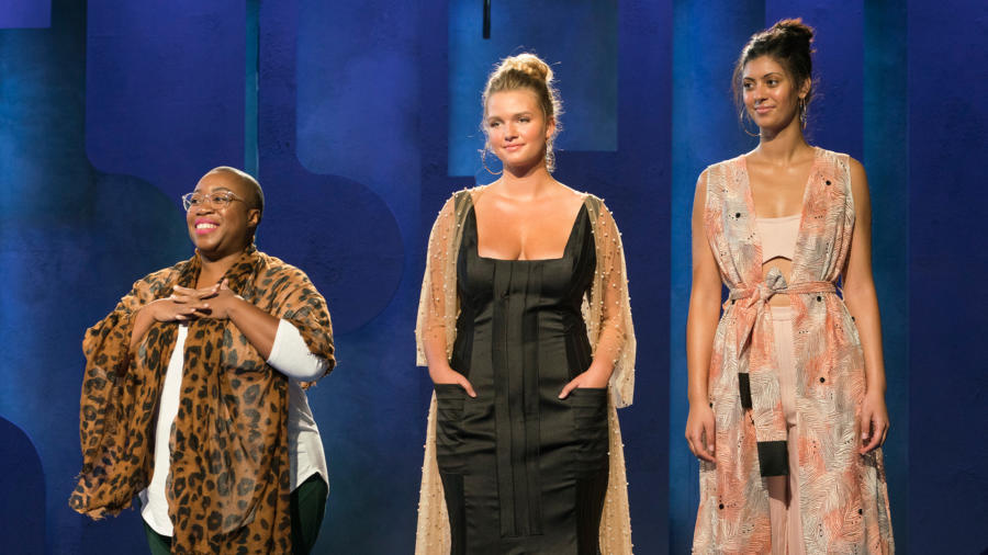
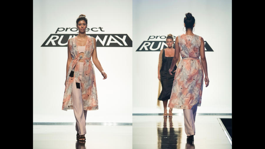
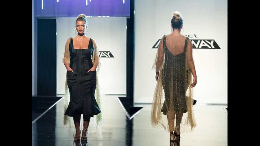
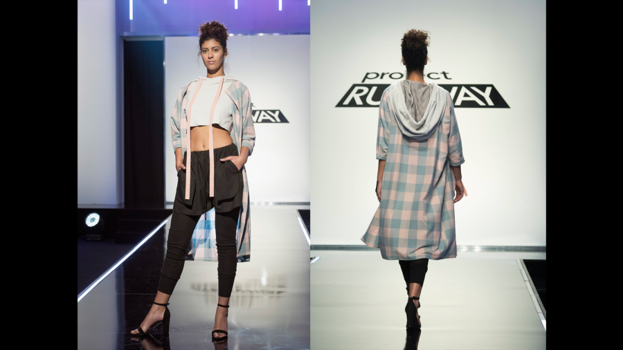
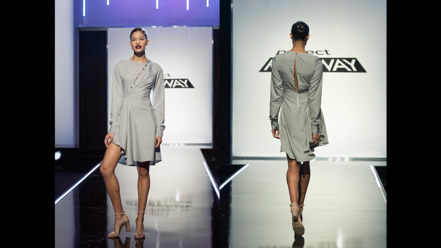
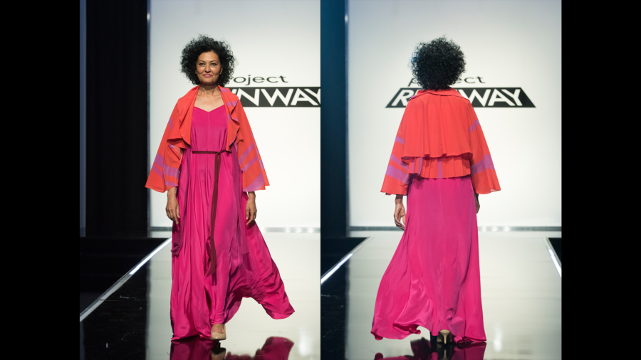
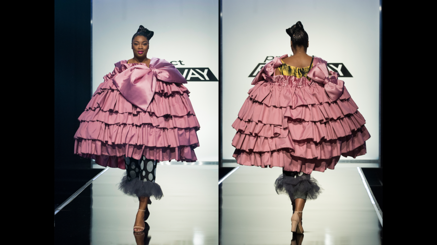
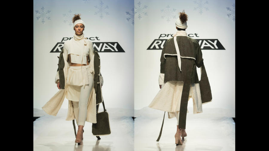
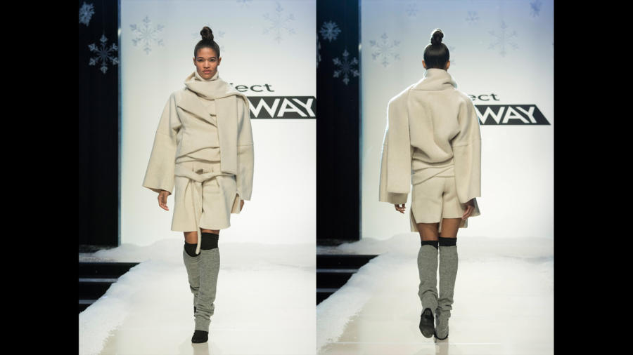
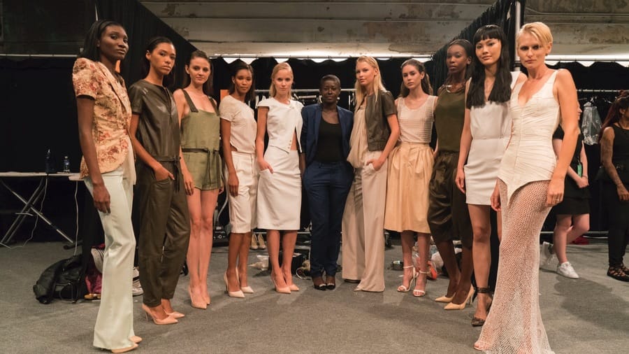
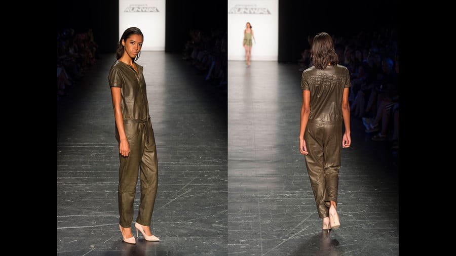
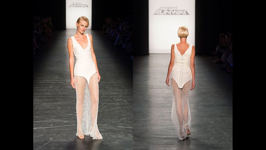
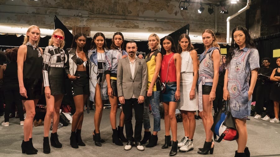
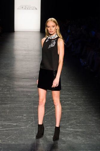
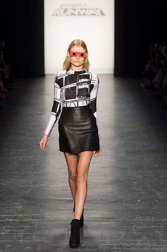
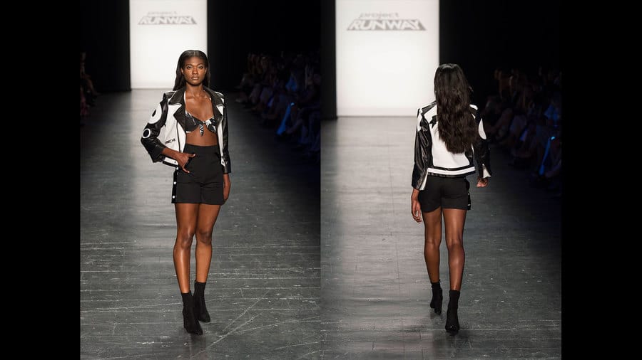
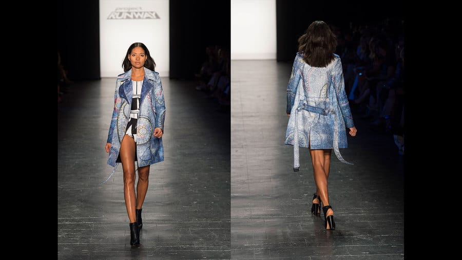
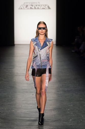
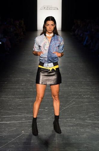
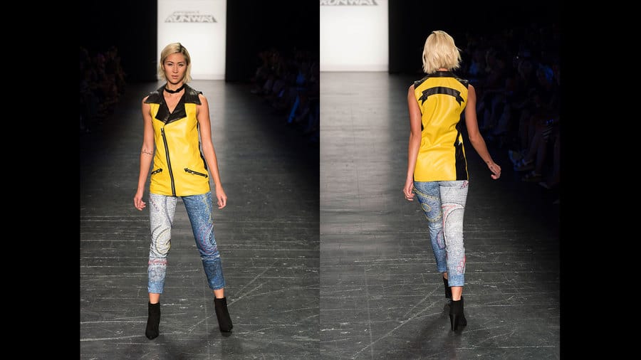
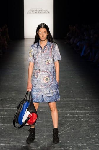
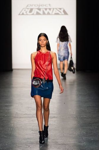
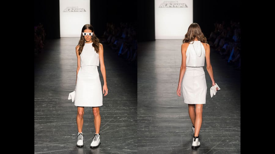
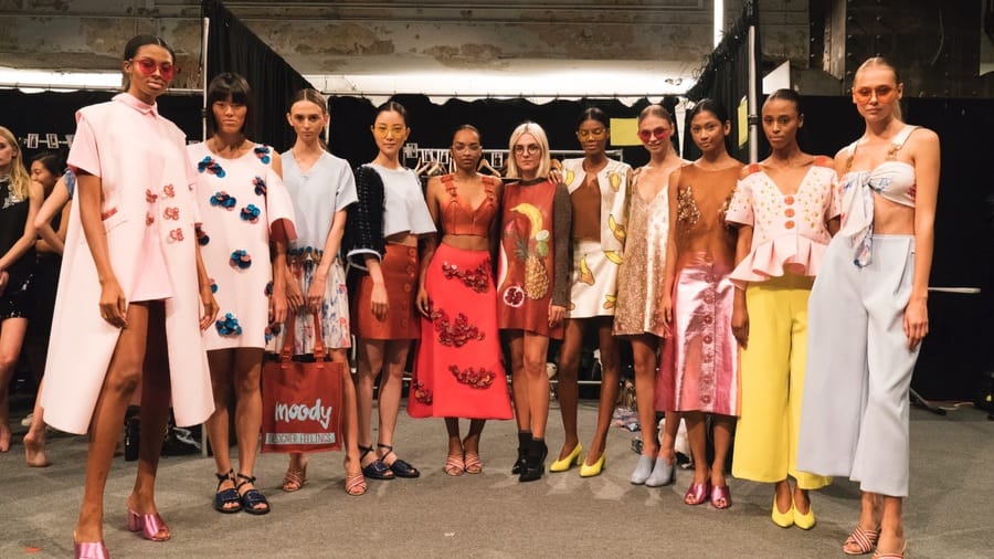
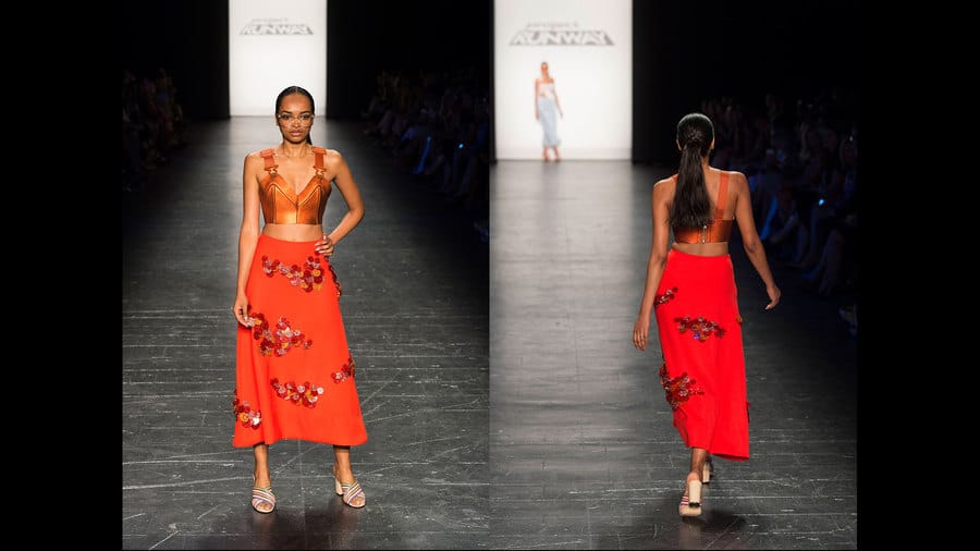
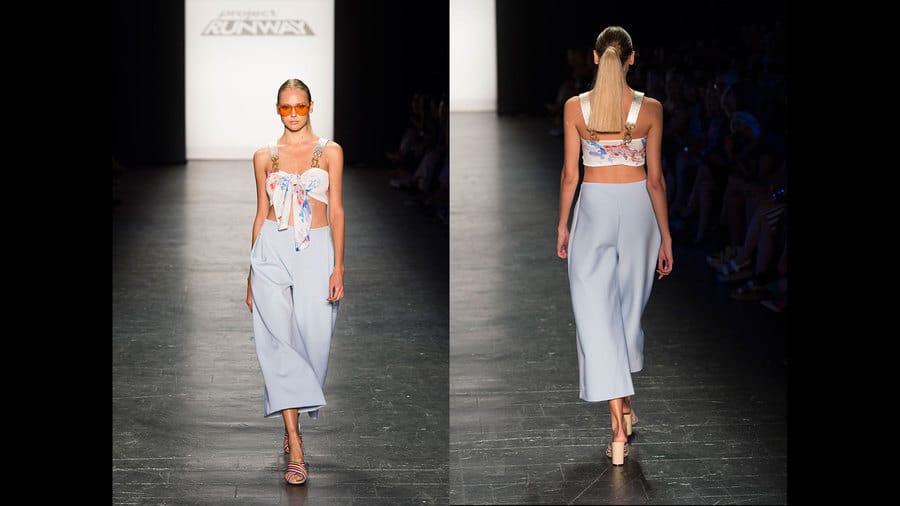
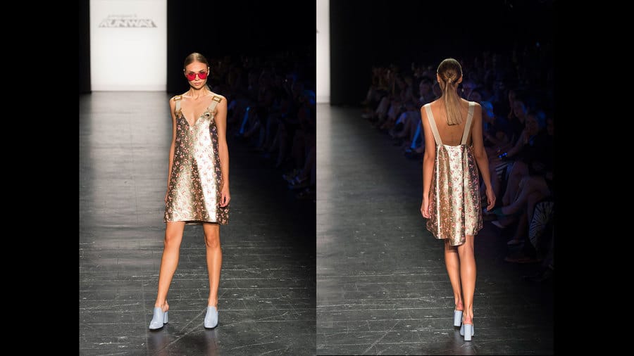
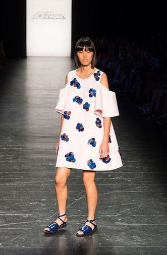
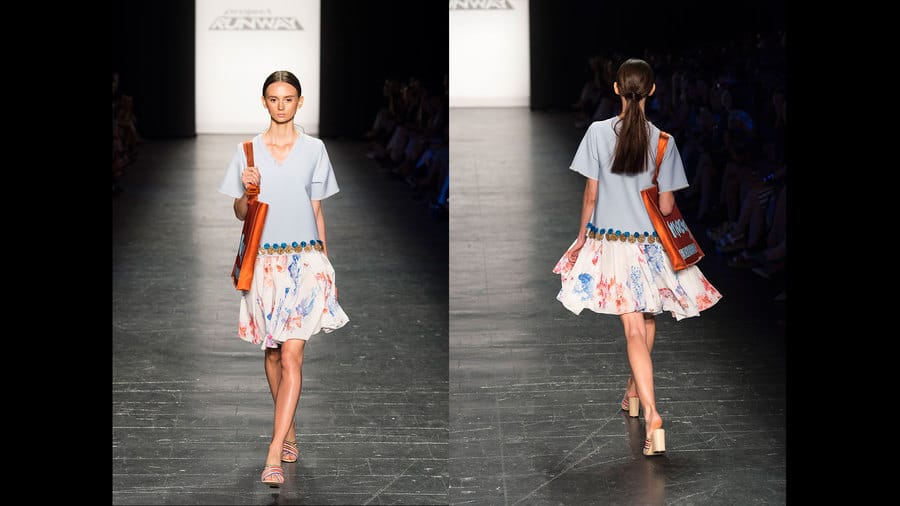
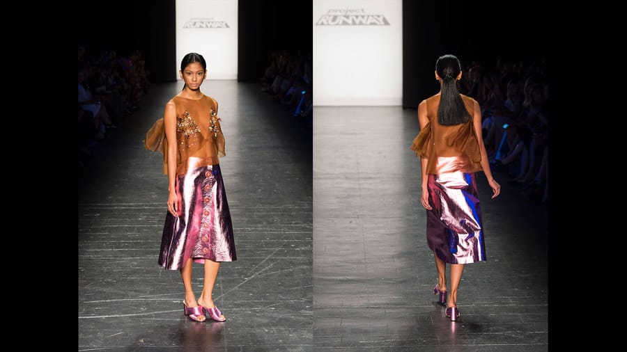
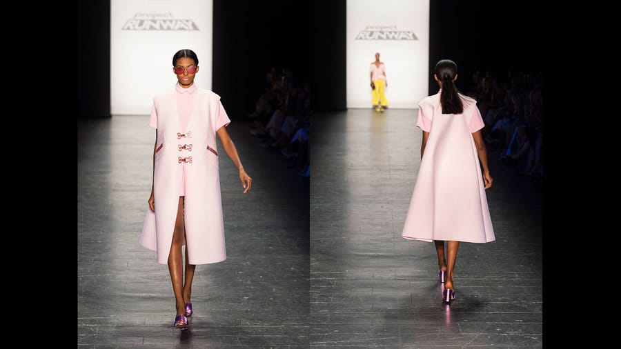
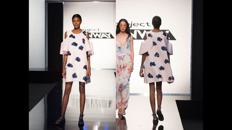
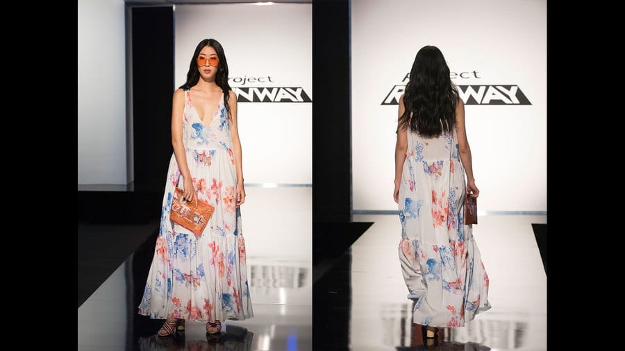
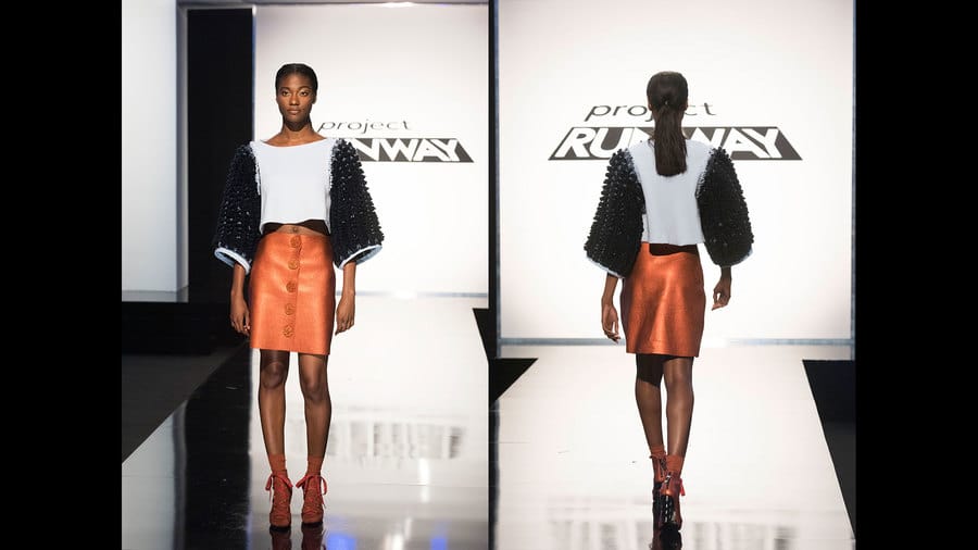
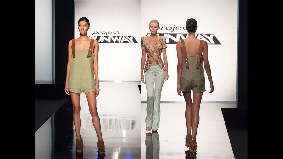
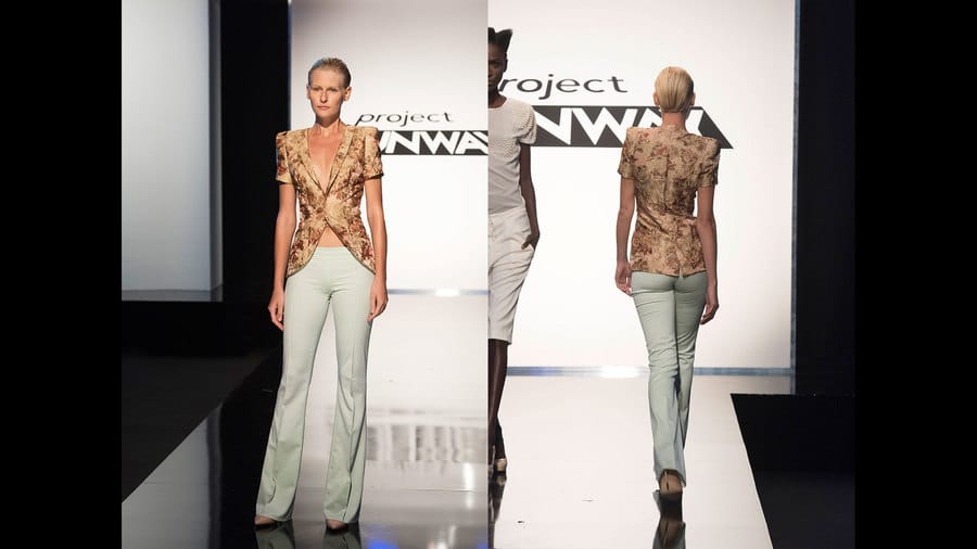
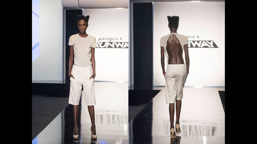
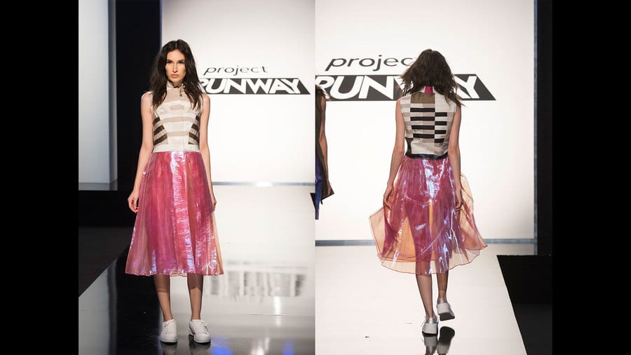
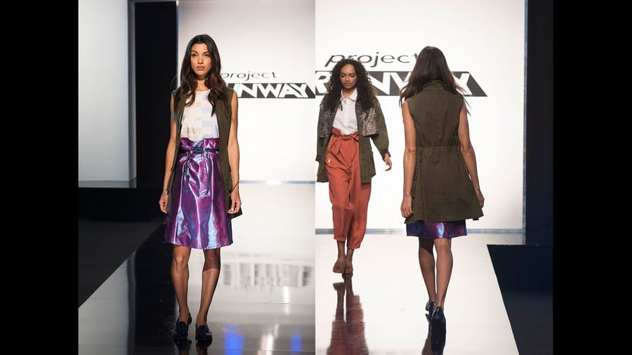
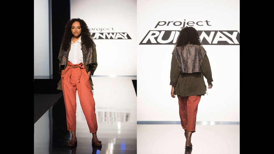
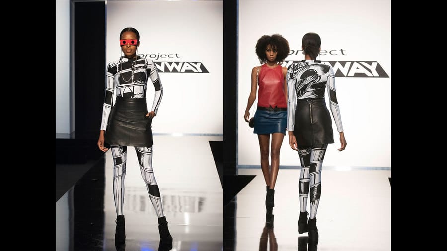
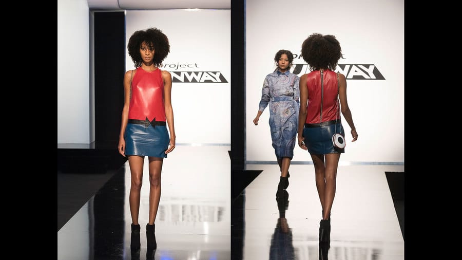
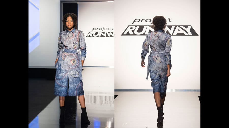
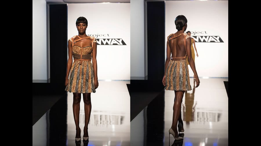
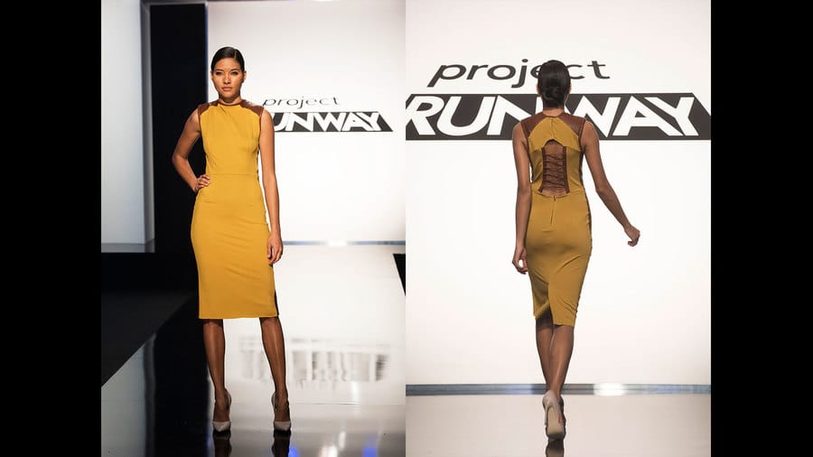
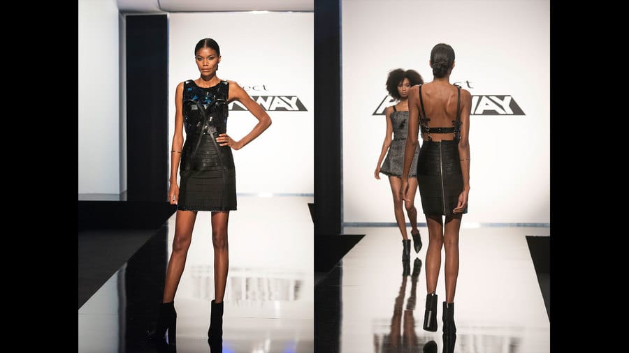
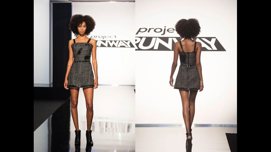
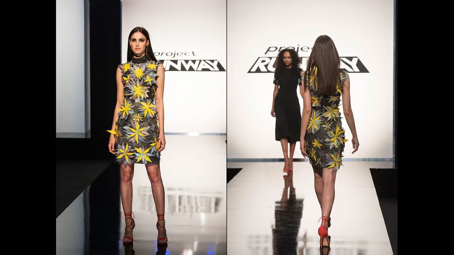
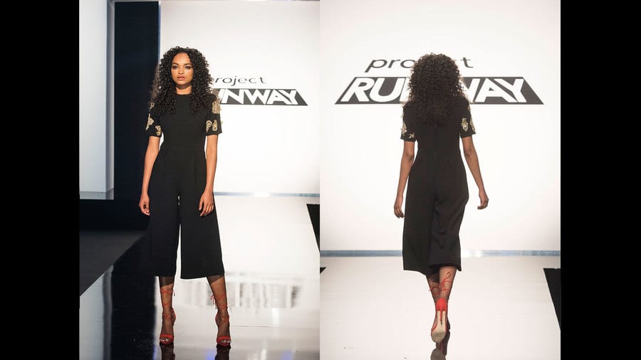
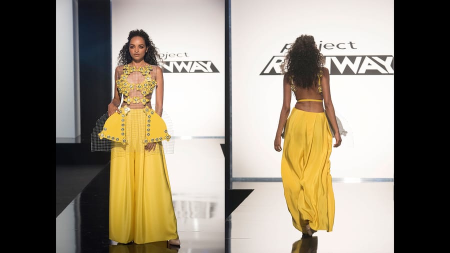
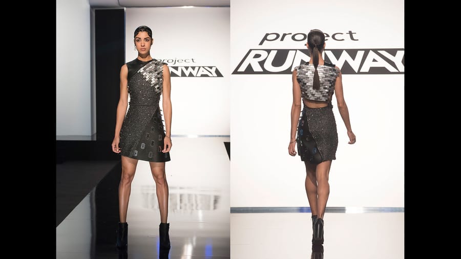
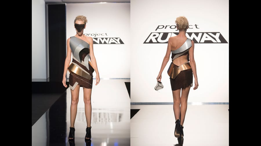
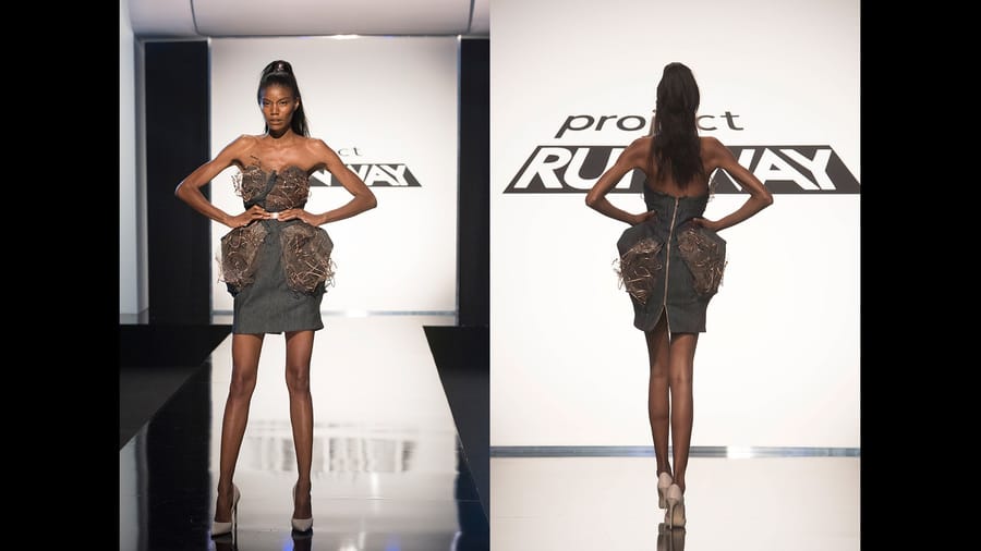
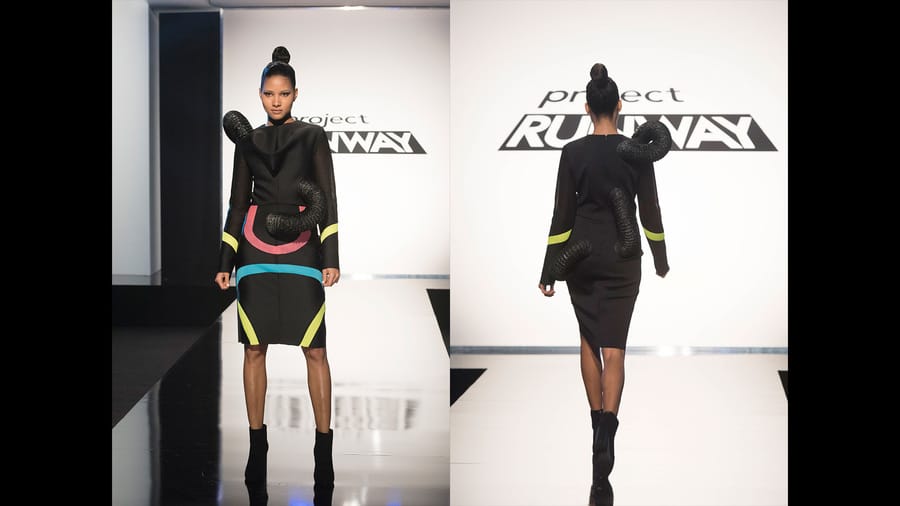
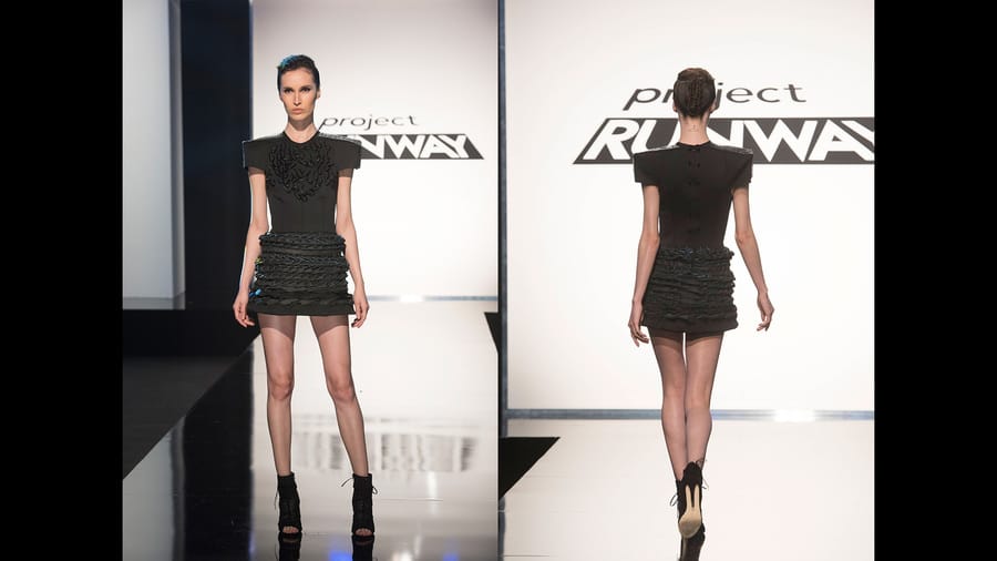
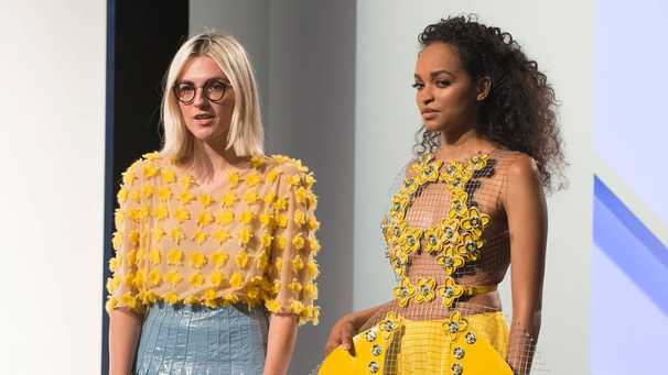
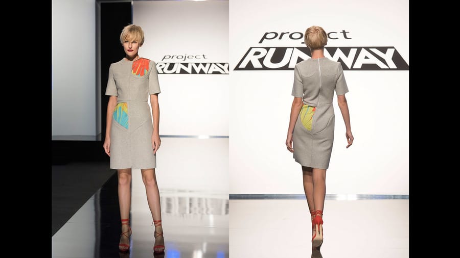
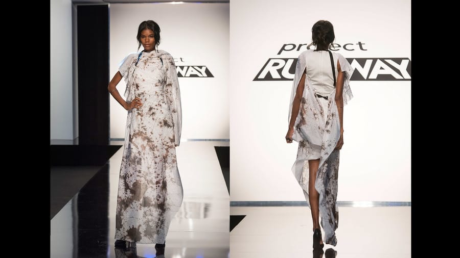
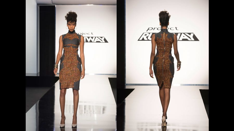
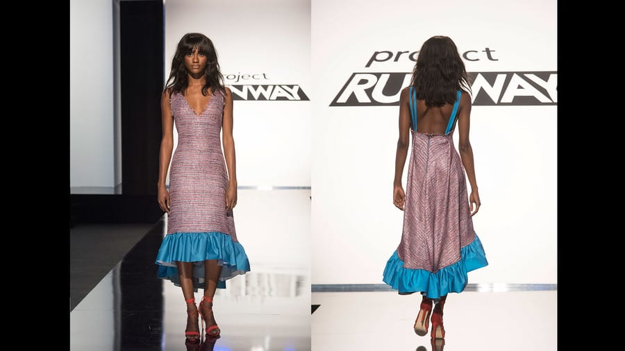
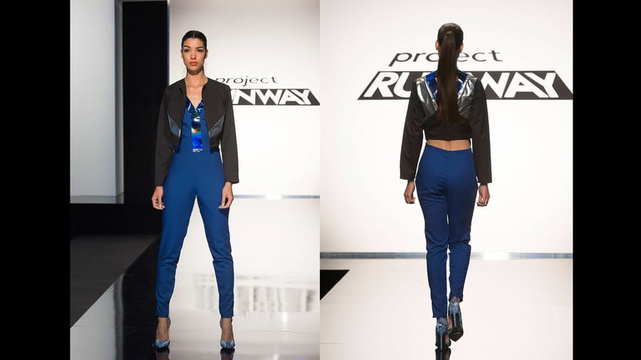
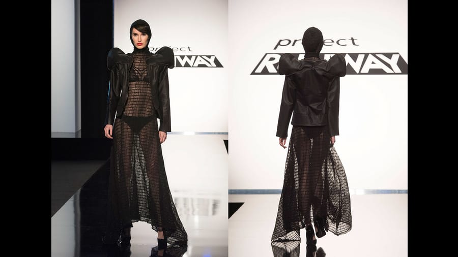
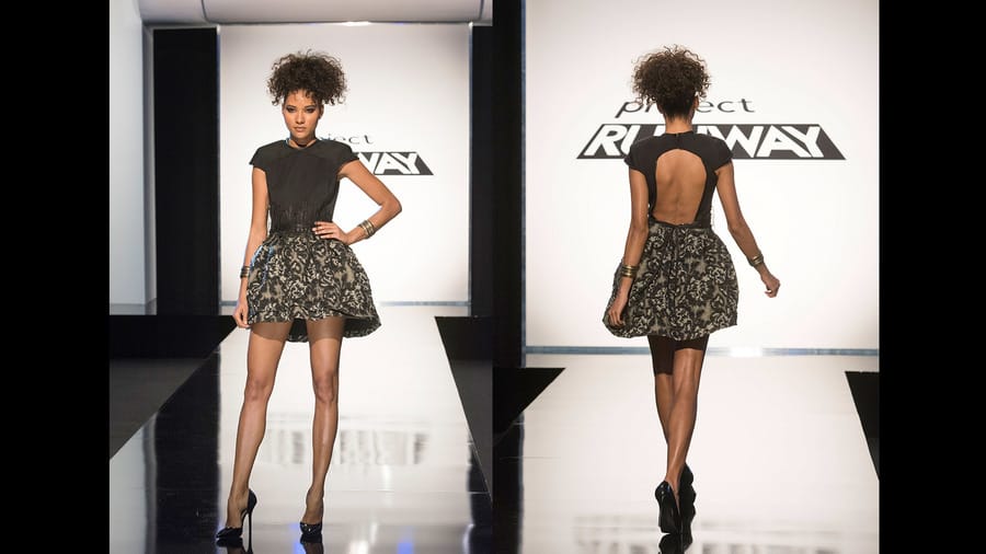
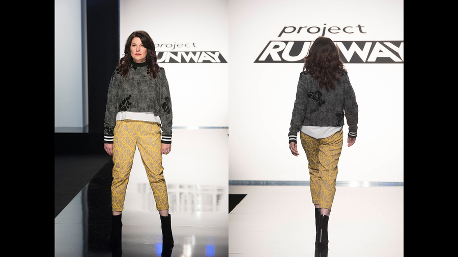
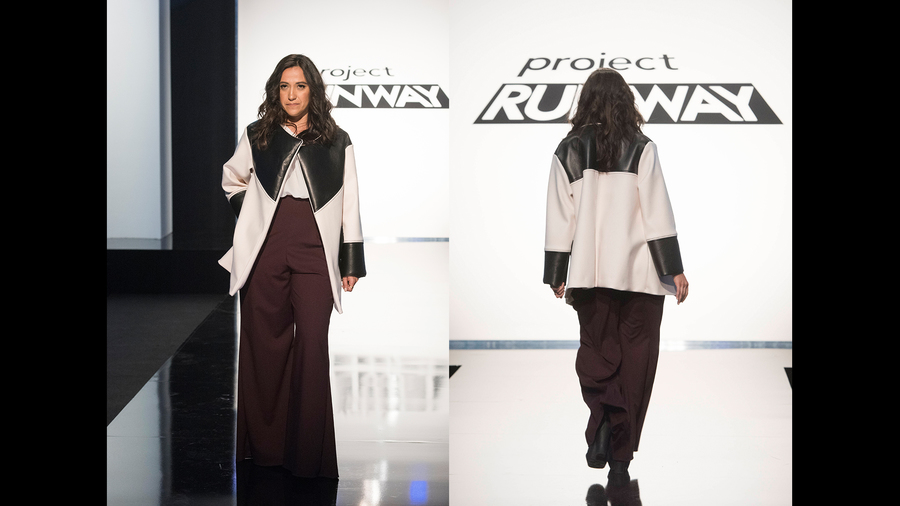
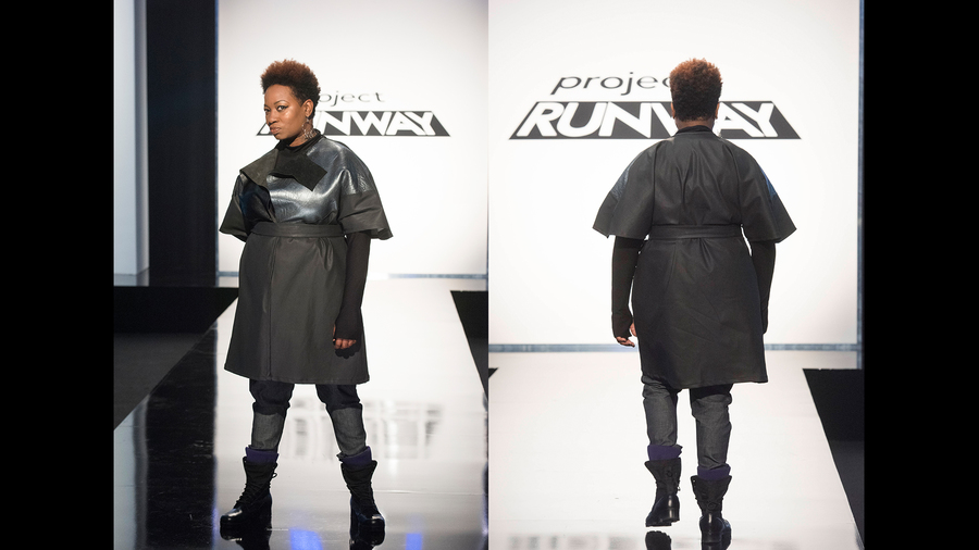
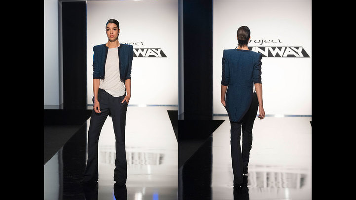
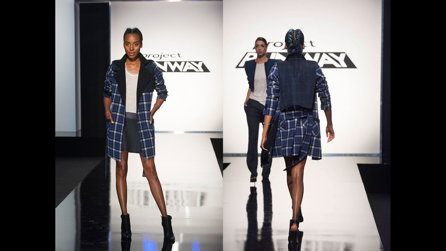
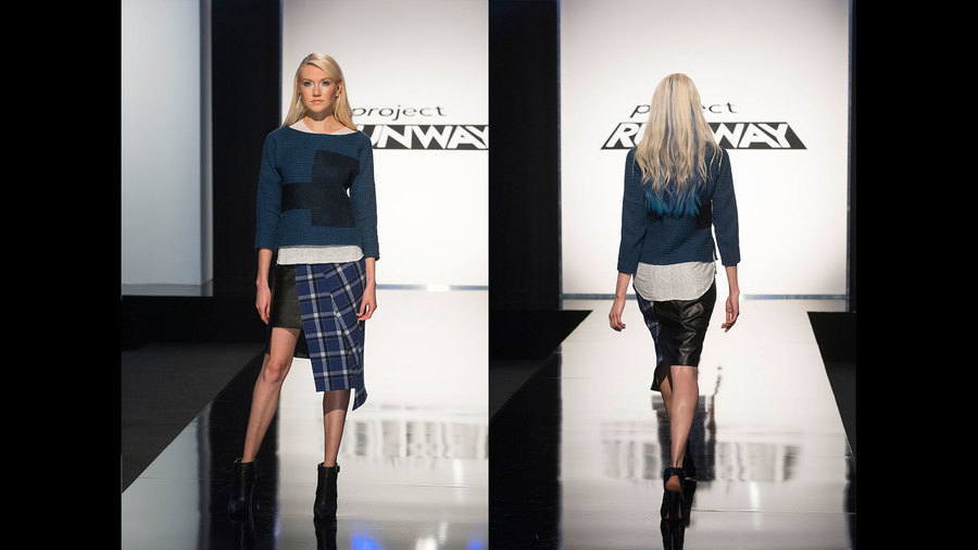
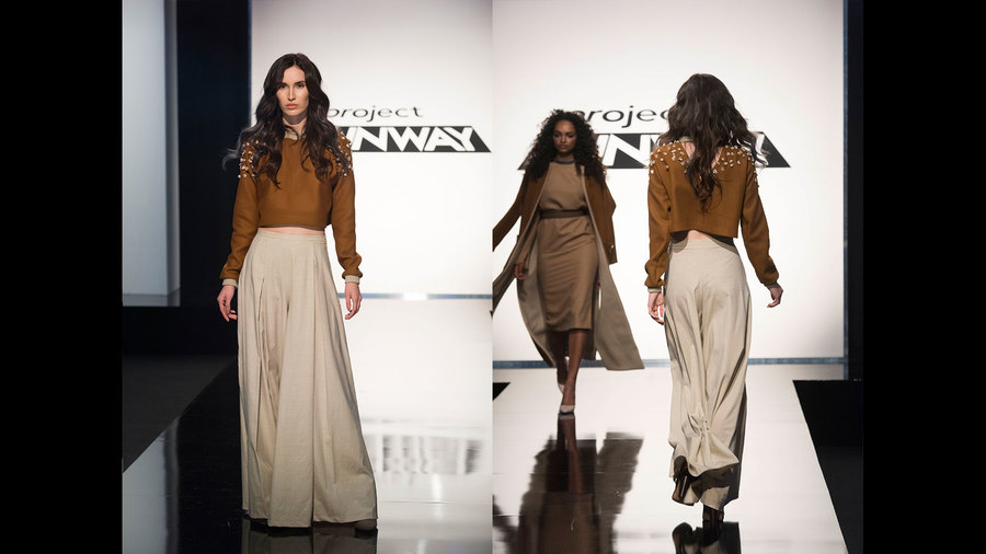
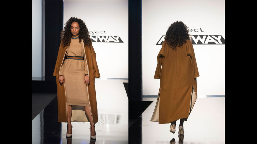
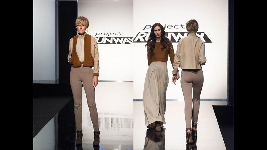
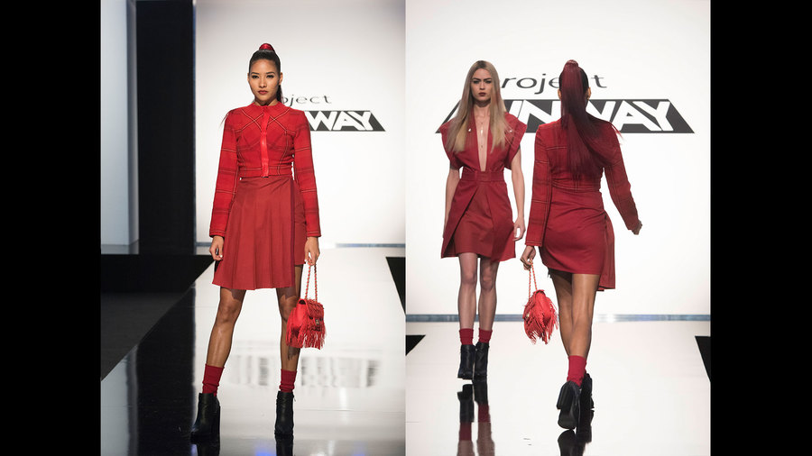
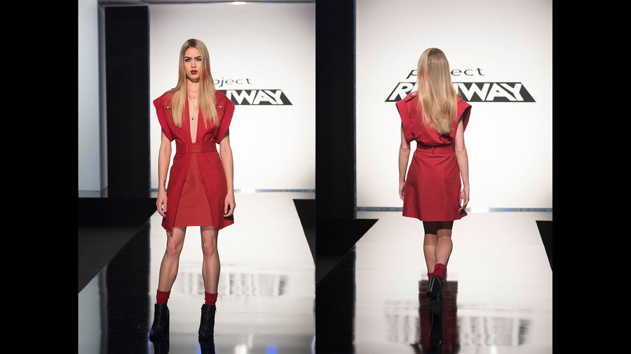
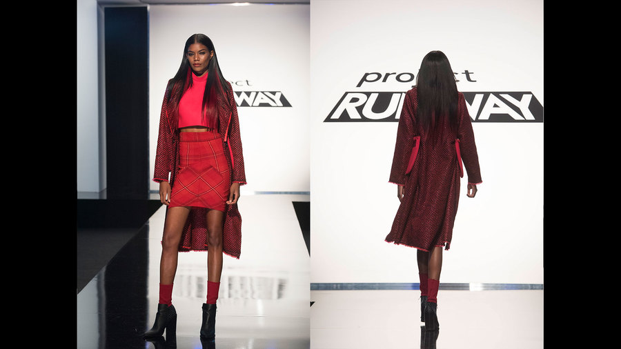
The pre-fashion-week home visits are my favorites, and it's always a good way to tell who is in good standing and who may be in trouble. There have never been five home visits before, so Tim Gunn had his work cut out for him to make his way all across the country to guide the designers through their visions. If you remember from the last episode, the judges only *guaranteed* three spots for Fashion Week, so the designers had to show the judges a two-look preview to decide who was officially moving forward. In the past they have done this with three-look previews, and I think that's a better system to allow the designers to showcase a beginning, middle, and end to their collections. A lot of them struggled with choosing two looks that fully represented every aspect of their collections, and it didn't feel like a very fair system. But hey, they didn't ask me. Brandon's collection was very Brandon and obviously the judges loved it. I was a tiny bit horrified by his flamingo print (and by a tiny bit horrified, I mean I was yelling at the TV about flamingos for a solid hour.) As far as I could tell, he used the flamingos in every single look, and I would think he might get in trouble for creating 10 of what is essentially the same look with the same fabric. I can appreciate that he treated some of the fabric to create a lighter version of the same print, but in comparison to the other textile work he's done throughout the season it felt a bit lazy. The first look Brandon showed the judges was a mixed bag. I liked the pants, though a paper-bag waist is sometimes tricky to wear. The top was not as successful, which Zac Posen was quick to point out. If he swaps the top out for a simpler tank he should be in good shape. The second look was much more successful, and his styling with the backpack was sporty and cute. I like the shapes he's created, but I'm not sure they're original enough to get him to the top. In the preview of the finale episode, it shows him sleeping while the other designers are hard at work doing finishing touches; his over-confidence might get the best of him. Margarita told the judges she would "bring it," and she certainly did. While her print is a love-it-or-hate-it situation, I loved that she took her inspiration from her family's 80's couch, and she kept her styling chic and cool. In comparison to the other designers she has the loudest color story, which will definitely help her stand out in the pack. While I completely loathe the hyper-flared pants in her first preview look, I can appreciate their value from a fashion show standpoint. They remind me of Kelly Dempsey's work a few seasons back. She was smart to style the pants with a simple, but beautifully draped top, and overall it was very thoughtful and well presented. The judges were not crazy about this look, and I felt bad because Tim basically told Margarita to style the look in this way; she wanted to pair the bodysuit with the bomber jacket, and Tim directed her to make a new pair of shorts to tone down the look. While it certainly isn't the most original thing we've seen on the runway, the detail in the bomber jacket is absolutely stunning, and styled correctly I think it could work. As the judges said, she needs to take her designs off the beach and into New York; if she mixes-and-matches her pieces together in the right way, she could put on a great show. Kentaro is making me nervous. At the home visit he said his design inspiration was based on different aspects of classical music, but in front of the judges he described a Japanese beach, which Tim looked very visibly confused about. Tim also warned him about his level of cohesion, and he would have been wise to take Tim's advice. He currently has a lot of exquisite but disjointed pieces, and it will take some careful edits to make it work as a collection. He didn't help himself with his styling, which Nina Garcia immediately loathed. Given his original classical music inspiration, I was surprised he went in a samurai direction, and I think he will be better off to go with softer, more romantic hair and makeup to suit his clothing. I have no idea why Kentaro made his first look or bothered to show it to the judges. It looks like it's made out of basic muslin, and the stiff, weird black appendage sticking out of the model's hip has no form or function. I suspect Tim will guide him to scrap this entire look, and I hope he's able to pull off something last-minute that looks more luxurious. The judges loved Kentaro's second preview look, and I wouldn't agree with them more. The draping is gorgeous and the movement in the skirt danced down the runway. The majority of his collection pieces seem to reflect this same feeling, so if he maintains this direction in his pieces he should be alright. So far Kentaro hasn't shown a great desire or ability to take direction or critique, so I hope he is able to make it work. After reviewing the entire season's best, I realized that Ayana had more winning looks in my book than any other designer, so I was waiting with bated breath to see her collection. Unfortunately, I was very disappointed. She definitely picked her two best looks for her preview; the rest of her collection seems to be filled with drab, dingy grandma dresses. I desperately hope she is able to amp-up her pieces and style them in a way that makes them, well. Less awful. Right now I'm far from impressed. Ayana's first preview look is very reminiscent of things she made throughout the season, and it's definitely the coolest look in her collection as far as I could tell. I loved that it was monochromatic but still multi-dimensional in texture and shape. I was surprised Ayana showed this as her second look since the pants are nearly identical to the first look - then again, all she had to show beyond this were really ugly dresses, so I guess this was her only option. The detailing on the top is pretty, but it isn't a very interesting shape and has zero wow-factor. Showing this to the judges also might have given them the impression that her entire color story is this taupe-ey silver, and I don't think they'll be pleasantly surprised by her dirty-looking greens and browns. And last but not least, our dear, dear Kenya. I really wanted to love Kenya's collection on the whole, and she had a lot of wonderful pieces, but in the end she focused too much on quality fabrication and less on styling and design. I think Kenya shot herself in the foot a little bit by pairing this crop top/pants look with a flowy, beachy cover-up. The fabric of the cover-up is stunning, but the look was originally paired with a sleek, structured, pearl-embellished jacket, which was a lot more modern and finished-looking. This look left the judges confused about her overall design sensibility. Kenya also had trouble with being assigned a model who could only fit into one of her looks. Given Kenya's skill in designing plus-size clothing I don't know why she didn't have more options that would fit her, but she was left with only one dress to work with, and an ill-fitting dress at that. Tim advised her to pair the dress with this cover-up, which the judges hated. I would tend to agree - the dress needed something to give it more of a wow-factor, but I'm not sure a soft, flowy cover-up worked over such a structured dress (a similar issue to her first look.) In the end, the judges didn't feel like Kenya's collection rose to the level of the other contestants and she was not included in the top four to show at fashion week. Unfortunately, I agree with their decision. She had a lot of potential, but she needed more time to develop and receive mentorship to guide her through her styling. I feel like at this point, it's a given that Brandon will win, and while I respect his designs and appreciate his talent, I don't really want him to win with that flamingo print. If Ayana had chosen different fabrics I think she would still have a fighting chance, and while I love Margarita's color story I'm not sure her designs are accessible enough for the judges to get on board. I don't even know if Kentaro's collection is in the running at all. All that said, the judges have a tendency to do the opposite of what anyone expects, so WE SHALL SEE!! Photo credits to www.mylifetime.com It's hard to believe that we already made it to part one of the Project Runway Season 16 Finale, especially because I didn't blog any part of this season. I think I ended up audibly yelling all my thoughts and feelings about what went down on the show and then forgot to actually write any of it down; I sincerely apologize for depriving you of Runway Recaps. This season was full of drama and scandal, but also had some delightful elements that kept it fresh and exciting after all these years. I loved that the show featured models ranging from size two to 22, and the "model confessionals" and extra behind-the-scenes footage was a nice addition. This season also had some of the best designs in the show's history, and I wanted to take a brief look back at the best-of-the-best throughout each episode thus far. These looks were not necessarily the official challenge winners or the favorites of the judges, but they deserve recognition all the same. ***SEASON SPOILERS AHEAD - READ AT YOUR OWN RISK*** Episode 1: Red Carpet Challenge Creating a Hawaiian floral look is risky at best, but Deyonte completely nailed it. The way he cut apart and broke up the large-scale floral made it look painterly and abstract, and the silhouette on his curvy model was stunning. A well-deserved challenge win for week one! Episode 1: Red Carpet Challenge I was very upset that Ayana didn't get recognized for this look. The hand-pieced floral is intricate and beautiful, and the color combination of the grey and green is fresh and unexpected. Her modest aesthetic is unique and inspiring, and she still managed to make her model look sexy while completely covered in this gown. I could tell immediately that she had talent, and I'm glad she's made it so far in the season. Episode 2: Unconventional Team Challenge This was one of the more disappointing team challenge episodes in the show's history. I understand making clothes out of garbage and recyclable materials is difficult, but the creativity was lacking overall - except for this look. Ayana took her team's color scheme and ran with it, adding texture and hand-made textiles wherever she could, which resulted in a multi-dimensional, editorial piece. Episode 3: Dance, Innovation and Movement Challenge I so, so wish Amy had been able to make it farther along in the season. She made innovative, transformational pieces right and left, and I would have loved to see a collection from her. This look featured a jumpsuit that could be flipped upside-down and worn as a hoodie. My brain is still trying to wrap around how anyone could even conceive that idea, and it looked so sporty and cool on the runway. Episode 3: Dance, Innovation and Movement Challenge This was the first episode where Brandon's work stood out to me. All the loops and fastens give it a bit of a steampunk vibe while still staying modern and cool. Episode 4: Heidi Klum Intimates Challenge I'm all about a good Gatsby reference, Michael's hit all the right deco notes while still representing the Heidi Klum Intimates brand. In spite of it being a straight slip, it still manages to be shapely and would look great on any figure. The color, pattern, and strap detail is delightfully feminine, and maintains modesty while still exuding sexiness. Episode 5: Good and Evil Challenge This was by far Kenya's best look of the season. I never would have thought to take the inspiration of evil and turn it into the baddest boss lady in a satin pantsuit, and it somehow works on every level. It has simple, clean lines but is still dark and dramatic. Episode 5: Good and Evil Challenge Can. We. Say. Beyonce. Model Liris completely killed it in Michael's look, and I still can't comprehend that this gown only has one seam. Talk about talent in tailoring. The feather detail could have gone so tacky so fast, but it's royal and regal in all the best ways. Episode 6: Models Off-Duty Challenge I knew Kentaro had potential, and he really lived up to it with this challenge. I loved how he and his model mutually connected through their understanding of Japanese culture, and he used that connection to his advantage in his inspiration. This challenge of creating an Instagram-worthy look was fulfilled and embodied new, editorial streetwear. Episode 7: Menswear-Inspired JCPenny Challenge Kentaro whipped out another great look for the menswear-inspired challenge, and he and Brandon made a fantastic team. The "brothers" created an entire retail collection's worth of mix-and-match pieces in a sleek, athleisure, masculine-to-feminine aesthetic. There's something for everyone in this collection and it suits the JCPenny market perfectly. Episode 7: Menswear-Inspired JCPenny Challenge As much as I loved Brandon and Kentaro's pieces, Margarita's dress was a flawless, stand-out piece for her. It was a sweet, feminine take on a men's shirt, and the ruching, slits, and asymmetry worked together beautifully. I was thrilled that she won and that this look was reproduced by JCPenny - it was actually one of the better Project Runway re-productions in the show's history, so if you got it before it sold out, congratulations! (And congrats to Margarita as well.) Episode 8: Client On-the-Go Challenge Kentaro's client needed a multi-purpose dress that she could wear to an Indian wedding, and he absolutely delivered. The color was a bold and outstanding choice, his minimalist print complimented it perfectly, and the pleated details in the back were a simple but impactful touch. I was pretty bummed that he didn't win this challenge, but if he makes a fashion week collection anywhere close to this I'll be a happy camper. Episode 9: Shopkins Avant Garde Challenge There were a lot of fantastic looks in this episode, but Ayana deserved a special shout-out. How she created this in a single day is baffling, and I could totally see a version of it at the Met Gala. Episode 9: Shopkins Avant Garde Challenge This was another gloriously feminine dress from Margarita. I was worried about her in the workroom, and this level of draping can go very wrong very quickly, but in the end her model looked like she was floating on a glittery unicorn cloud. Episode 9: Shopkins Avant Garde Challenge I wasn't sure what to think about Michael's "melting disco ball" inspiration, but it ended up working really well on the runway. He definitely deserves all the props for managing to sculpt and tailor sequins, and since the challenge prize involved reproduction on a Shopkins doll, I understand why he won. It was a really cool, fantastical look. Episode 10: Lexus Unconventional Challenge Throughout the season, Ayana continued to pull out all the stops. This is probably the best unconventional challenge design I've ever seen. I mean, she created a leather-look top with a mosaic collar, a painted textile, a floating ballgown skirt and a headpiece. HOW. It's conceptual and impeccable, and she proved herself to be the one to watch. Episode 11: Warrior Woman Challenge Ayana blew me away once again in this episode. She took the challenge in an unexpected direction, her tailoring was flawless, and I love a girl who pulls off a stripe-on-stripe. Episode 12: Winter Wonderland Challenge Brandon's looks are most successful when he stays away from his strappy-tied aesthetic (which, while a favorite of the judges, is a little gimmicky to me at this point.) This design was clearly his but he pushed his creativity and he played around with layering in a fresh way. Episode 12: Winter Wonderland Challenge Kentaro had some ups and downs throughout the season, but this was a major comeback for him. I think he described it as looking like whipped cream...or a marshmallow? Some type of white dessert. Whatever. It looks fantastic. I never would have considered shorts in the winter, but in this fabrication and styled with the leg warmers it just all works. Part one of the season finale is featuring five designers: Brandon, Kentaro, Ayana, Margarita, and Kenya. Only THREE of them are guaranteed spots at Fashion Week, which is stressful and terrifying. I'll be hitting you up soon with my takes on the designer's collection previews and, of course, you'll get my season finale recap after it airs next week. Thanks a million for reading and waiting patiently for my two cents. What are your thoughts? Who do you think will win this sweet sixteen season?? Photo credits to www.mylifetime.com This season's finale was not remotely what I expected. All of the designers had work to do after their preview with the judges, and it seemed like anyone would be able to pull something great off and make it work for the win. Some of the designers surprised and impressed me, others were severely disappointing. Let's jump right into it. Laurence's collection suffered from Kini Syndrome: that thing where you do fantastic work the entire season and then your collection is completely unlike anything you've made that the judges loved. I understood her desire to take a departure from black, and I think the neutral color palette was fine, but there wasn't a single piece on the runway that stood out or made me say WOW. Some of her fans have stated that "if 'sparkle' was required in order to win, that should be a stipulation from the judges before the designers make their collections," and I see the point of that, but at the same time you have to understand that NYFW is a SHOW, and everything you make needs to stand out under flashing lights. Laurence just didn't get that. To no surprise, her best pieces were in leather. I loved the olive color and her stitching work on the back of both her jumpsuit and her short sleeved jacket were DIVINE. I simply wish she had done more to play with this strength, because only two of her pieces featured it. Laurence's pearl-detailed tops were also a favorite of mine, although photographs hardly do them justice. Her attention to detail, again, was phenomenal, but if you can't see it on camera it won't put you on the map. I was glad Laurence edited her lederhosen romper to feature more leather. It elevated the overall look and became a very cute, fresh piece. That said, her styling was a little basic and boring. Most of her models had no accessories at all, and with a piece this simple something extra is needed to amp it up. Unfortunately, I think most of Laurence's separates were throw-away pieces. Her chiffon tops were literally nothing, her pants, while beautifully tailored, were pretty basic and too ready-to-wear for a fashion show. I could buy most of her pieces off the rack tomorrow. As she got into her white "finding the light" moments, any detail that might have been there got lost in the whiteness of the white. It has been said many times on Project Runway that an all black or all white collection is a bad idea because detail gets lost, and I don't know how long it's going to take for designers to take note. And then, of course, there was Laurence's finale look. What. On earth. Is this. Is it a swimsuit? Is it lingerie? Is it supposed to resemble a mermaid? Why is there an ARROW POINTING TO HER WHO-HA?? Especially given Laurence's clear ability to display a classy, elevated taste level, this look was unprecedented and disturbing coming from her. Overall, it was quite clear that Laurence was going to be an easy cut. She had so much potential and she just didn't live up to everyone's expectations. Rik's collection surprised me the most in the best way possible. Going into the final four, I didn't really think he belonged with the other designers, but he absolutely proved me wrong. His collection was quirky, cool, stylish, and unlike anything we've seen over the years. I was thrilled that he took the judges' advice to have his models show a little more skin and let them breathe. His collection already had enough going on, and the results were fantastic. Rik's black and white pieces were really strong. His last-minute black dress with his signature paisley applique was genius, and his printed top, followed by his stunning leather jacket showed incredible range within a color story. The way Rik transitioned the black and white into his denim pieces was flawless. I adored his printed trench coat and vest, and I WANT THAT BOMBER JACKET MORE THAN ANYTHING. The yellow leather vest with the printed denim pants was a great transitional look and also showcases the full range of Rik's technical abilities. It was very wise of Rik to take the judge's advice on the next two looks. Shortening the jumpsuit and adding a cool leather weekender brought it to a completely different level, and adding the paisley logo to the tiny bag made the bag + dress combo look elevated instead of junior. Rik's finale dress suffered the same issue as Laurence - the white just didn't showcase the detail under the lights. That said, his styling with the glasses and the booties brought a pretty white dress into a punk arena, and it was a great ending to a wonderful show. After seeing Rik's collection I thought he had it in the bag...until I saw Roberi. I was so nervous for Roberi after the preview, but he TURNED IT OUT. There were very few looks that I had any complaints about, and he created a unique, creative, lovely collection. Roberi's first look INSTANTLY had me hooked. He created it in a day and that skirt is, was, and will always be everything to me. I want it. I need it. I was surprised that Roberi didn't really edit the looks from his preview with the judges following their comments, but in the context of the collection as a whole, they worked fine. The separates look definitely benefited from shortening the skirt, and both looked better with the orange shoes. I'm very happy that some of the separates look in his preview got utilized in his collection. This utilitarian coat was FABULOUS, and paired with another shiny skirt was a genius decision that I never would have thought of. A lot of people complained that the purple dress was disconnected from the rest of the collection, but I adored it. It reflected the classic styling he showed throughout the whole season: ageless, timeless, and beautiful. Roberi's more casual denim looks were just as strong as the rest. The dip-dyed denim pants were phenomenal and I want them immediately; pairing them with another phenomenal quilted top and a cool jewel-toned cardigan seemed disjointed but somehow all worked together. The shape of his denim jacket was gorgeous and I loved that he kept the theme of pairing the utilitarian style with a pretty, shimmery dress. The feather dress was stunning, and I never would have thought it would make any sense paired under a printed track jacket, but it was SO BEAUTIFUL. I was also thrilled that Roberi got to showcase his macrame technique again. The dress, while a beautiful fabric, was a little too simple when he showed it to Tim, but with the threaded overlay it was transformed into something completely unique and lovely. Roberi's finale look was the only real weak point of the collection, which definitely isn't the place you want to have a weak spot. The top is glorious, but the skirt is a bit sad and drab. If he had used his shimmery fabrics to create an explosive ballgown skirt, I would have declared him the winner in a second. Unfortunately, sometimes it's just a finale skirt that can cost you the win. You all know that I have been on Team Erin since episode one, and after the judges preview I thought she would turn her collection into something brilliant, but on the whole I just wasn't digging it. She made so many better things throughout the season, and while some of her pieces were good and you could argue she's more of a "visionary," her collection definitely wasn't better than Roberi's. So let's break this down: Erin's first look, which should ideally be one of your strongest, was incredibly weak. Pairing an orange top with a tomato red skirt just looks like a mistake - like she was trying to match, but it was too dark in her workroom. Normally I love her applique details, but the plexiglass on the skirt just isn't impressive. The top could have been fine with a different bottom, but this outfit as a whole just doesn't work. I was glad Erin kept her original print, but the bikini-style top didn't really fit with the style of the rest of her collection, and the pants were just...nothing. Way too simple for her out-there style. Erin's third look was one of my favorites. The gold had great runway impact, and the fact that it was hand-painted added a great "Erin" touch. That said, the print was so small I'm not sure her efforts were completely realized. Erin only made minor adjustments to her separates look from the preview; she shortened the skirt a bit and swapped out the shoes, which improved it dramatically. She left the neoprene dress alone, which was a good choice. I was glad that Erin was able to salvage more of her original print, and her next flirty dess was the kind of design I would have liked to see more of. Creative prints, flattering solids, and textured details are all a part of Erin's signature, and the "moody designer feelings" bag was super cheeky and cute. ...and then this weirdo look happened. The stiff, shiny fabric didn't have nearly the same effect as Roberi's flowy styles, especially in the midi length, and a matchy-matchy shoe is never a great idea. I like the brown top on its own, but with the rest of the outfit it just doesn't work. The pink coat look was another one that was definitely an Erin signature, but like some of her coats throughout the season, she could have taken out half the volume and it would have been just as good, if not better. ...and along came this atrocity. Erin made this top in the 24 hours before the show, and I don't know why for the life of me. I get that she felt the need to add another separate, but this is NOT the right one. Does anyone remember Sandaya's American Girl challenge look? Do we not notice the resemblance? It's a ridiculous clown costume, end of story. Annnnd we end with the banana look. I actually don't mind it as much as some people did; I would definitely wear the jacket with a white tee and jeans. The look reflected a lot of the items she made before the season began and I think it reflects her aesthetic well. I wish she hadn't put it with such a throwaway top underneath, but all in all it was funky and fun. So who do you choose as a winner? Erin, the season favorite who can create masterful pieces but had a hit-and-miss collection, or Roberi, the underdog of the season who brought forth brilliance in his final show? Obviously we have no way of knowing what led to the judges' final decision, but it must have come down to this: If you're judging based the NYFW collection alone, Roberi should have won. He had more interesting pieces and more successful looks overall. If you're judging based on on the body of work throughout the season, Erin had it in the bag, hands down. However the judges came to their choice, they chose Erin. I've been saying I thought she should win from episode one, and I wish I could be a little more excited about it - Roberi put up quite a strong fight. But I am happy for Erin, truly. She has an aesthetic the world has never seen, and I'm excited to see what she has in store! All photos from www.mylifetime.com At this point in the season, the final challenge has ended. The weeks have gone by, the designers have created their collections, they have consulted with Tim, and they have returned to New York. There is only one stop left on their journey: a preview with the judges so they can revise and adjust their collections in the final few days before Fashion Week. To no surprise, I was quite impressed with Erin's collection. It was not quite up to par with the designs she made throughout the season, but still impressive. Most of the looks featured plexiglass ornamentation that she cut and hand-sewed, which gave her designs extra sparkle. Her first preview look was a darling neoprene dress. It suited her style completely, and I loved that she paired it with the blue strappy flats. Her second look needed a little help. The print of the dress was a collaborative design that she created with a friend, and I understand why she loved it and wanted to keep it, but the flowy maxi style simply didn't work in the context of the whole collection. I think if she breaks it up and creates a top to go with a different bottom, or a skirt to go with a solid top, she'll be in better shape. (I do love the clutch. Michael Kors thought it was stupid, but give me a quirky hand-painted clutch and I'm a happy girl.) Erin's third look needed some styling help. The judges didn't like her top, but I appreciated the weaving technique in the arms and I think she should keep it. The skirt with the top, however, doesn't quite work. If she shortened the skirt into a mini and added the blue shoes from the first look, it might work better. Overall, I think Erin's styling needs adjusted. If she swaps out a few tops and bottoms, I think she'll be in good shape. Laurence's collection was not remotely what I expected from her. She had very few leather pieces, and her color palette was far softer than anything she's made throughout the season. I understand her desire to take a departure from her usual aesthetic, but she might have strayed too far away from her strengths. Her first look was fresh and young, but as Michael Kors pointed out, a little too much like lederhosen. I liked the jacket in the second look (though I should mention that my mother hates it with a burning passion because she thinks it looks like her grandmother's couch) but the ill-fitting mint green pants are horrifying, and the jacket without a top underneath is too much of an early 2000s throwback. I desperately want Laurence to swap out the shorts from her third look to coordinate with jacket in the second look. Overall, her third look was my favorite, and the pearl detail on the shirt was divine. That said, you really can only see the detail up close, and I'm not sure it will have effective runway impact. I think Laurence is in the same position as Erin in terms of switching up her separates, but her color choices might have blown her chance at winning already. I have very mixed feelings about Roberi's collection. He described his collection as being "personal" and inspired by "confusion," but he was never really able to explain what that meant or how he was translating that into his designs. He was certainly in a better place after his visit from Tim, but I'm not sure how his collection as a whole is going to work out. His first look was pretty, and I liked the unexpected matte-quilted top with the iridescent skirt. The judges didn't like his styling with the sneakers, but I think it works and keeps the look unexpected and sporty. I like the idea of mixing the utilitarian vest with a fancier top/skirt, but the second look wasn't my favorite. I appreciate the quilted top and the vest, but the skirt fabric reminds me of a cheap Barbie outfit, and the proportions are definitely off. Roberi's third look was by far the most wearable and definitely my favorite, but of course, it was the judge's least favorite so it's probably going to be scrapped. I still want it, though. It's so Anthropologie. I can't. GIVE IT TO ME, ROBERI. I think Nina is right about Roberi: his strengths lie in unique, effortless, lovely clothes, and his fabric choice was a little too try-hard. If he, like Erin, swaps out some of his tops and bottoms and perhaps adds a few new pieces, I'll be pleased. I'm a little worried for him because he seems very stuck in his current vision, but hopefully with a little more guidance from him he'll be okay. I liked Rik's collection a lot more on the rack than I did walking down the runway. He had three distinct points to his collection: black and white pieces, colorful leather pieces, and printed denim pieces. On the rack, he mixed and matched them expertly, but showing them without context to the judges made his collection look wildly incohesive. The first look, plain and simple, reminded me of a Stormtrooper body suit from Black Milk. I like the print design, I liked the idea of it, but it was just a LOT. The glasses were cool, but in this look it just added to the futuristic vibe, which isn't exactly what he was going for. This is definitely a look that will require some editing. The leather dress was my favorite, though I wish it were a touch longer for wearability (on me, it would be a top, not a dress.) The judges took issue with the size of the purse, but I thought it was cute and could easily be swapped into a different look if necessary. I don't think the judges gave Rik remotely enough credit for creating this print. I totally agree that his model could use a little more skin, but beyond that, I liked this look a lot and I appreciate his creativity. He has quite a few pieces with the same print, and I'm excited to see the rest come together in his collection. The judges were pretty critical of Rik, but I think he'll be fine. If he shows some more skin and makes some alterations, he'll be in great shape. I think it's fair to say that Laurence is out of the running. Erin has been my longtime favorite, but Roberi also has a special place in my heart and Rik's collection is a major contender. The next few days will be critical to determine who comes out on top!! All photos from www.mylifetime.com This was the LAST EPISODE to determine which four designers will show at New York Fashion Week. Surprisingly, it was yet another unconventional challenge, but with a twist: THE CHALLENGE: Create a high-fashion look using unconventional materials from small-town shops in Austin, Texas. As a last-minute addition, create a companion piece using fabric from Mood. My Favorites (in order from top to bottom): 1. Erin Robertson Erin took a HUGE risk with her unconventional materials by making a flower treatment with melted guitar picks and DRIED MEALWORMS. Yes, you read that correctly. Mealworms. On a dress. But Erin being Erin, she spray painted them gold and they turned into magic. The shape of the skirt balanced out the top and the open back gave the look a breath of fresh air. Erin's companion look had the same fun energy as the first, and I could absolutely see them both in a resort collection together. The frayed chiffon edges were super cute, and the overall look was sweet and flirty. 2. Roberi Parra Roberi's unconventional look doesn't come across well in photographs, but up close it is genius. He knotted each thread of this piece until his hands literally bled, and I would have loved to see how this look would have progressed even further had he had more time to work on it. The skill level is incredible, and his talent clearly shone through. While Roberi's companion look didn't resemble his unconventional look at all in terms of fabrication, the shapes and the curves were what kept it cohesive, and I adored his pattern mixing. If he does anything like this in his finale collection, I'll be very happy. 3. Laurence Basse Laurence, of course, was drawn to leather bridles and horse harnesses, but she managed to make them feminine and soft by mixing them with paper and bird seed. It definitely was a departure from her usual tough leather jackets and refreshing to see. I enjoyed Laurence's conventional look a lot more than the judges. Perhaps it's because I have a special place in my heart for mustard yellow clothing, but I just think it was a really pretty dress with interesting detail. If she had the time to improve the construction, it would have been a really wonderful piece. 4. Rik Villa Rik's unconventional look was very chic and beautifully made. I didn't fully understand how this look reflected inspiration from Austin, but in general as an unconventional look, it was stylish and impressive. Rik's companion look was significantly less exciting. The cut was simplistic, and the distressing of the tweed, while a signature of Rik's, looked sloppy in this context and didn't match the sleek nature of the unconventional dress. All in all, though, his design aesthetic is clear and he definitely deserved to go to fashion week. 5. Cornelius Ortiz Cornelius' look wasn't bad, but at this point in the competition it simply wasn't good enough to make the cut. The paper cut-outs looked like a craft project and weren't fully integrated into his design. His companion piece was actually quite pretty and something that I definitely would wear, but it doesn't meet the qualifications of the challenge. It isn't elevated enough to be high fashion, and it doesn't coordinate well enough with his unconventional look. At the end of the day, sending Cornelius home was a good choice. He's only really made one good outfit this entire season, and in comparison to the other four designers, he didn't deserve to go to fashion week. I CANNOT WAIT to see what the final four designers make for their final collections! All photos from www.mylifetime.com This might be one of the few challenges in which I 100% agreed with the judges picks for top and bottom, in the same order. It's almost like they listened to me and finally got it right! ;) THE CHALLENGE: Create an avant-garde look with unconventional materials as a fusion challenge inspired by Lexus. My Top 3: 1. Erin Robertson Erin's ability to use random materials to create beautiful, feminine things is so incredible, and her floral treatment was no exception. The "paper doll" inspiration was really creative and unique, and it takes a very talented designer to send a topless model down the runway who still looks completely modest. And can we talk about the model's styling? The whole effect was so feminine and dreamy, and she succeeded in creating an avant-garde fantasy. I cannot. I am obsessed. ERIN IS BACK!!!!! 2. Rik Villa While this wasn't the most avant-garde design in the world, Rik's use of unconventional materials might go down as one of the best in Project Runway history. The way he sculpted the tile sheets on the shoulder and the back was extraordinary, his beading treatment was remarkable, and overall, the wear-ability and structure of his garment was incredible. 3. Roberi Parra Roberi was inspired by the Lexus for this challenge, and I definitely think Lexus could use this in their advertising. His use of the unconventional materials was very successful, the look was futuristic and avant-garde, and his styling was spot-on. My Bottom 3: 1. Mah-Jing Wong Mah-Jing was on the right track with his copper details, but unlike Erin, who took metal pieces and made them into a cohesive, avant-garde piece, Mah-Jing's just looked stuck on to a basic denim dress, and their weight led to fit and construction problems. It wasn't a terrible idea, but it just wasn't good enough at this point in the competition. 2. Cornelius Ortiz This definitely wasn't the best use of unconventional materials, nor was it all that avant-garde, but it wasn't the worst. I think I was more disappointed with this because after Cornelius' phenomenal dress last week, everything else that isn't as phenomenal looks a thousand times crappier. Plus there's the fact that due to my many years as a babysitter, it reminded me a little too much of the vacuum from Teletubbies. A dark, disturbing Noo Noo. 3. Laurence Basse If this was a normal unconventional materials challenge this would be fine, but as an avant-garde challenge it missed the mark. It looks exactly like everything else Laurence has ever made, and the proportions are really off. Not the worst of the bunch, but not her best work. So let's give a shout out to QUEEN ERIN being back on the top!! And can we give her some mad props for wearing a top that matches her avant-garde design? Killing it. All photos from www.mylifetime.com THE CHALLENGE: Be inspired by the aerial view of New York City to create an editorial look for a powerful woman. The winning look will be featured in Marie Claire magazine. My Top 3: 1. Cornelius Ortiz This is 100% the best thing Cornelius has ever made, and it 100% fit the bill for the challenge. He was inspired by shapes he saw from the aerial view of New York to create the style lines, and this is definitely a powerful look for a powerful woman. I love that this dress is completely ageless, and I think it would be great for an editorial in Marie Claire. I want it and my mom wants it, which is hard to achieve, and his execution and styling was spot on. 2. Rik Villa This look wasn't perfect, and I agree with the judges that it would have been nicer had the draped fabric continued on the back, but Rik deserves mad props for creating such a beautiful textile, and I could definitely see this photographing beautifully in a Marie Claire spread. 3. Mah-Jing Wong Like Rik's look, this wasn't perfect by any means. The patterning of the boobs was placed too high, and some of the tweed stretched in weird places. That said, this is probably the most creative dress Mah-Jing has made, the fabrication was interesting, and I appreciate his aesthetic take on what a "powerful woman" should look like. Honorable Mention: Erin Robertson This is not my favorite look of Erin's, but it is SIGNIFICANTLY better than the looks she's made the past few weeks. The color story was bright and fun, and the "business-on-top, party-on-bottom" design was creative and chic. It looks like Erin is making a comeback!! My Bottom 3: 1. Nathalia JMag There really isn't anything positive to say about this look. Nathalia decided that a "powerful woman" needed to be a futeristic superhero, and the result looked like cheap, poorly made student work. After her inexcusable proportions last week and her poor showing this week, I think it was definitely justified for the judges to send her home. 2. Dexter Simmons There are so many things wrong with this look. To start, his jacket was an exact re-creation of his jacket from week 7 that the judges all hated. Second, he spend all his time on the jacket and his dress ended up simply being a single drape of fabric with arm holes. To top it all off, the only interesting design feature was the model's lingerie, which Dexter didn't even make - the model brought it herself. In a design competition, you can't put all your eggs in one jacket (yeah? see what I did there?) and expect it to go well for you. 3. Laurence Basse I was really shocked that the judges didn't rake Laurence over hot coals for this. Sure, she did some nice leatherwork in the waistband, but a touch of good leatherwork just isn't enough at this point in the competition. The back of this dress is a design feature she's done before, and the bottom is just way too short. As a whole it looks like a really cheap homecoming dress, and Laurence can do so much better. So in the end, Nathalia went home. AND DEXTER WENT HOME, TOO. YUSSSSSSS. This was the most deserved double elimination ever, and I couldn't have been more thrilled to see Sassy Pants Diva Dexter go home. AND, I couldn't be more happy about Cornelius winning the challenge, which as you know, is never, EVER something I thought I would say. This was a much needed redemption after Tim used his Tim Gunn save. All photos from www.mylifetime.com THE CHALLENGE: Create a look for a friend/family member who is creating a "new start" for themselves. The designer and the client will receive $25,000 EACH to help them achieve their goals and dreams. My Top 3: 1. Roberi Parra Roberi’s friend was an aspiring graphic designer who wanted a dress to wear at art showings and industry events, and I couldn't think of a dress that's any more perfect for an artist. It’s graphic and modern but also sweet, which is hard to achieve and it was executed brilliantly. I want this dress. I want this dress. I want this dress. 2. Rik Villa While Roberi's look was my personal favorite, I completely support the judges' choice of Rik as the winner. His mom is returning to school to earn a promotion in management, and this look fits the bill perfectly. It's well proportioned, flattering, professional, and sweet. I love that he incorporated a bit of his heritage with the white stitching, and the fact that Rik is using his prize money from the win to pay back his mom for loaning him money for school and his studio space is totally heart warming. 3. Erin Robertson Erin was in the bottom for this look, and I agree with the judges on the fact that it was a winter coat with a spring dress, however, as someone from the mid-west who frequently has to wear winter coats on Easter, there's a sense of practicality to that situation that works for me. The construction of the dress could have been improved, but we would sell this style at Anthropologie in a second, and it's still a very special piece. My Bottom 3: 1. Jenni Riccetti Jenni definitely deserved to go home. She purchased maroon fabric that would have made her pants look more sophisticated, but even that wouldn't have saved her look overall. It simply wasn't appropriate for a preschool director in any capacity, and she missed the mark of the challenge. 2. Nathalia JMag Nathalia's look was well intentioned, and the idea of a coat for travel was a good idea for her "client," but the proportions swallowed her and the whole thing was poorly made. If she doesn't turn it around next week, she's going home for sure. 3. Mah-Jing Wong The judges put this look in the top, and I can't fault Mah-Jing for creating a look that embodied exactly what his mom wanted. She's starting a record label and wanted a powerful look that made her feel like a warrior. That's definitely what Mah-Jing created, but I just can't get behind it as a look. Her legs looked like toothpicks coming out from the coat and it looked like a costume to me. All photos from www.mylifetime.com We all know how the last team challenge went, and given how poorly most of the designers have been doing lately, I was ready for this team challenge to be another disaster. Much to my surprise and delight, this episode ended up being one of my favorites! The Challenge: In 3 teams of 3, create a 3-piece collection inspired by one of Sally Beauty's new fall color concepts: New Neutrals, Tones of Blue, or Red Violet. As an added twist to this challenge, the collections were shown to the public, and the winner of the public vote earned a 20% boost to their final judges' scores. Team Tones of Blue This team won the judges final vote, and I can completely understand why. Thier fabric choice and cohesive aesthetic earned the top spot, and it was well deserved! Laurence's look was a little funky in the proportions, but it won me over with a cool, relaxed vibe that couldn't be overlooked. The "Chanel-in-Front, Tuxedo-in-Back" jacket was so unusual and yet completely wearable, and any girl could leave the house in this look feeling confident. This look is one of the best things Rik has made on the show so far. I thought his dress was a little too basic, and Tim Gunn expressed the same concern, but in the end, with the coat and with proper styling, it became easy and effortless. I’m not a plaid girl in the least, but the style lines of this coat make it very desireable. ROBERI’S LOOK WAS MY ABOSULTE FAVORITE. It might be one of my favorite Project Runway looks ever, and I want every piece in my closet right now. It had a little touch of punk, but in a subtle, classic way that could allow for many women of any age to appreciate each piece. He TOTALLY deserved the challenge win! Team New Neutrals This team earned the public vote, which surprised me because the public perception of browns and neutrals isn't usually very positive, but their chic sportswear styling ended up being their saving grace! I appreciated that the team mixed and matched their pieces to create an aesthetic that merged their styles. Jenni's popcorn sweater with Nathalia's pants were a great combination. The wide-leg pants give the vibe of a work look, but the sweater allows it to be a little more casual to take it out of the office as well. The "popcorn" detail on the sweater shoulders were genius, and added great textural details. Nathalia's coat paired with Mah-Jing's dress was brilliant. What other wise could have read as a boring, potato-sack dress was transformed into a luxurious, expensive looking outfit. The touch of denim at the waist and neckline was a great way to break up the neutral tones. While I personally would never wear Jenni's leggings because my booty would make a cry for help (and honestly, they aren't that flattering on the model either,) I appreciate the cut out knees and the seam lines to add some interest, and adding the bomber jacket gave the look a cool, "after school" feeling. Team Red Violet This team had all the advantages in the world, and they didn't use any of them. "Red Violet" meant they could have incorporated pinks and purples, and their collection could have been a glorious jewel-toned moment. In addition, red is an action color, which makes the public far more likely to vote for them. Instead, Dexter decided their collection needed to be "punk," and their battle was fought and lost at Mood with their fabric choice. I've been no fan of Cornelius, but I really felt sorry for him. He had to help finish Dexter and Erin's looks, and as a result, his own work suffered. His jacket isn't bad, but the closure in the front looks like a strip of duct tape from afar, and his pleated skirt (which I don't entirely blame him for, since Erin designed it,) was poorly made due to his time constraints. Overall, it's just too red-on-red-on-red to be successful. Dexter's look wasn't the worst, but no woman would ever wear it due to the bra issue in the front, and for a design competition it really wasn't that difficult to make. If this was all he was going to contribute, he should have been more of a help to his team, and the fact that his design aesthetic was responsible for the other looks makes it even less excusable. Erin’s coat saved this collection, and Cornelius was on track with breaking up his suit and putting his skirt with Erin’s look. I was a little pissed that the coat was basically all Erin made, but it was the most successful look overall. Team Red Violet’s critique was a train wreck, but an expected train wreck. Dexter made a trillion excuses as to why they had a disadvantage, Dexter and Erin blamed Cornelius for everything, and Cornelius took the heat for not standing up to his team members. Even though Dexter was responsible for the collection aesthetic and Erin made a lot of the design decisions, Cornelius was sent home. BUT WAIT. Tim used his Tim Gunn save. ON CORNELIUS. I have given Cornelius a lot of crap this season, and that crap has been well deserved in my opinion, but I agree with Tim. In this case, on this week, he did not deserve to go home. Tim stood up to the judges and told them Dexter and Erin were the "mean girls" on the team and tried to explain that Cornelius didn't have a lot to do with the end results, but they didn't listen to him. In the end, Tim uses his save when he completely disagrees with the judges' vote, and I agree that the judges sent the wrong person home. HOWEVER. Cornelius is going to have a lot to prove. Honestly, I haven't loved a single thing he's made this entire season, and I worry that another (more talented) designer might not get the opportunity they deserve because Tim wasted his save. Only time will tell. All I know is that looking at these sassy pants, nothing good is going to come from next week. All photos from www.mylifetime.com |
categories
All
archives
May 2019
|

 RSS Feed
