|
THE CHALLENGE: Use the jungle roller coaster experience as inspiration to create street wear for the "urban jungle." My Top 3: 1. Nathalia JMag My only criticism of this is that I wished Nathalia had made a top with a little pop of color. Design wise and construction wise, I have no complaints. I would wear that jacket, I would wear those pants. She played with volume in just the right way, and she designed according to the challenge perfectly! 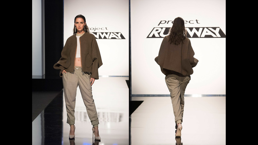 2. Jenni Riccetti Jenni's pieces were definitely more basic, but she chose a great print and her styling, while not my personal taste, is on trend and would sell well. She definitely understood the challenge, and I think she deserved to be in the top instead of just safe. 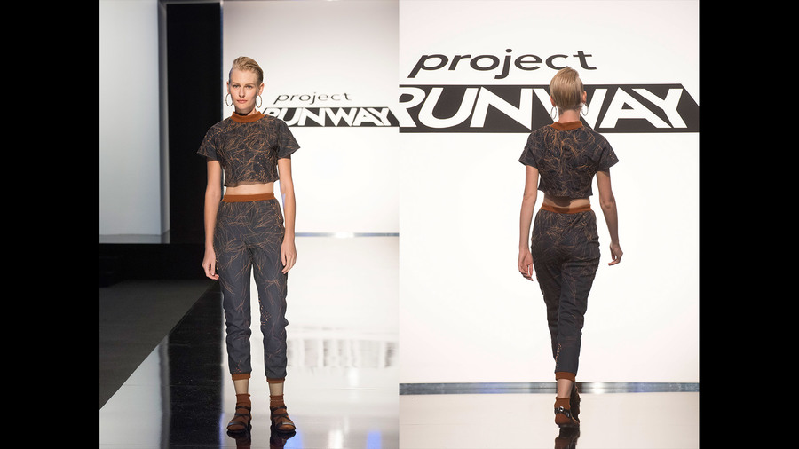 3. Laurence Basse Laurence won this challenge because she made an amazing jacket and her styling was great, and I’m happy to give her props for that, but I took issue with some things, too. Her pants definitely made her model look like she had a hefty package – NOT okay under any circumstances, and she acknowledged that she messed them up, but they were really awful. I appreciated that she made a jacket style that was different than her standard shoulder detail, but it was a little too reminiscent of Michael Jackson’s “thriller” look for my taste.  ...the fact that each of my top looks still had problems with them should give you a hint that the rest of the designers were a hot mess. My Bottom 4: (That's right, 4. Hot. Mess.) 1. Cornelius Ortiz I’ve taken issue with Cornelius’ attitude and taste level before, but this pushed me over the edge. The pants were constructed well, but the fact that Nina Garcia considered them to be “current” was insane to me; they remind me of everything NSYNC wore in 2001. And if the dated pants weren’t enough, he gave us a poorly made, poorly designed top to go with it. That. Top. Is. Awful. Send. Him. Home.  2. Dexter Simmons This was another scenario where Nina Garcia was completely off base – she applauded Dexter for being innovative and trying something new, but new for the sake of new doesn’t make it acceptable. The jacket shoulders are absurd. The high waisted + Bermuda length shorts are hideous (and he didn’t even finish the hem. Ugh.) The only thing I like about this look is the top underneath the jacket (which you can’t see) and the finger-less gloves (which I can buy at Target.) And if we’re being really honest with ourselves, this isn’t street wear. What woman would ever wear this in her everyday life?! 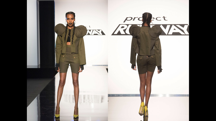 3. Brik Allen I don’t know if I agree that Brik should have gone home for this because his construction was better than quite a few of the other designers, but as far as taste-level was concerned, it wasn’t too great. I wished he had patterned the pant print so it was symmetrical along the center seam, and I wish he had used his top print as-is instead of deconstructing it into a top that didn’t go with the pants at all. I think Brik struggles with designing well under pressure, and if he had more time to look at his design he would be able to see that his look wasn’t successful. 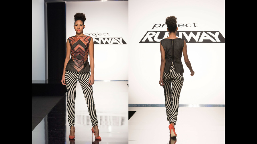 4. Erin Robertson It would appear that Erin is losing her way, and she CAN’T because I’ve already pinned her as the season winner and if she screws that up I’ll be mad. But I can’t deny that this look is pretty crappy. The top isn’t the worst, but the embroidery details on the shorts were unsuccessful and the fit of her shorts were off, too. If she had used the embroidered sections as sleeve details on a jacket, that might have worked, but on shorts they just look silly. 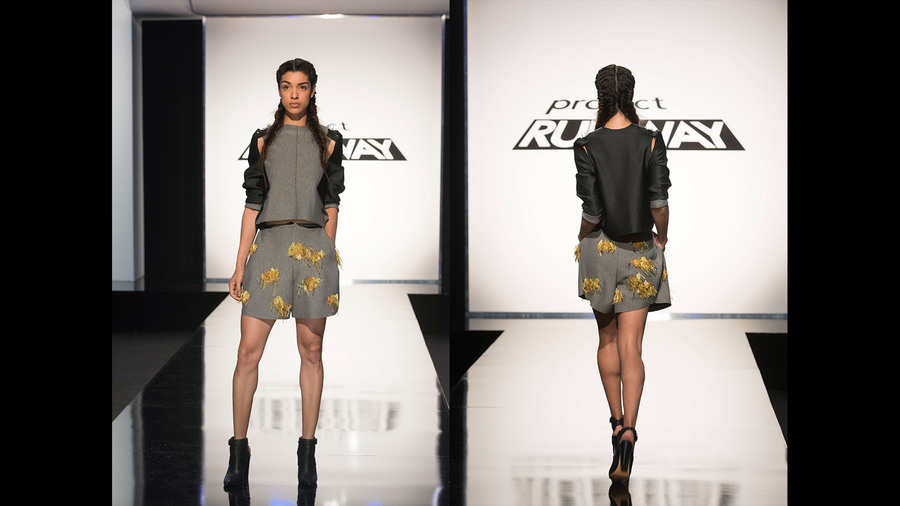 I think the theme park aspect of the challenge confused a lot of the designers and they simply got lost. If it had just been a matter of creating street wear, they probably would have done better. Maybe. At this point, I have no idea what some of the designers are capable of, so we'll see where we go from here. All photos from www.mylifetime.com
0 Comments
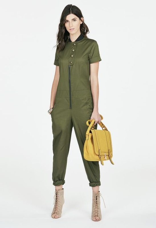
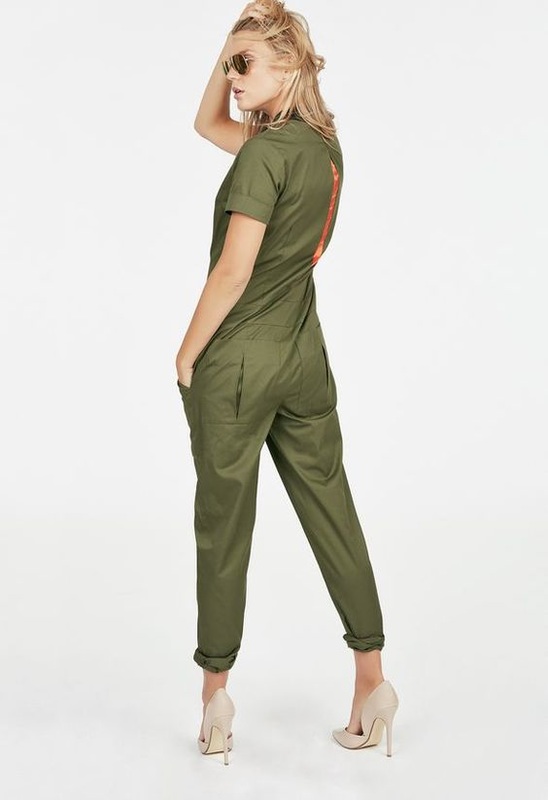
THE CHALLENGE: Be inspired by your surroundings at a press party to design a cocktail look. I had no idea why a lot of the designers struggled with this – cocktail dresses are kind of design school 101, and the room where their press party was held was filled to the brim with things to be inspired by, so I don’t know what the deal was. As always, some designers were extremely successful and others were massive failures. My Top 3: 1. Laurence Basse WINNER. WINNER. WINNER. This might honestly be one of the best dresses I’ve ever seen anyone make on this show. Ever. The leather work in the shoulders and the yoke of the neckline is impeccable, the open back is completely stunning, and SHE MADE IT LONG ENOUGH SO ANY WOMAN CAN WEAR IT. I want it. I need it. UMPH. 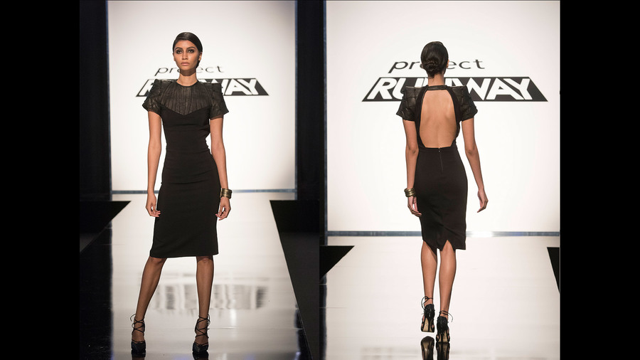 2. Erin Robertson I have no freaking idea why Erin almost got sent home for this. It was one of the few looks that actually fit the challenge: it was unmistakably a cocktail dress, she took the inspiration of her surroundings literally and seriously, and she created a unique look that played with textures and textiles. Maybe she could have gone a little lighter on the feathers, but she was going for drama, and I’d rather she give us too much drama than not enough. I thought the copper color was gorgeous, and she made an effort to create something more structured, which should be applauded. 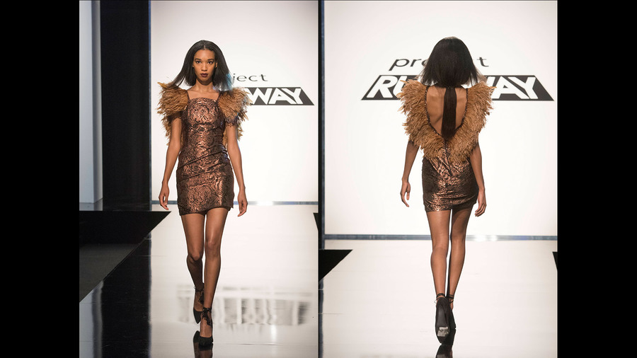 3. Roberi Parra Roberi has, overall, been a really unappreciated designer in this competition. I thought this dress looked like a Rothko painting, and the idea of using a painterly knit for a cocktail dress is really unique. He probably could have accessorized it with a little more glitz to bring it into the cocktail arena, but overall I thought it was creative and beautiful. 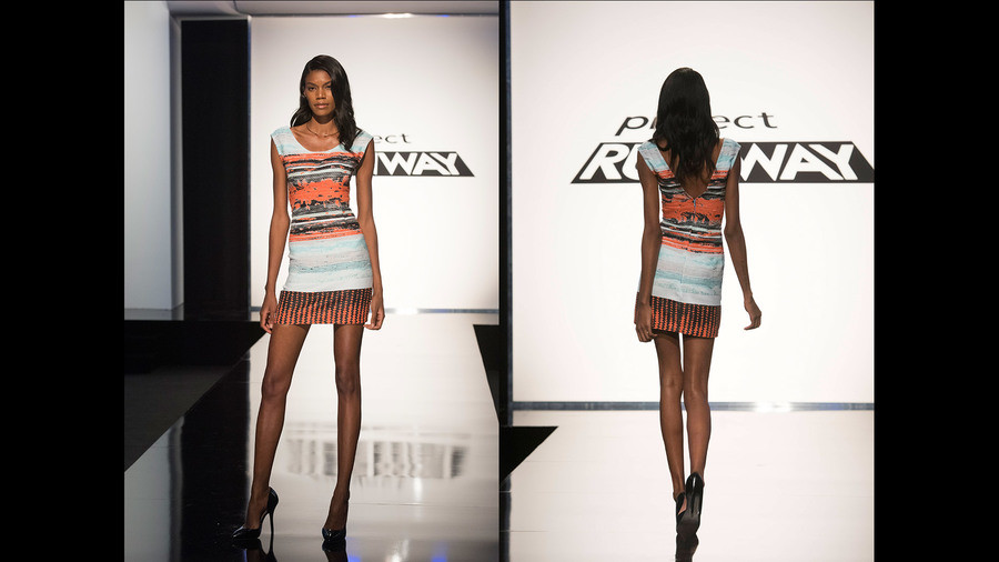 My Bottom 3: 1. Tasha Henderson Tasha fell into the ever-present “streetwear-designers-can’t-go-outside-their-box” trap this week. She was so caught up with making a traditional cocktail dress that she made a really basic dress and threw a sparkle belt on it, and anytime you throw a sparkle belt on your look, you’re doomed. And no one said she had to make a dress! She could have gone Kelly Dempsey’s route and made a cool jumpsuit, she could have stuck to her roots and made a slouchy, sporty dress. But she didn’t, and as much as I love Tasha’s personality and wish she could have stayed in the competition for longer, she deserved to go home for this. 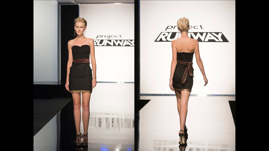 2. Dexter Simmons I know Dexter had immunity and couldn’t be sent home, but I wish they could have broken the rules and sent him home anyway. Tube dresses do not show the world that you can design clothes, and they’re a big no-no for Project Runway in the first place. Then he added freaking FRINGE to it. I love fringe. Fringe is fantastic. I even liked when Dexter used fringe in the black light challenge. But this cocktail fringe situation just looks like a bad haircut. I’ve said it before and I’ll say it again: if you can’t do fringe like Sean Kelly, don’t do fringe at all. 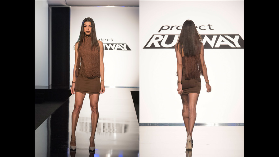 3. Mah-Jing Wong Mah-Jing’s inspiration was pretty weird (condensation on cocktail glasses? ummm...) and his lack of success in executing his inspiration led to him having to create a new look halfway through the design period. As much as I’d like to excuse his final look because he made it in a few hours, the taste level was startlingly bad. The fabric choice was horrendous, the sweetheart neckline was too exaggerated, the slit made it unwearable, the illusion top was rumpled weird, and the overall fit and construction was dreadful. I would say it looked like a $20 homecoming dress, but that would be an insult to $20 homecoming dresses. 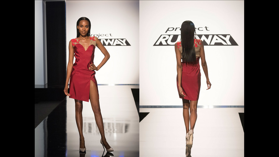 Honestly, now that we've established that most of the designers can't make swimwear OR cocktail attire, I'd like us to speed the process along and just eliminate, like, five designers at a time. Is that cool? No? Okay. Let's buckle up. All photos from www.mylifetime.com ...this is going to be a rough ride, kids. If you saw the episode, YOU KNOW WHY. THE CHALLENGE: In a team of 6, design a 4-piece collection to pitch to a group of "investors" (who happen to be Heidi, Zac, and Nina) who will give you the money to spend on your collection based on how well they like your pitch. The collection would be accompanied by customized makeup looks from Mary Kay. 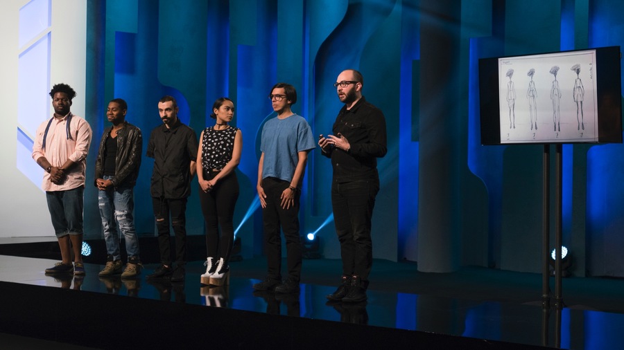 "Team Unity," comprised of Mah-Jing, Cornelius, Ric, Nathalia, Roberi, and Alex, pitched an elevated line of work-wear for the woman who wants quality and detail but also wants a mid-range price point. Because Alex owns a business and has pitched in professional settings before, he gave the team pitch and, in my opinion, did a PHENOMENAL job. He sounded like he knew exactly what he was doing, he had answers to every one of the questions from the "investors," and they definitely would have had my money. 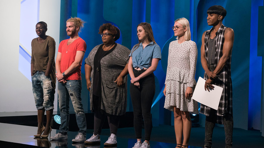 "Team Button Bag," which featured Laurence, Brik, Tasha, Jenni, Erin, and Dexter, was quite clearly a team of misfits. As a group of creative artists, they each were coming at the pitch from their own aesthetics and weren't committed to cohesion at all. In the end, they also pitched work-wear to the "investors," but their angle was to create a work-wear line for the woman who is edgy and doesn't work in a traditional office setting. I thought their pitch was a mess, but in the end they ended up getting the majority of the money ($2,200!) leaving "Team Unity" with only $800 to work with. "Team Button Bag" definitely didn't use their money wisely. They invested in a lot of embellishment that they didn't end up using and some quirky yellow fabric that only fit Erin's aesthetic. The first look was their "work suit," which was supposed to be edgy because it was high-end denim, but at the end of the day, if the embellishments weren't on the sleeves and the ankles, this suit would be nothing. They sketched an asymmetrical jacket, which is not what they made, and I've definitely already seen similar suits like this on the market. 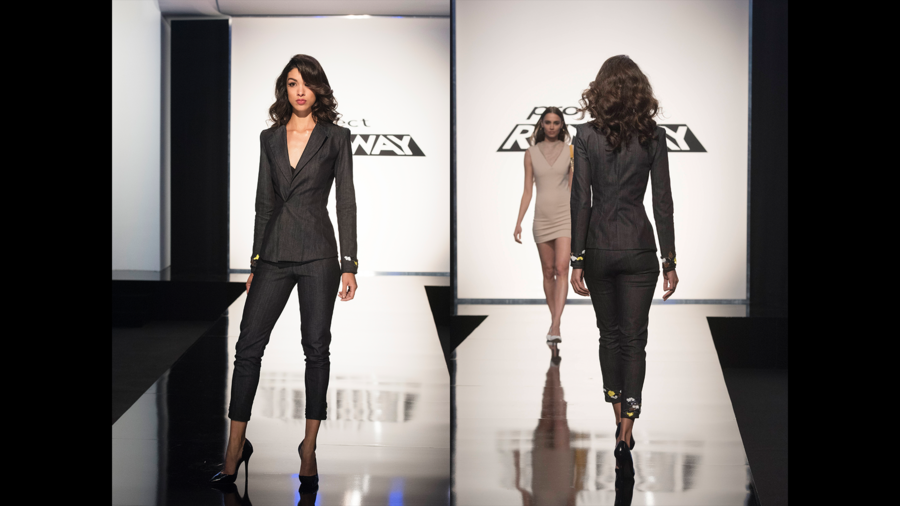 Then Brik made this way-too-short-for-any-work-environment dress. The fur around the collar made it just plain weird, and the color and cut was completely unflattering. 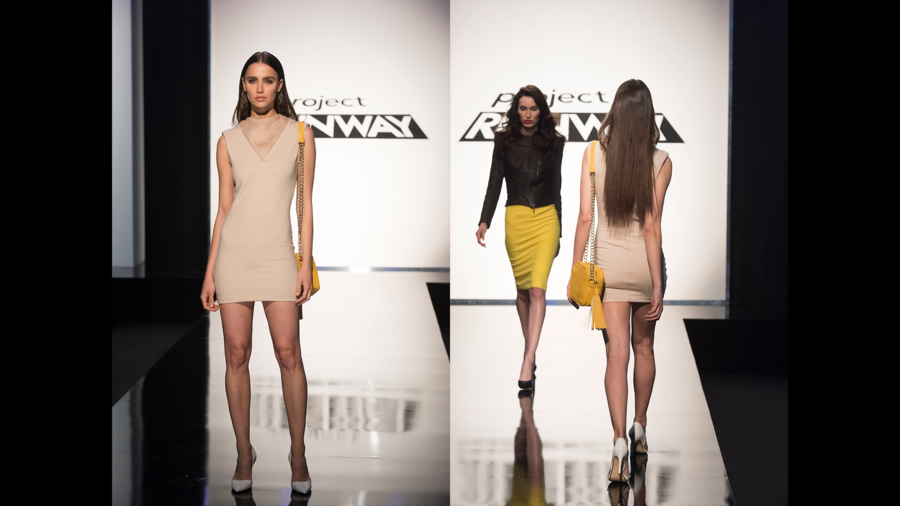 The third look was solely in the collection so Laurence could make her signature leather jacket. Did her leather jacket look phenomenal? Of course. Did it go with any of the other looks in the collection? Nope. It might have actually been acceptable over Brik's dress or with a denim skirt to match the suit, but instead they created this bumblebee costume. 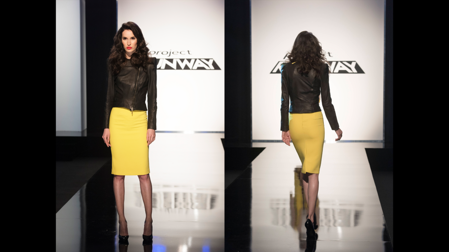 Then Erin made this lovely coat; it's a little weird, but it worked and I enjoyed it. HOWEVER. If you watched the episode, you know that they threw together the look under the coat in about 5 minutes, and it was horribly executed; there's a reason the model didn't take the coat off. 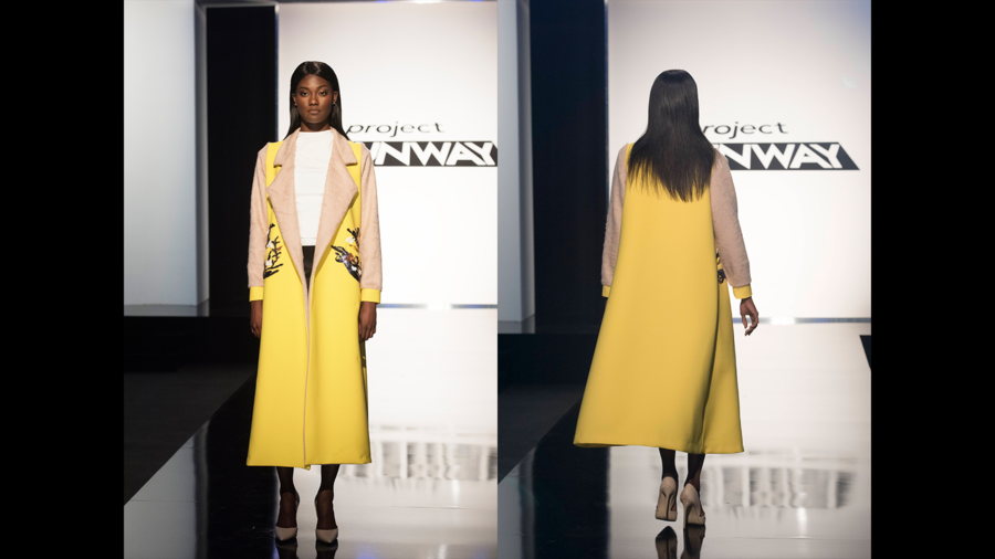 Other than color cohesion, the four looks were disjointed. "Team Unity" decided, per the judges' critique, to elevate their fabrics to create a line that could translate from work into an evening soiree. Their first look was a sculptural dress with a printed crop jacket. While the dress wasn't the most work-appropriate, the jacket was excellent. 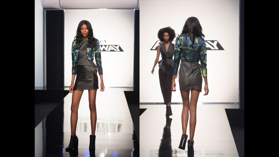 The second look featured a structured vest by Mah-Jing. I enjoyed the juxtaposition of the fit in the vest to the looseness of the pants, and I think it would fit very well into the Marie Claire market. This was by far the most work appropriate, and a favorite of the judges. 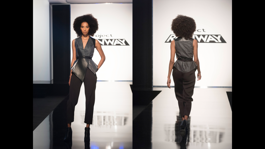 Things started to go a bit downhill from here. I personally adore the pants and the coat, but they probably shouldn't have been paired together, and Roberi's top with the wonky hemline wasn't appropriate for the collection or with the outfit as a whole. 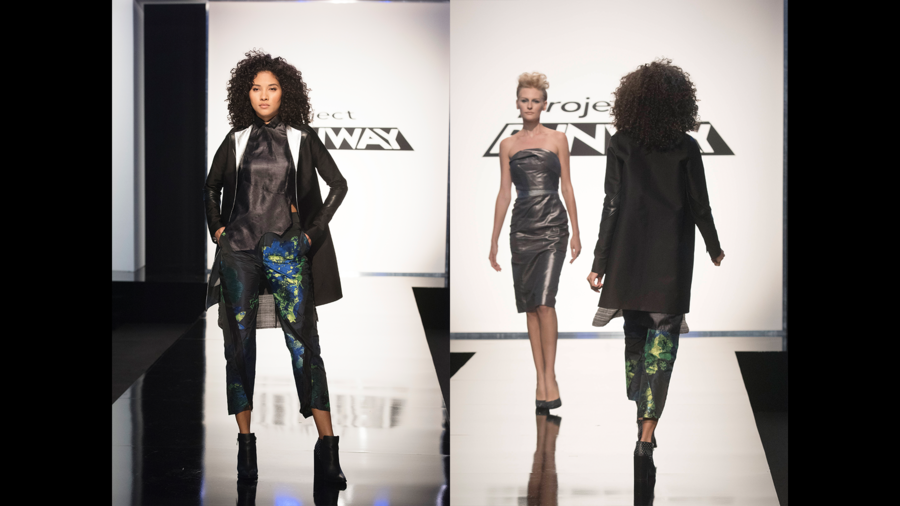 Alex's dress looked wonderful from the front, but the back had construction issues, and while I understood their desire to take their collection into a work-to-evening direction, this wouldn't be appropriate for many work environments. 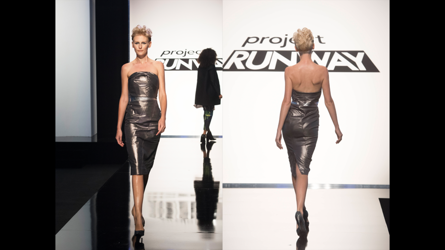 The judges thought that "Team Unity" over-designed their collection and thought the color palette was dark and too formal/evening. I understood some of their criticism, but "Team Button Bag" had more issues with cohesion and construction. I was stunned when "Team Unity" was put in the bottom, and even more upset when the team was forced to pick someone to send home. They worked together so well as a team and it was obvious in the workroom that their collection was a true collaboration. Even ego-monster Cornelius was bawling his eyes out on the runway when it came time to decide who should go home. In the end, since Alex made the pitch and took the lead in the design aesthetic, he took responsibility for the team's failings and sacrificed himself for the others. The judges sent him home, and on his way out he told his team members to have integrity. WHO IS THIS SAINT AND WHY HAS HE NEVER BEEN ON PROJECT RUNWAY BEFORE?!? Every team challenge winds up with everyone fighting and someone getting thrown under the bus. I was so proud of all the contestants for owning what they made and sticking up for each other. And now I'm crying again.  So this post is dedicated to ALEX. You may have been sent home, but you were the winner in all our hearts. ...yes, I know how sappy that was. No, I will not apologize for it. All photos from www.mylifetime.com THE CHALLENGE: Create a textile design to feature on a swimsuit and a cover-up for Heidi Klum’s swimwear line. 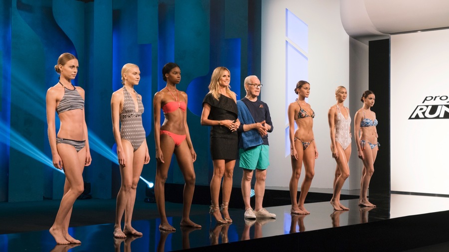 I was shocked at how many of the designers totally fell apart in this challenge. There were a lot of poorly made, ill-fitting looks walking down the runway; if you've never made a swimsuit before I can understand a bit of a struggle since swimwear fabric is difficult to work with and proportions can be confusing, but it's not like these people have never seen a swimsuit before. Then there's the matter of the prints - there were a lot of crappy, crappy prints. Taste level was definitely called into question, and a lot of the designers will have to redeem themselves next week. My Top 3: 1. Roberi Parra I was SO hoping Roberi would win this challenge! I don’t think his print really fit with Heidi’s line, so in that way I understand why he couldn’t win, but it was definitely the most flattering suit on the runway and his styling was flawless. I want Anthropologie to pick him up for next summer’s swim line because I WANT THIS. 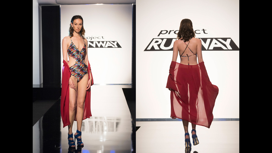 2. Rik Villa I was thrilled that Rik was able to redeem himself after last week’s horror show. I’m not 100% into the neckline (I mean, can you picture those tan lines?) but his print is graphic and unique, and I loved the ease and transformative power of his cover-up. 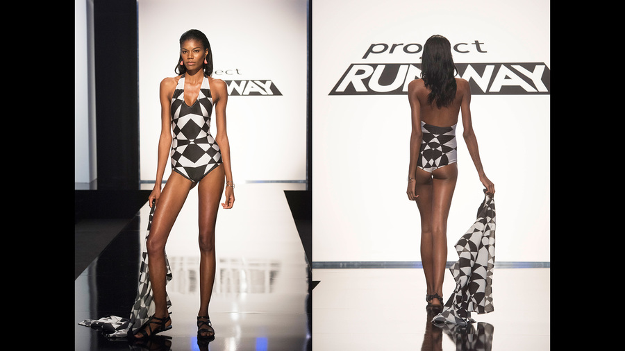 3. Nathalia JMag Nathalia’s print was really lovely, and her bikini proportions were the best in the bunch. The cut of the top was proportional to the waistline of the bottoms, and her cover-up was beachy and beautiful. The smaller scale of her print made it workable for the suit and the cover-up, since it wasn’t so overwhelming, and overall it was a really successful look. 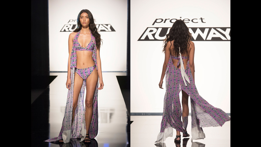 My Bottom 3: 1. Sarah Donofrino You all know how I’ve felt about Sarah’s looks this season. She’s created nothing but basic and boring looks, and while a novelty print swimsuit can be cute in the right context, the cut of her suit didn’t work with the print and her cover-up was childish and poorly made. I’m glad she’s out of the way so the real designers can compete. 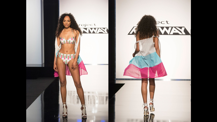 2. Jenni Riccetti The fact that Jenni ever thought her print would work as a swimsuit simply baffles me; the scale of the design is WAY too large and the color (even if it had been what she saw on the computer screen) read WAY too junior. Her cover-up was like a weird skirt-cape, and the fact that she liked it and defended it makes me worry about her taste level. 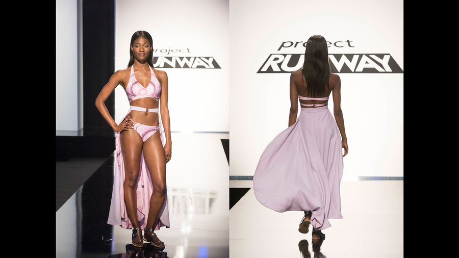 3. Cornelius Ortiz I was pissed at Cornelius' pompous vanity last week, but this week he pulled a 360 and adopted a completely defeatist attitude. I can't count the number of times he said "I just can't do this," after last week when he basically claimed to be the be-all and end-all of fashion design humanity. Gotta love when someone's ego can be brought down to earth. But really, his print was hideous, the proportions of his suit were weird, and his cover-up was basically a black bed sheet wrapped around his model's waist. Not good. 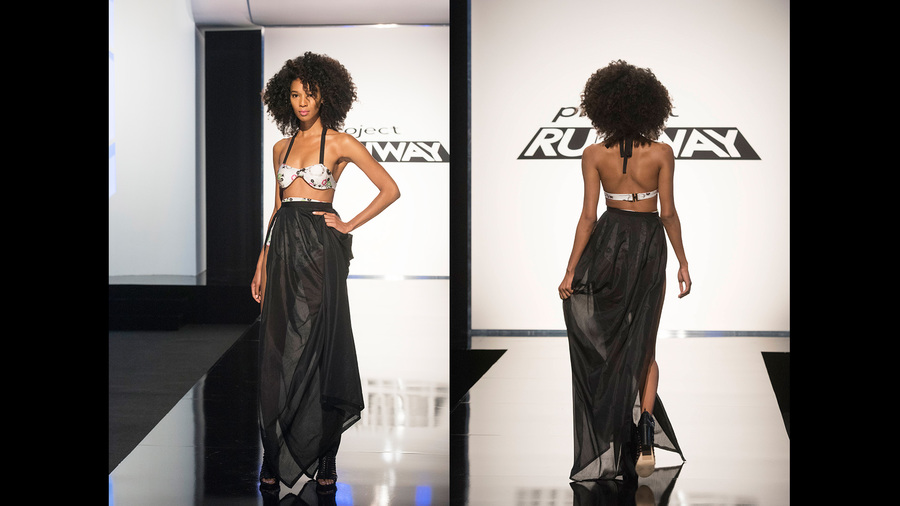 Overall, it was kind of a disappointing episode - nothing makes you lose confidence in your favorite designers like a swimwear or a lingerie challenge! I'm hoping for better things next Thursday. All photos from www.mylifetime.com THE CHALLENGE: Create a day-to-night look that's impactful in daylight and under a black light, inspired by Transitions lenses. This was definitely a fun challenge and put the designer's artistic creativity to the test, but also a little weird that Transitions lenses decided to sponsor the challenge...who has Transitions anymore?  My Top 3: 1. Erin Robertson Erin was the obvious winner. I can’t get over how the three looks she has created this season are so different, and yet you can tell they came from the same designer and her aesthetic is the strongest of the bunch. I loved her fabric choice and her ability to create such a beautiful textile in one day is remarkable. With a little more lining I would definitely wear it. SO GOOD. 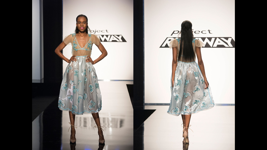 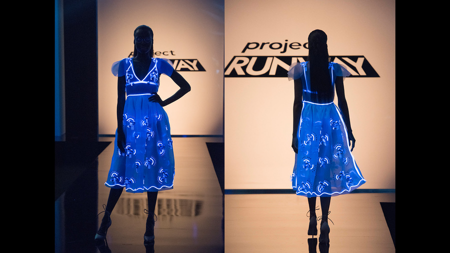 2. Dexter Simmons I haven’t been a huge fan of Dexter’s work so far, but this was a stand-out look for the challenge and I can’t believe it was only safe. His all-white look had great runway impact in the natural light, but he managed to get some of the white to read negative in the black light, which allowed for really unique contrast. He showed the best use of fringe that I've seen since Sean Kelly, and I'm interested to see what he'll design in the coming weeks. 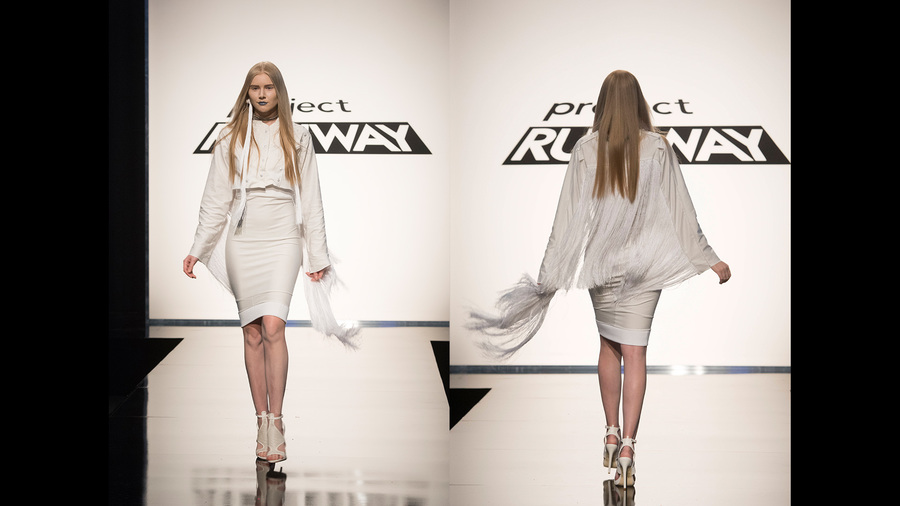 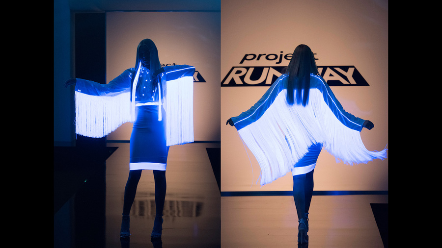 3. Roberi Parra Tim Gunn always says that a challenge is won or lost at Mood, and Roberi made one of the best fabric choices of the bunch. The effect that the fabric distress had under the black light was remarkable, and while it all may have been a happy accident, sometimes the best designs aren't what you meant to create. I'm into Roberi's ethereal aesthetic, and I'd love to see him make it to Fashion Week. 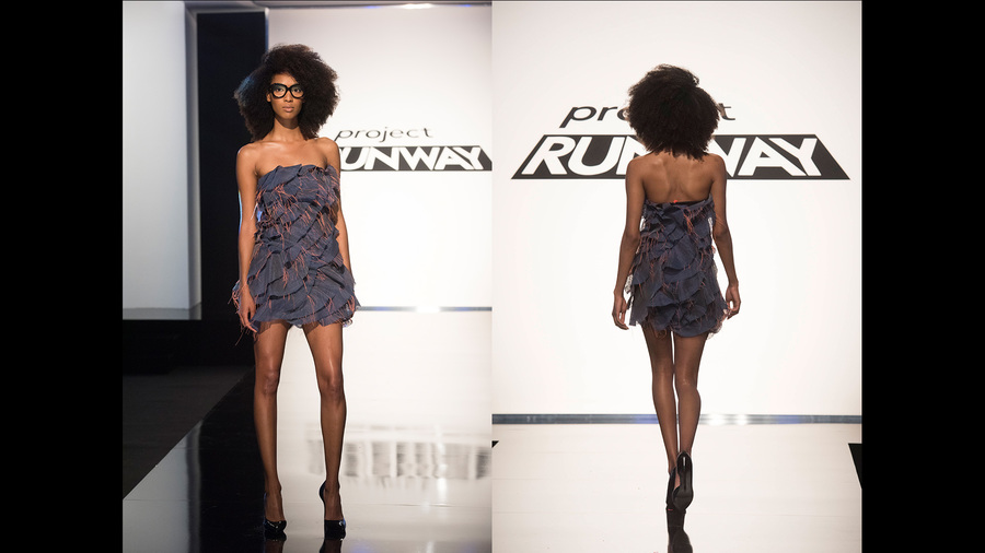 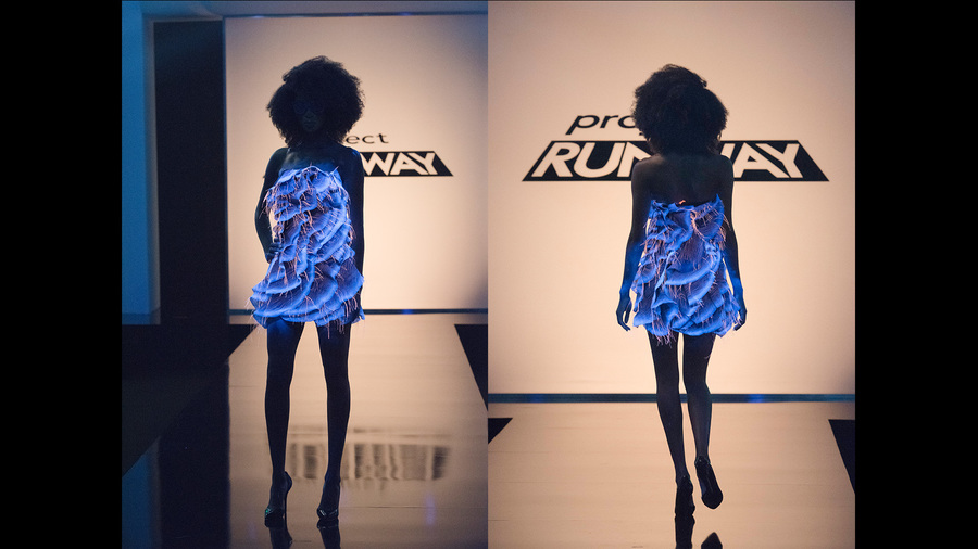 Honorable Mention: Cornelius Ortiz The transformative nature of this dress from daylight to black light was impressive, and the emoji concept was culturally relevant and cute. THAT SAID. Cornelius is really lucky I'm giving him an honorable mention because his attitude is crap, his ego is DOUBLE CRAP, and I want someone to bring him down to earth and tell him that he's not the be-all and end-all of the world. I mean, he said that Erin's look was just a box-pleat dress with "stuff" glued on it. GET REAL. Your dress is just a shift dress that you taped and spray painted. You are not the most talented designer in the universe. He gets an honorable mention because the design was good, but he's on my very. last. nerve. 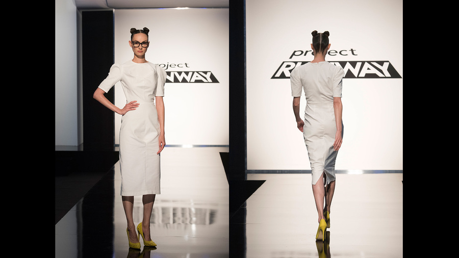 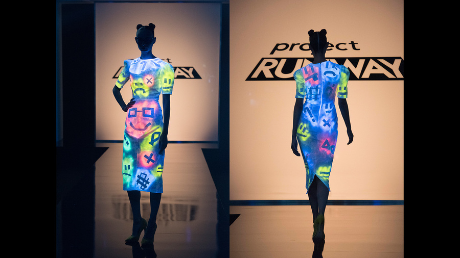 My Bottom 3: 1. Kimber Richardson While I didn't think Kimber's look was the absolute worst last week, it wasn't the best either, and after two not-so-successful looks in a row, I was fine with her going home. This dress was pretty average under the normal light, and in the black light it just didn't do anything, so she completely missed the mark of the challenge. At the end of the day, her design aesthetic simply isn't up to the level of competition. 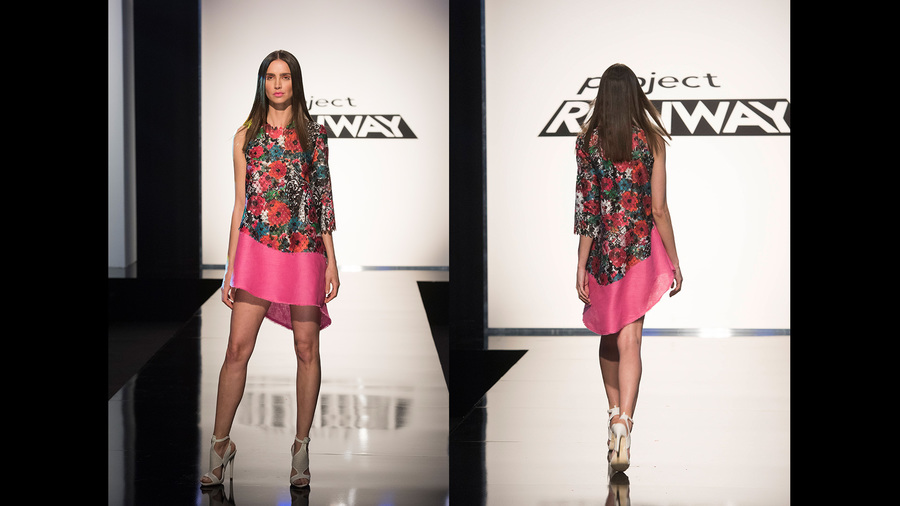 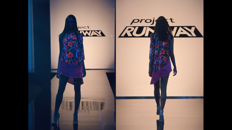 2. Rik Villa The judges were right to put him in the bottom for this 80's raver nightmare. I think that's really all that needs to be said. 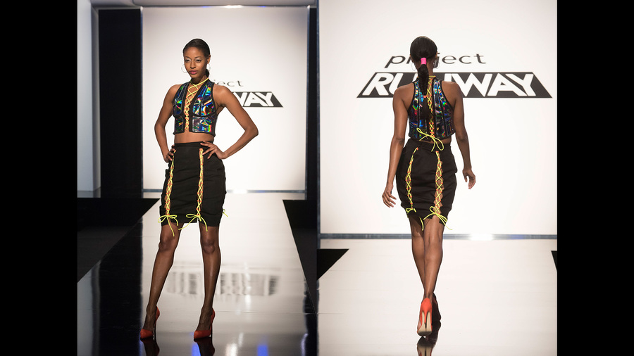 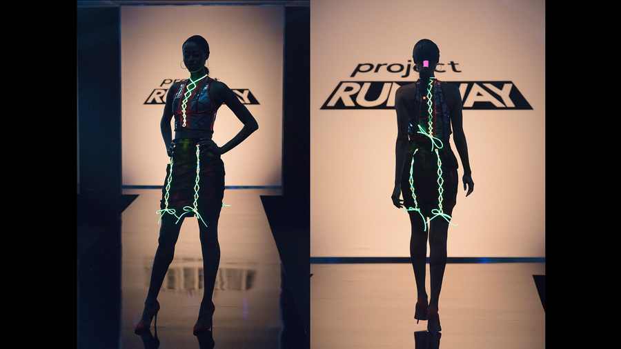 3. Sarah Donofrino I am so unbelievably bored by Sarah's looks. This definitely wasn't the worst look of the week, but I've had her in the bottom each week because her looks are SO FREAKING BASIC, and while I'm all about quirky vintage ModCloth style, her skill level simply isn't up to par with everyone else, and since she's clearly not going to win the competition I don't know why we're bothering with keeping her around. 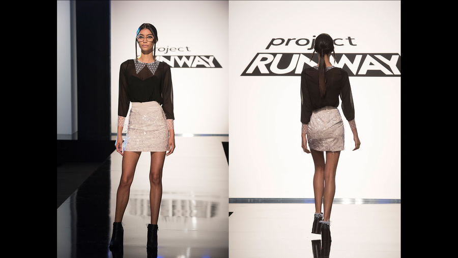 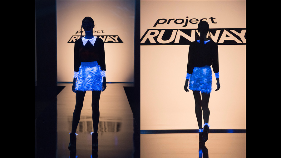 But let's give Erin another CONGRATULATIONS! Quite honestly, I'd be fine with skipping ahead and just declaring her the winner of the whole competition, because at this point, no one can hold a candle to her. Is that possible? Can we just have a super short season? No? Okay.  All photos from www.mylifetime.com THE CHALLENGE: Create a look for the everyday woman (every age, every size) that can be reproduced and sold on justfab.com. I had a few issues with how the designers handled this challenge: 1. Most of the designers had no concept of what "can be reproduced" means. If you add a thousand intricate design details, it can't be reproduced. Duh. 2. Most of the designers had no concept of what "sold on justfab.com" means. If you're selling to an online market, it has to stand out on the website. The runway was an ocean of grey, black, and beige, and very few of them used any color, which always sells better online. 3. Most of the designers had no concept of who the "everyday woman" is. Mini skirts, crop tops, and drop crotches are generally not what the everyday woman is looking for. I think things would have gone better if the designers had been required to use "everyday women" as their models, because having the opportunity to ask them questions and find out what they actually wanted to wear and to buy could have been helpful. BUT NO ONE ASKED ME, DID THEY. I'm telling you, Project Runway should hire me as a content consultant. My Top 3: 1. Laurence Basse I definitely think Laurence deserved the challenge win. Jumpsuits are super trendy right now, and hers was basic enough to make it wearable but unique enough to stand out. GOD BLESS HER for adding a little extra room in the hips; as anyone who has a bit of a booty knows, finding a jumpsuit or romper that fits your top and bottom half is a feat of impossible proportions. I love the little pop of color in the back, and overall I think she met the challenge requirements perfectly. 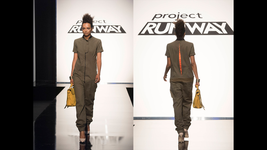 2. Erin Robertson I don't think Erin's look was very reproducible (because really, is the everyday woman going to buy a neoprene bell-skirt dress? Probs not.) That said, I love the color combination, I love that the belt can be snapped in the front or the back to create a stronger waistline, and I love how clear her aesthetic is coming through from challenge to challenge. I really hope she makes it to the top of the entire competition. 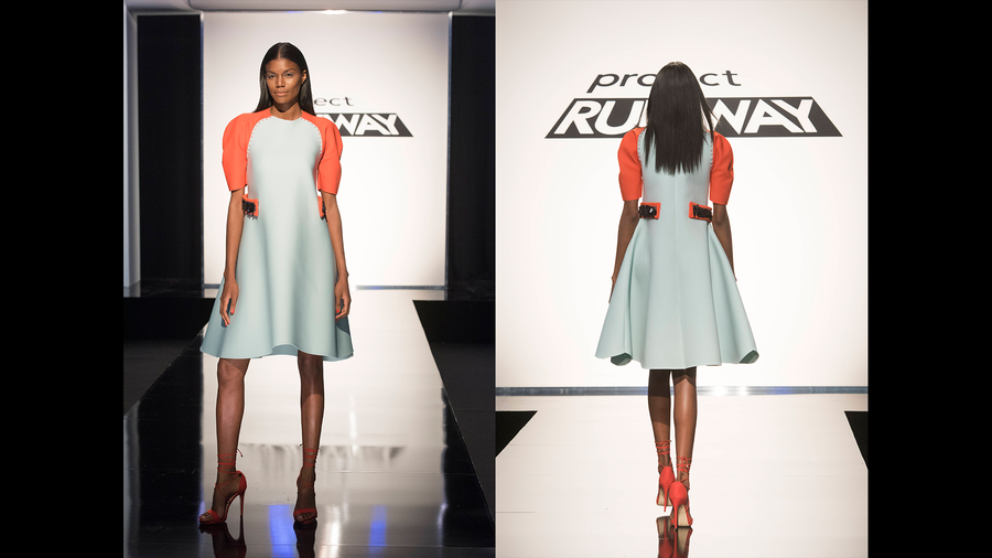 3. Tasha Henderson Going into the competition, Tasha said she designed for girls who weren't girly, and that aesthetic really shows in this dress. I love the sporty vibe with the t-shirt style top and the mesh bottom, and it looks like a dress for girls who don't like wearing dresses (or for girls who do...I love wearing dresses and I'd buy this in a second!) I think she should have styled it with sneakers instead of the pumps, but other than that I have no complaints and I'm excited to see what Tasha does next! 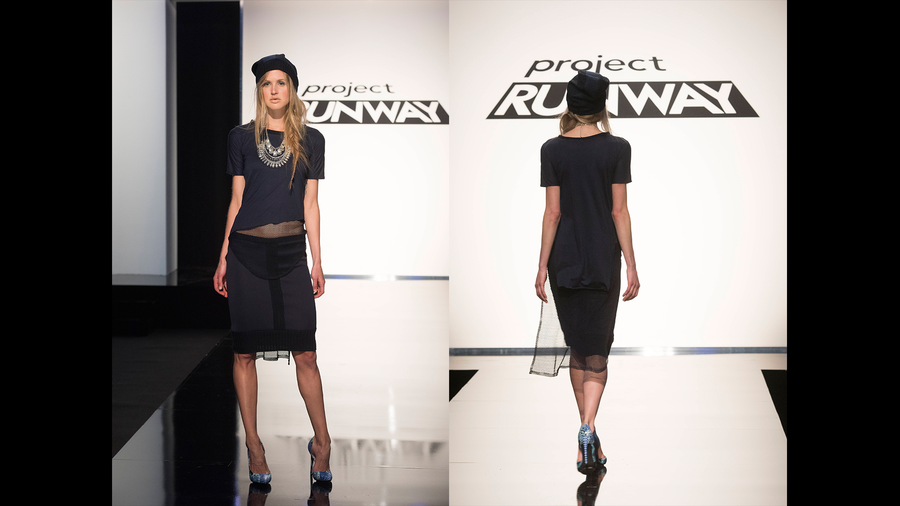 My Bottom 3: 1. Linda Marcus This might be one of the few times I agree with the judges on both the winner and the loser. Knit dresses are awful. Using chiffon or organza or whatever it was for that kimono jacket was even more awful. And to stand up in front of the judges and say that this is a look for someone whose body has changed after having kids? Get real. 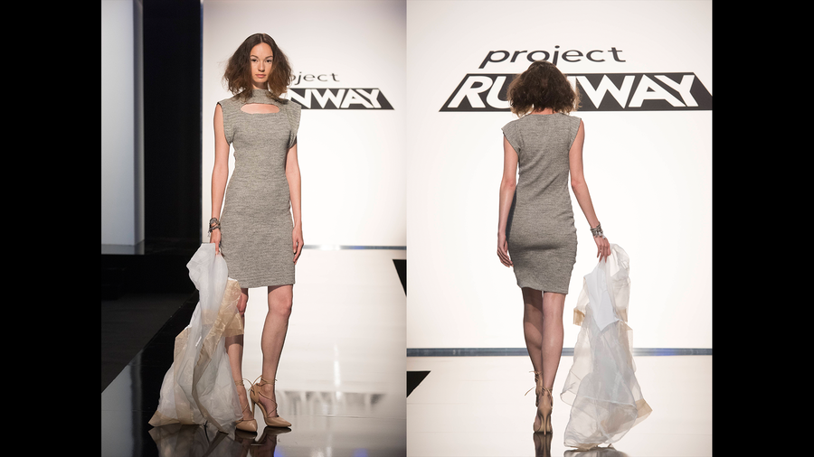 2. Sarah Donofrino I thought Sarah's look last week was basic and boring, and I think the same thing of this. I could get any of her pieces on the clearance rack at Kohl's, and there's nothing wrong with the clearance rack at Kohl's, but if you're designing on Project Runway, your looks have to be more elevated. 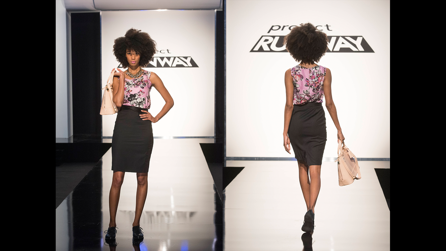 3. Kimber Richardson This look wasn't a bad idea in theory, but Kimber had pretty terrible time management issues and it showed in her construction. She also had an issue recognizing that women with curvier bodies don't want a pant that obviously will emphasize a stomach and a top that obviously will constrict the boobs. I don't know why it's hard to understand that women aren't all the same size. Ugh. 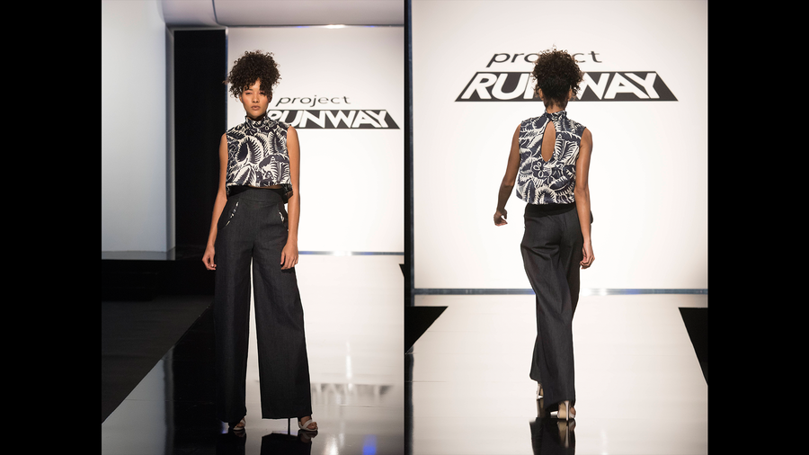 So there were a few hits and a few misses this week. If there ends up being an actual "real woman" challenge I think we might have some trouble, but who knows! Maybe the designers will step it up by then. In the meantime, CONGRATS, Laurence! And congrats to justfab.com for not screwing up the reproduction of Laurence's look as so many retailers have done in previous seasons. If it wasn't sold out in every size (already!) I would totally snap it up.
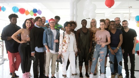
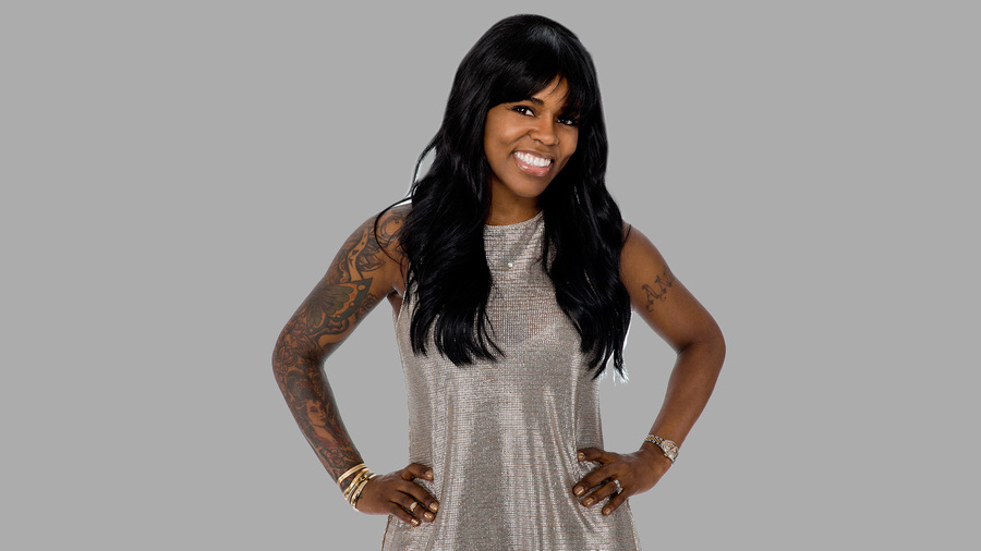
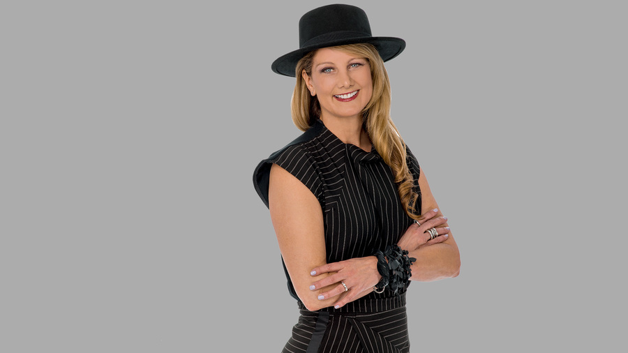
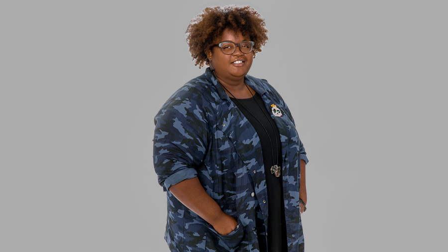
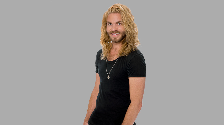
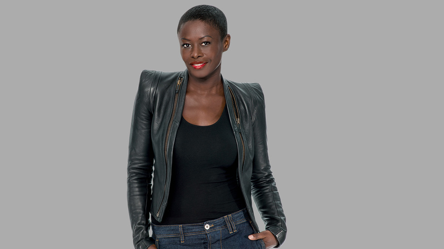
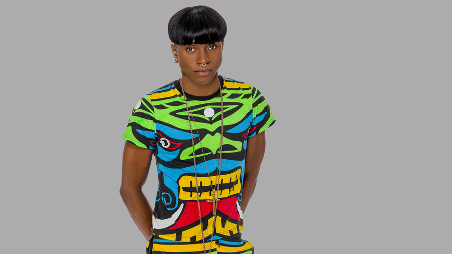
All photos from www.mylifetime.com and www.justfab.com I’ve had the premier of Season 15 of Project Runway marked in my planner for weeks. It looks like this group of designers is extremely talented, and I’m excited to see what’s in store! Let’s meet the designers really quick:
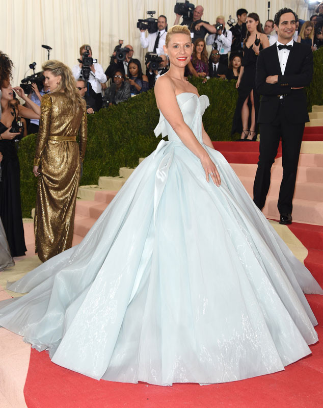
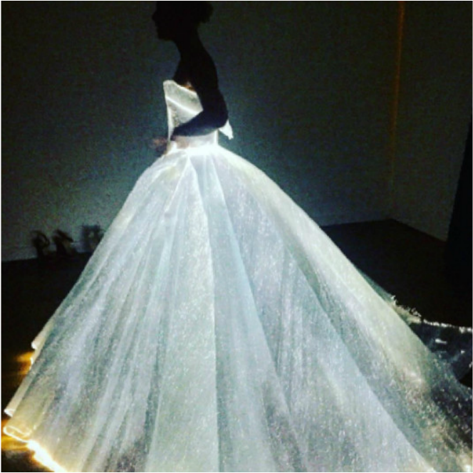
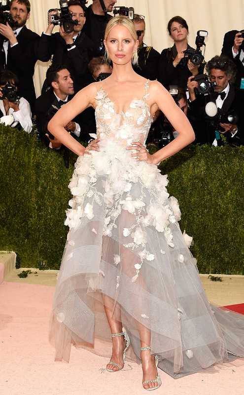
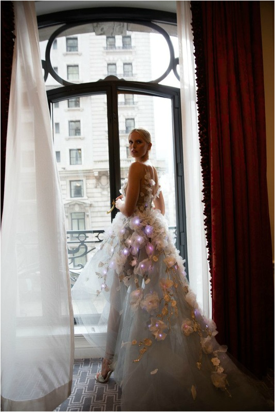
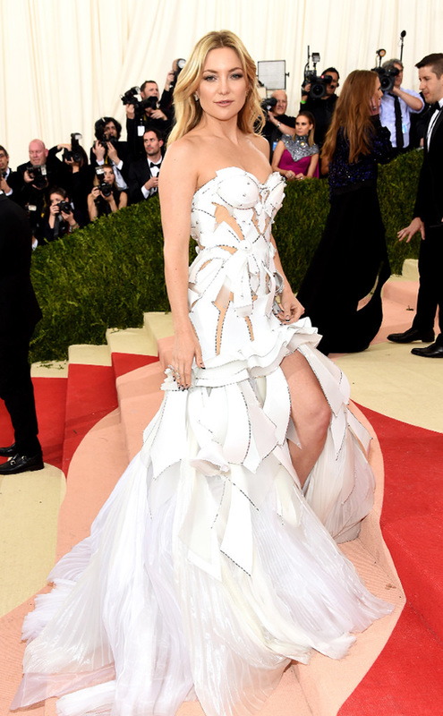
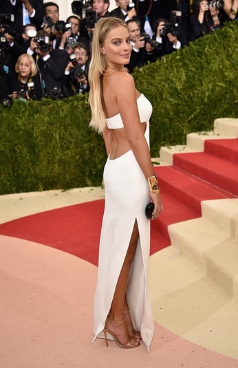
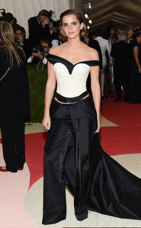
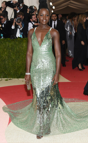
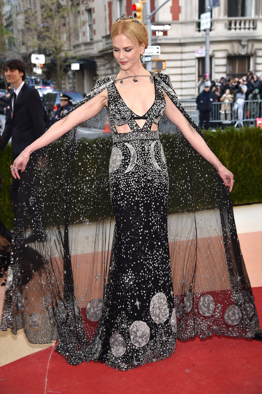
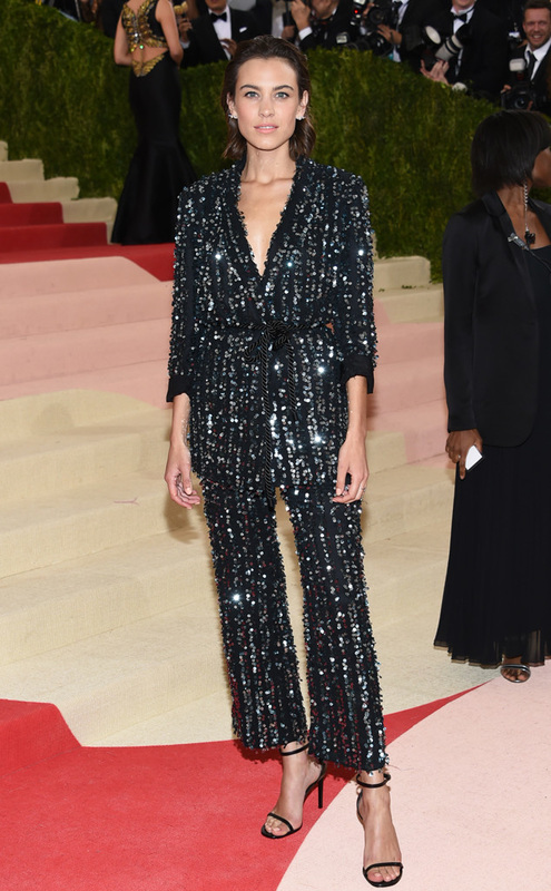
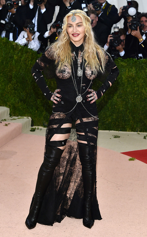
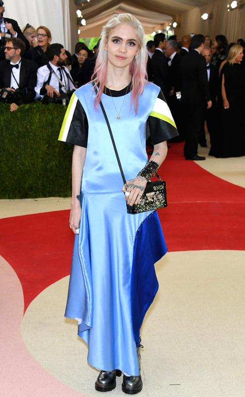
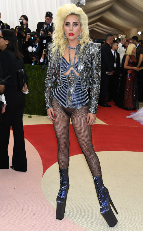
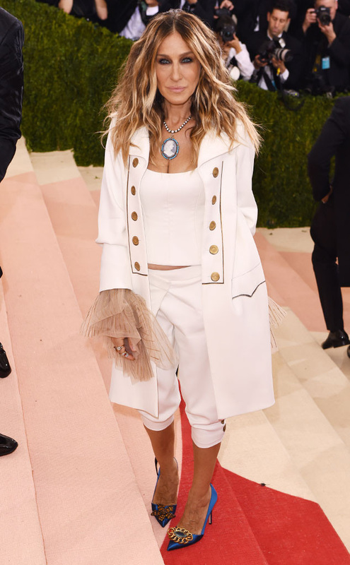
 THE CHALLENGE: Use unconventional materials found in the Season 15 launch party room to create a look that represents your aesthetic. It’s always rough when the designers are forced to do an unconventional challenge right at the beginning of the season, but as far as unconventional materials challenges go, there weren’t any looks that were so bad that they obviously deserved to go home (I’m talking bad, like Emilio’s washer bikini from season 7…still haunting my memories.) Because there are 16 designers I’m not going to go through everyone’s designs, but just as the judges pick their Top 3 and Bottom 3 designers, I will do the same. HERE WE GO. 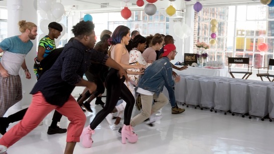 My Top 3: 1. Erin Robertson It was clear in Erin's audition that she liked to use yellow, and obviously, she really likes to use yellow. I was a little concerned for her time management, and she slipped this on her model with less than ten minutes to spare, but I can't argue with her results. This look had major runway impact and her technique was incredible. Definitely a well-deserved win! 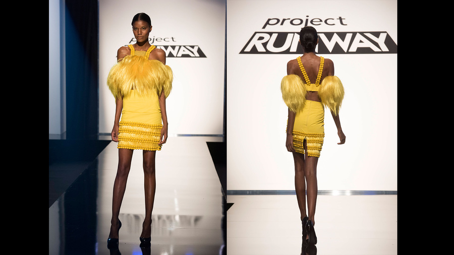 2. Roberi Parra So artistic. I cannot. The fact that Roberi twisted and manipulated paper lanterns to make this look is remarkable, and his on-the-fly creativity will get him far in this competition. I don’t get why half of the judges didn’t like this look, because it’s one of the best uses of unconventional materials I’ve ever seen. 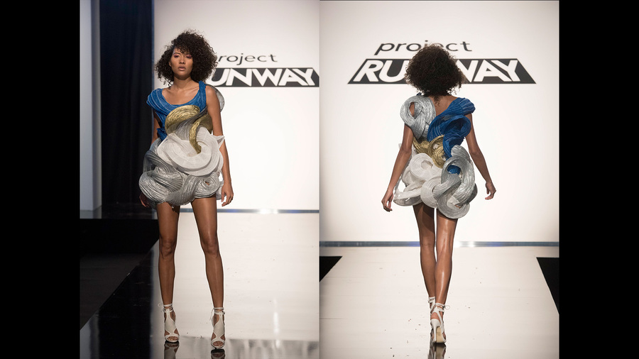 3. Brik Allen Brik almost got sent home for this look, and I don’t think that was very fair. Granted, his styling was off and the bell bottom pants were a little too short. HOWEVER. The judges called his outfit “Lady Gaga meets Disco” as if that was a bad thing…as if Lady Gaga wouldn’t put on those glitter pants and wear them for days. The look might have been seen as more cohesive if he had made glittery hot pants instead of glittery bell bottoms, but I saw where he was going and I appreciated his technique. He made a top out of BASEBALL HATS, for goodness sake. Give the man credit where it’s due. 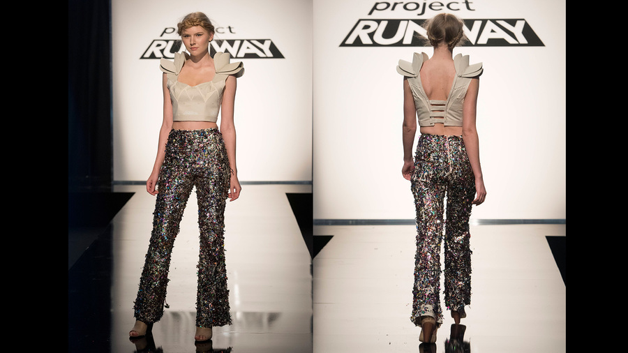 My Bottom: 1. Ian Hargrove Honestly, I don’t think this was the worst look. I didn’t think he really deserved to go home, and I will always want to root for a Chicagoan. But his attitude toward Tim Gunn and the judges? Absolutely not. If Tim Gunn tells you your outfit lacks runway impact, you add more to your outfit. If Zac Posen tells you your outfit was blah on the runway, you don’t argue with him. You can argue when you’re Tim Gunn and Zac Posen, but you aren’t Tim Gunn or Zac Posen yet, which is why you’re on Project Runway and you aren’t already a famous designer. A lack of humility always irritates me to no end, and for that I agree with the judges on sending him home. 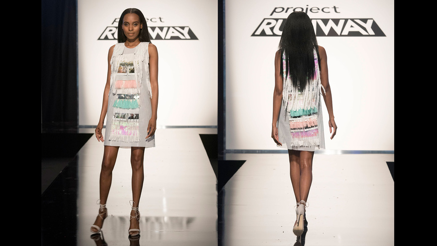 2. Sarah Donofrino The judges voted this look as safe, but it just looked too crafty to me. Maybe she was thrown by the unconventional materials, but it looked like I could have made her outfit with construction paper and hot glue. I don’t think it was up to par with the Project Runway skill set, and she's going to need to step up her design game. 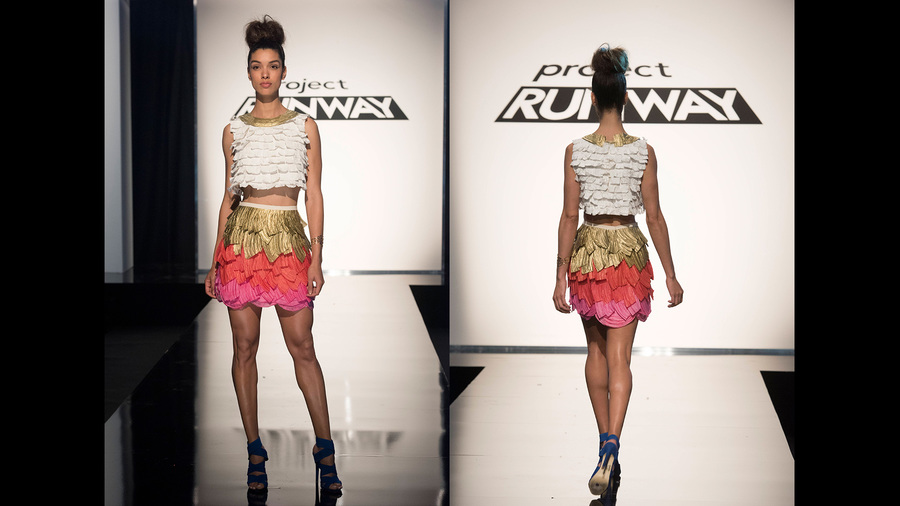 3. Dexter Simmons …how on earth was this voted in the top? IT LOOKS LIKE A NATIVE AMERICAN ABOMINABLE SNOWMAN. This seriously couldn’t be more ridiculous. Sometimes I think the judges must be on the crack pipe. That is all. 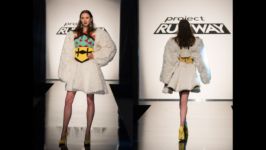 Overall, the show was great, and I'm looking forward to seeing what the designers put forth in the coming weeks. ...and CONGRATS, Erin! You've set the bar pretty high this season. Keep it up!  All photos from www.mylifetime.com I'll be honest, the Met Costume Gala was just not on my radar this year, but thanks to my friend, Lydia, who requested a "best and worst dressed" review before I even knew the Gala was happening, I will gladly provide my feedback. It’s always pretty difficult to determine the “best and the worst” in Met Gala fashion; ridiculousness is expected, and as I said last year, the line between what is good and what is bad is weird and blurry. This year's Gala theme was "Manus x Machina: Fashion in an Age of Technology." It seemed like a lot of guests took that to mean: 1. "Oh, so I can dress like a robot and that will work fine." 2. "So I can just cover myself in sequins and beading? Cool." 3. "Yeah, I have no idea what this theme means so I'm going to wear a totally plain dress and call it a day." 4. "I can wear something off-theme as long as I mention that technology created my outfit," (*cough cough* SARAH JESSICA PARKER.) Overall I thought there were a lot of missed opportunities when it came to the theme, but there were still some clear winners that stood out. Best Tech Dresses
Best Sustainable Looks
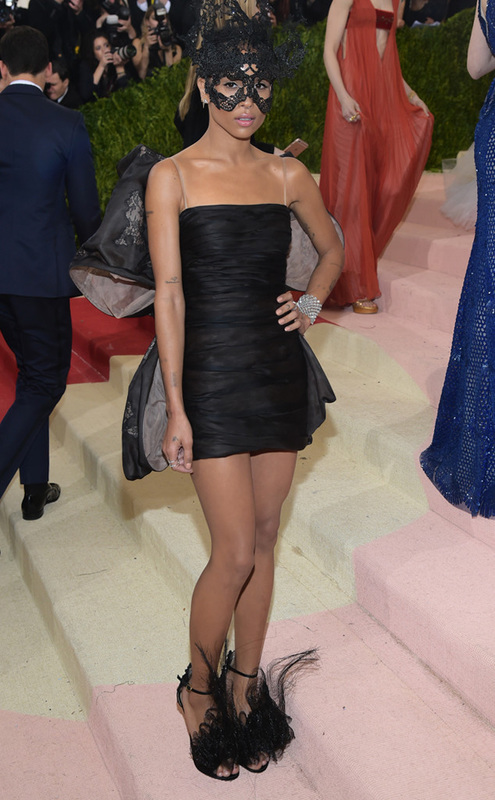
Best Black + Metal
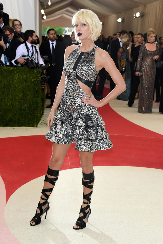
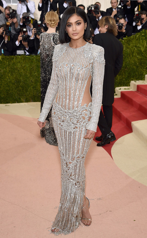
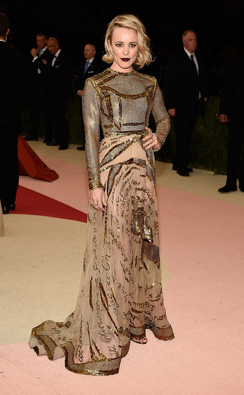
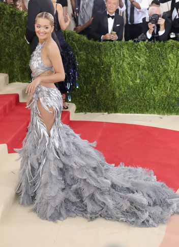
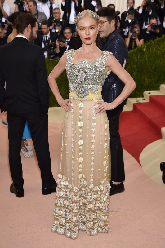
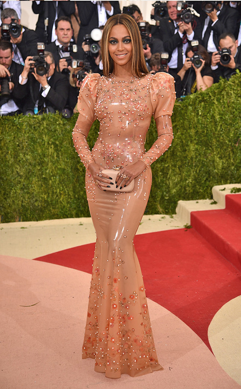
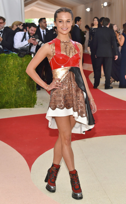
Best Silver and Gold
Best for Last Year's Theme
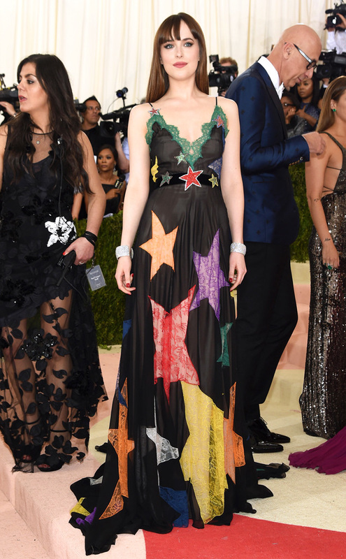
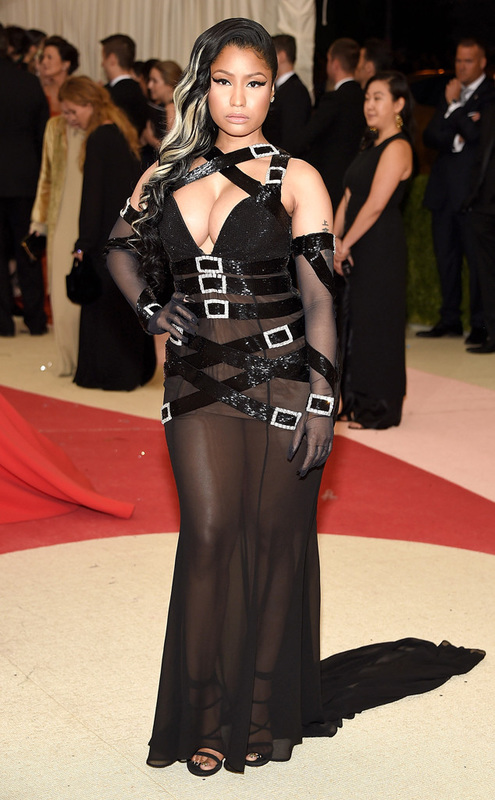
Worst Dressed
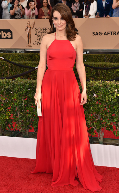
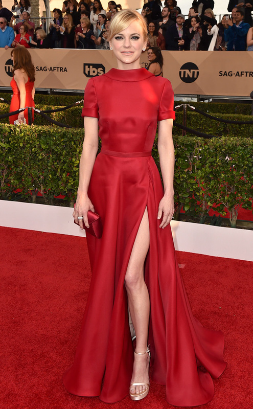
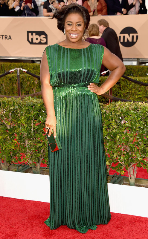
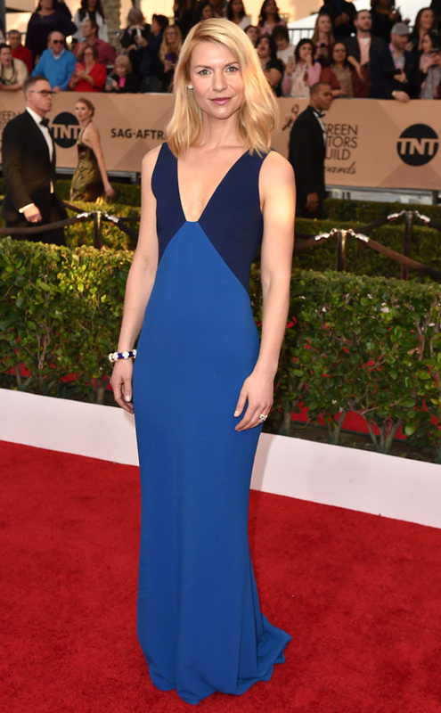
All photos from Eonline, Huffington Post, Vanity Fair, smashd.co, and Upworthy. Between #OscarsSoWhite and #AskHerMore, this year's Oscars were full of controversial happy fun times. But Chris Rock made a great point in his monologue. Not everything is about racism or sexism. Sometimes, it's just about a pretty dress. Best TV Hosts
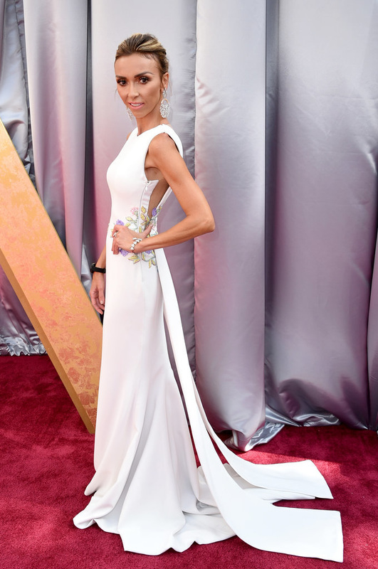
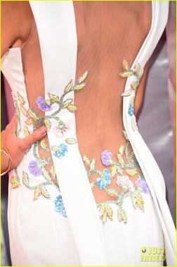
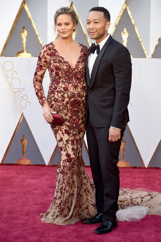
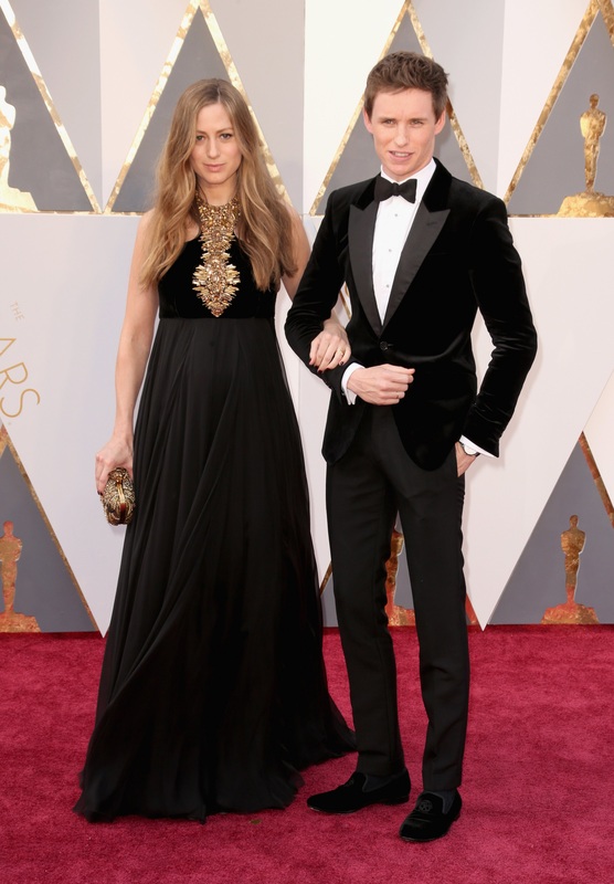
Best Couples
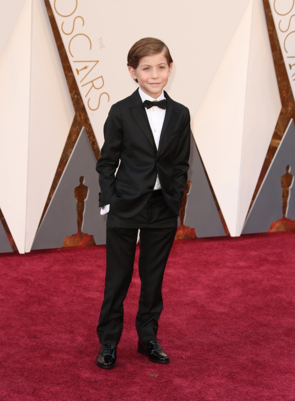
Best Kid
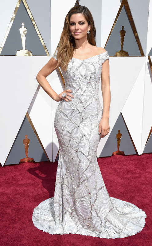
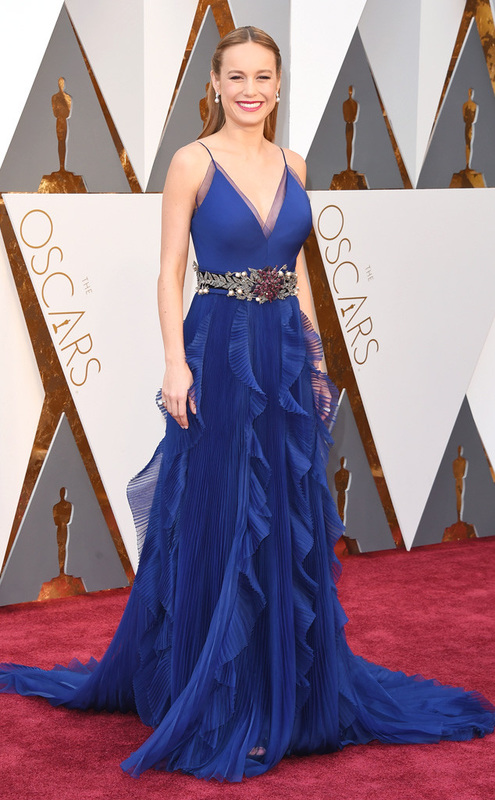
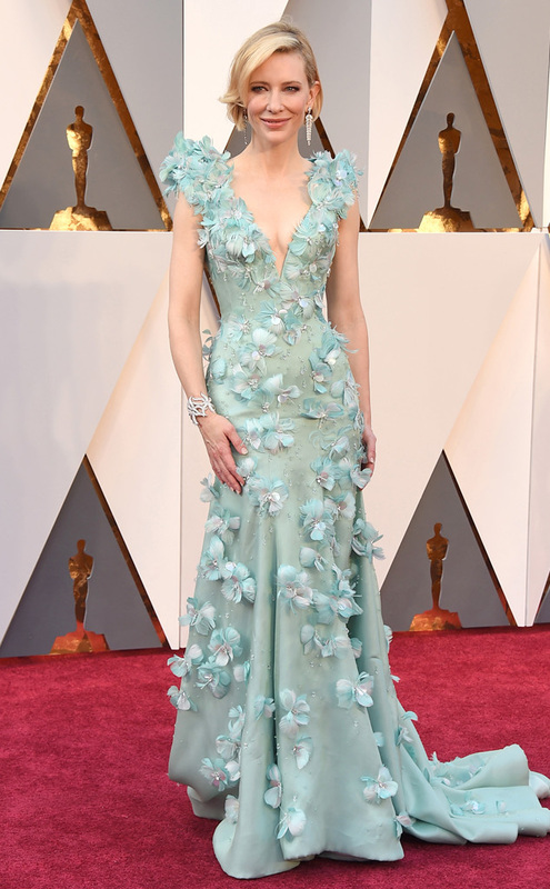
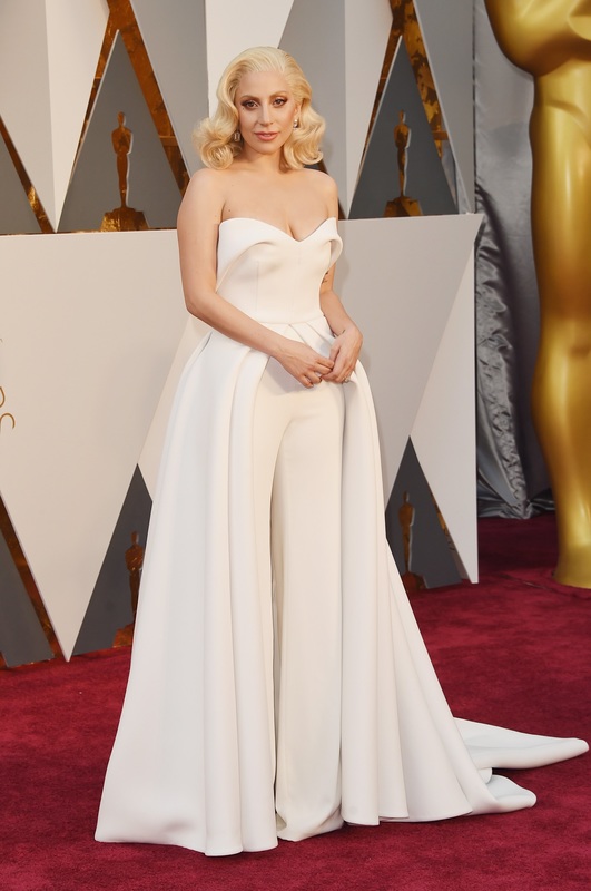
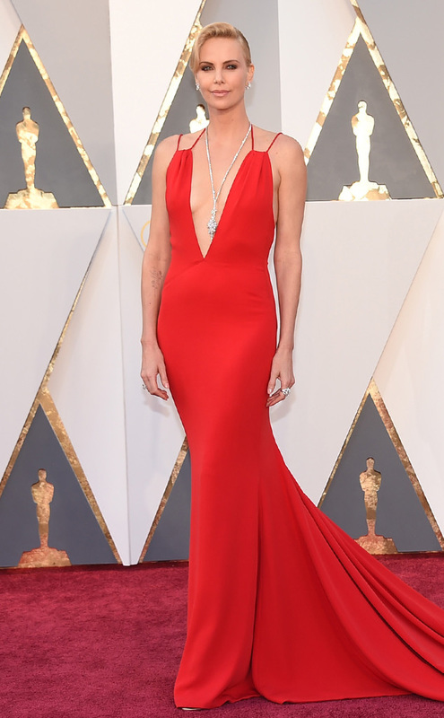
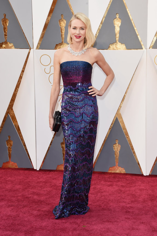
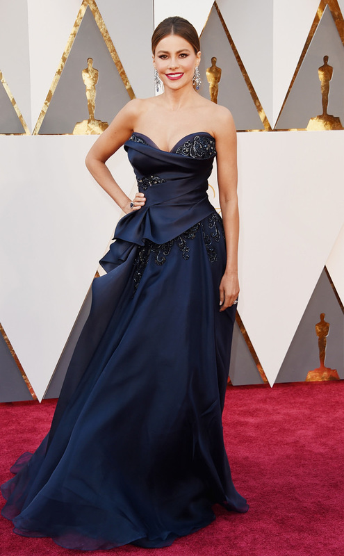
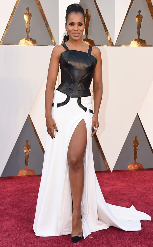
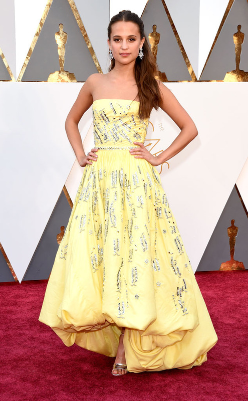
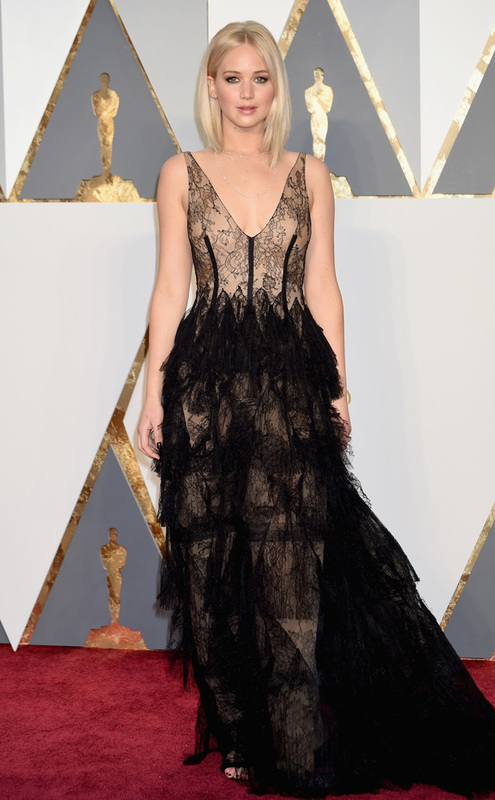
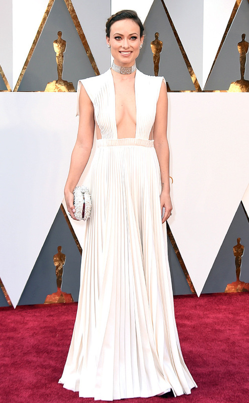
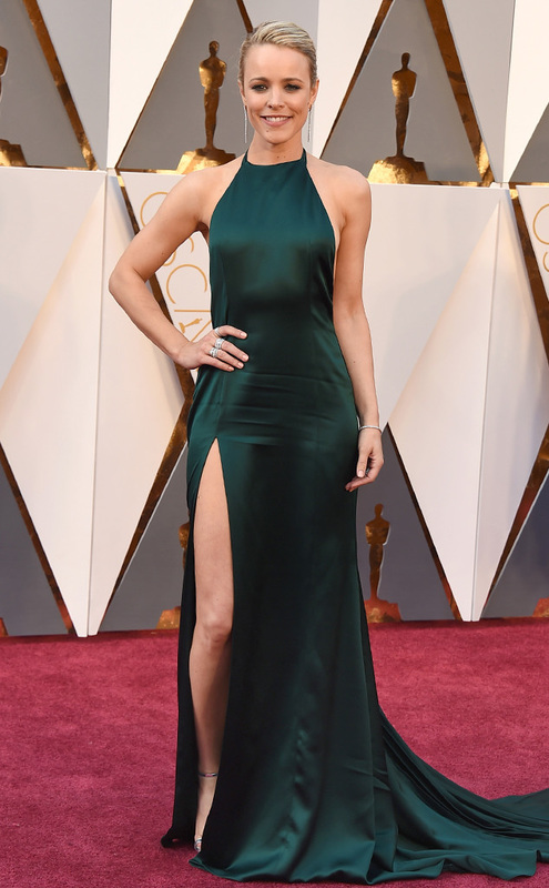
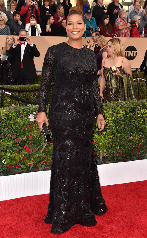
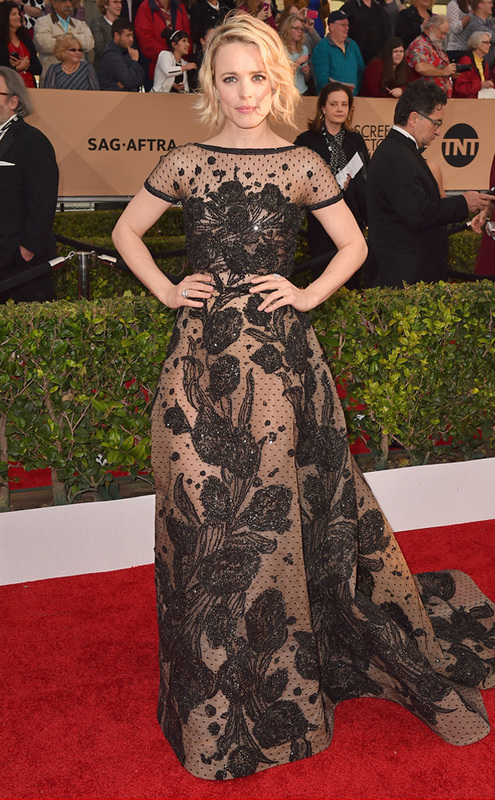
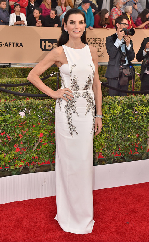
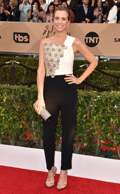
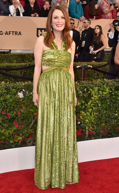
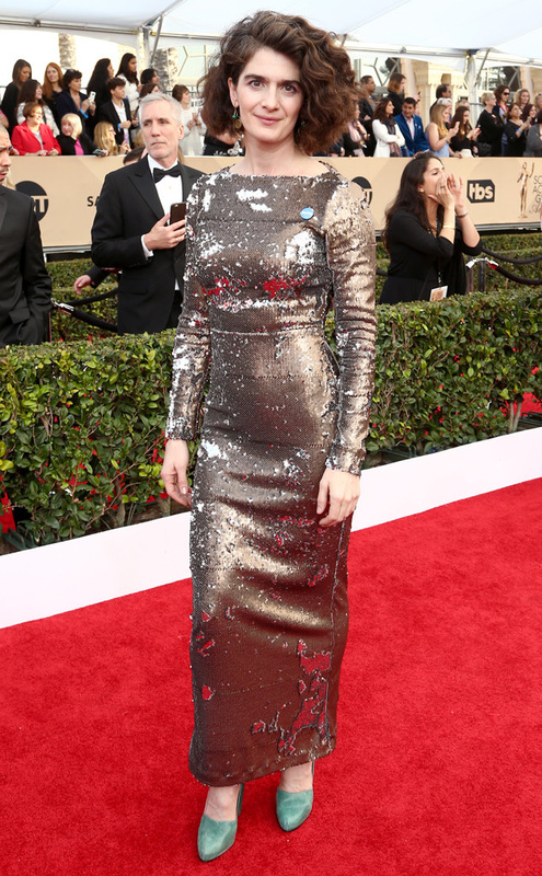
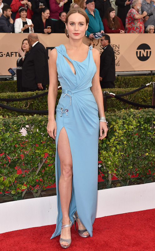
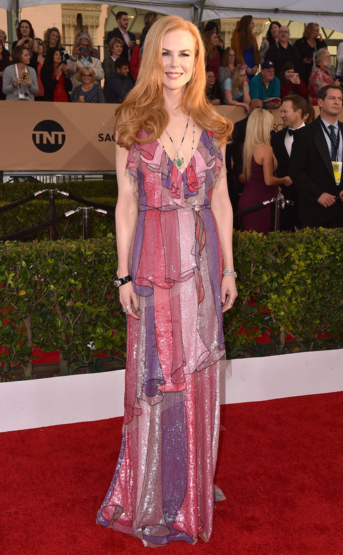
Best Dressed
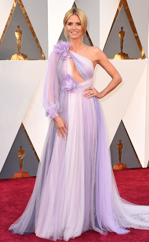
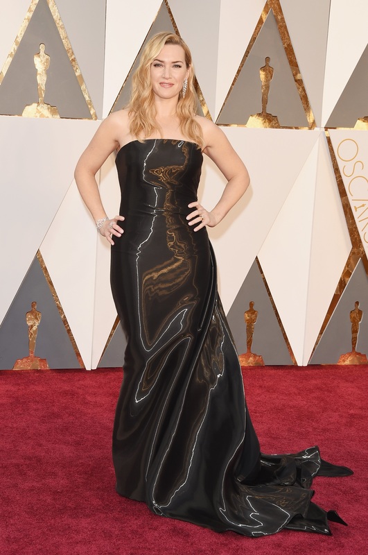
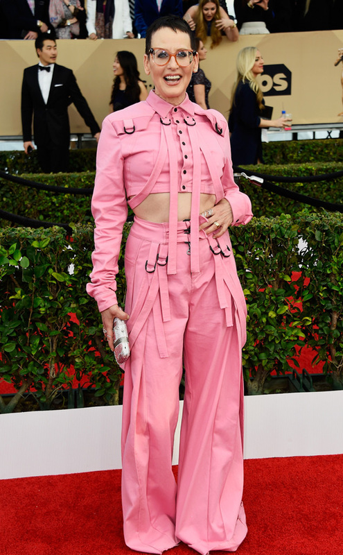
Worst Dressed
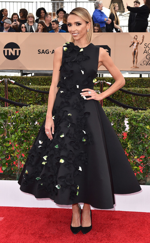
All photos from eonline.com, popsugar.com, justjared.com, and vogue.com Best Black and White
Best Brights
Worst Dressed
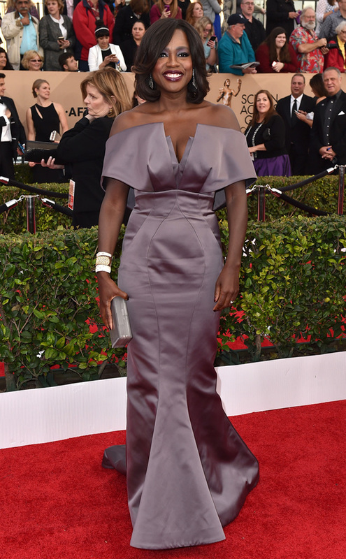
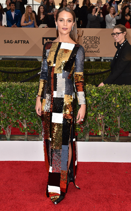
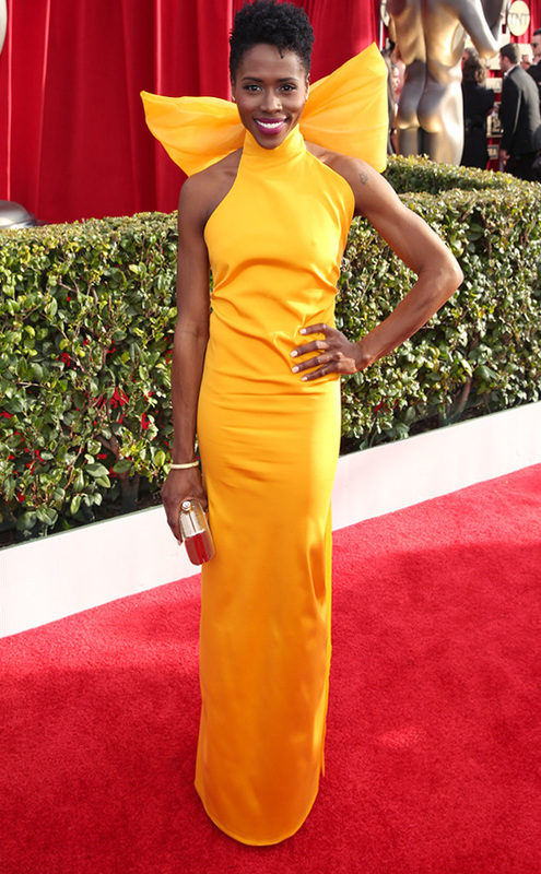
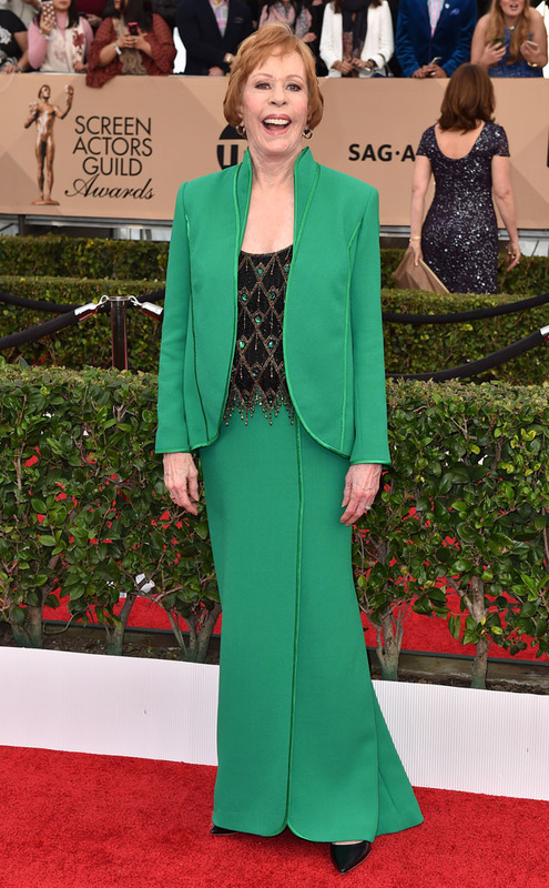
All photos from eonline.com |
categories
All
archives
May 2019
|


 RSS Feed
